Shosai
Colorverse No. 21/22 Schrödinger & Cat — Vivid Green with Colour-Shifting Sheen & Cobalt Blue with Silver Shimmer Fountain Pen Ink Set (65ml + 15ml)
Colorverse No. 21/22 Schrödinger & Cat — Vivid Green with Colour-Shifting Sheen & Cobalt Blue with Silver Shimmer Fountain Pen Ink Set (65ml + 15ml)
Couldn't load pickup availability
Colorverse No. 21/22 Schrödinger & Cat — Vivid Green with Colour-Shifting Sheen & Cobalt Blue with Silver Shimmer Fountain Pen Ink Set (65ml + 15ml)
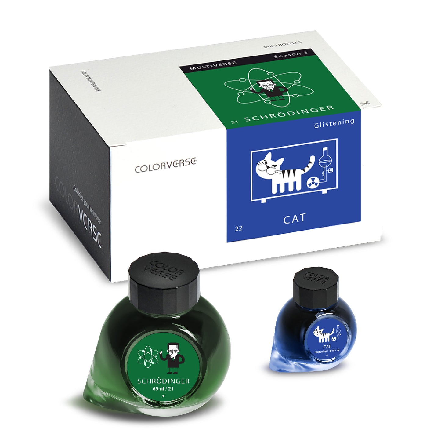
Colorverse No. 21/22 Schrödinger & Cat is a two-ink fountain pen set from Season 3: Multiverse — Colorverse's six-set series built on concepts of harmony, symmetry, and the paired relationships that govern the universe at its most fundamental level. The set draws its name and concept from one of quantum mechanics' most enduring thought experiments: Schrödinger's cat, the paradox proposed by Erwin Schrödinger in 1935 to illustrate the strangeness of quantum superposition — the idea that a system can exist in multiple states simultaneously until the moment of observation collapses it into one. The two inks enact that paradox directly: Schrödinger, the 65ml green, is the unobserved system — vivid, present, and alive with a colour-shifting sheen that changes with the angle of light; Cat, the 15ml Glistening blue, is the observer's reward — a classic, saturated cobalt with silver shimmer and its own intense pink sheen, the companion that completes the quantum pair.
As a Multiverse set, Schrödinger & Cat are formulated as complements rather than contrasts — the green and blue bases are visually harmonious, and the sheen colours of both inks echo each other across the pair, creating a coherent chromatic relationship that rewards using both inks together. Schrödinger is a pure dye ink with no shimmer; Cat is a Glistening ink with fine silver shimmer particles. Both carry significant sheen effects, making this one of the most visually complex and rewarding sets in the Colorverse catalogue.
The set arrives in Colorverse's signature constellation-decorated presentation box with illustrated stickers and a bookmark themed to the Multiverse series. Available at Shosai (shosai.ca) in Gatineau / Ottawa — with in-store pickup (J9J 0K6) and Canada-wide shipping.
What Makes Schrödinger & Cat Different
Paired ink sets are a familiar format in the fountain pen world, but most pairs are thematically linked rather than genuinely complementary — two colours that share a name rather than a chromatic relationship. Schrödinger & Cat is a different kind of pair. The green and blue bases are harmonious without being similar; the sheen colours of both inks — shifting between pink, black, electric blue, and dark red depending on light and ink load — echo each other across the pair in a way that makes the two inks feel like parts of a single chromatic system rather than independent products that happen to share a box.
Schrödinger itself is one of the most unusual green inks in the Korean catalogue. Vivid, saturated grass greens are common; greens with significant sheen effects are rare; greens whose sheen shifts between black, pink, and electric blue depending on light conditions are genuinely exceptional. The colour-shifting sheen is the defining characteristic of Schrödinger and the reason it has remained one of the most discussed inks in the Multiverse series since its release — a green that is practical enough for everyday use and visually complex enough to reward close and repeated attention.
Cat, as the Glistening companion, adds a different kind of visual complexity: fine silver shimmer particles that catch the light without overwhelming the cobalt blue base, paired with an intense pink sheen and dark red sheen at pooling points that mirrors and complements Schrödinger's own sheen palette. The result is a pair of inks that genuinely enact their namesake paradox — two states, observed and unobserved, that together form something more complete than either alone.
Ink Profiles
Schrödinger (No. 21) — 65ml
Colour
No. 21 Schrödinger is a medium grass green — a vivid, saturated Kelly green that occupies the classic everyday green register without leaning toward yellow-green or blue-green. In the bottle, it presents as a rich, confident green with visible chromatic depth. On the page, it dries to a legible, fully saturated grass green that holds its vibrancy well across nib sizes and paper types: expressive and luminous at medium to broad sizes, clean and distinctly green at fine sizes. Writers describe the base as medium grass green, Kelly green, vivid everyday green, or a saturated green that reads as neither warm nor cool — a colour that is direct, confident, and immediately readable as green without qualification.
Shading
Medium and clearly present. Schrödinger shades from a lighter, brighter grass green in fine strokes to a deeper, richer forest green at pooling points and heavier stroke areas. The shading gradient — light grass to deep forest — is clearly visible on quality papers with medium and broader nibs, adding tonal depth to what is already a characterful base colour. On Tomoe River and Rhodia, the shading is most active and most rewarding; on standard papers, it narrows but remains visible.
Sheen
Intense, colour-shifting, and genuinely exceptional. The sheen is Schrödinger's defining characteristic and one of the most unusual sheen effects in the Colorverse catalogue — or in Korean ink more broadly. Rather than producing a single consistent sheen colour, Schrödinger shifts between multiple sheen registers depending on light angle, ink load, and paper surface. In everyday writing, the sheen most commonly presents as a deep, dramatic black sheen at stroke edges and pooling points — dark, almost iridescent, and striking against the vivid green base. Under raking or angled light, the sheen shifts to reveal pink and electric blue registers that are rarely seen on green inks of any origin. At heavy pooling points and in swab applications, the electric blue sheen is most apparent, creating a green-to-blue iridescent effect that is, by any standard, extraordinary.
Reviewers consistently identify the colour-shifting sheen as Schrödinger's most compelling quality — a green ink that behaves unlike any other green, producing black, pink, and electric blue iridescence depending on how and where you look at it. The sheen performs best on smooth, slow-absorbing papers with medium to broad or stub nibs; on standard absorbent papers, the sheen diminishes significantly.
Shimmer
None. Schrödinger is a pure dye ink with no shimmer particles. The visual complexity comes entirely from the dye formulation and its interaction with paper surface — vivid green base, expressive shading, extraordinary colour-shifting sheen. No particle clogging risk; low-maintenance; safe for all pens.
Cat (No. 22) — 15ml Glistening
Colour
No. 22 Cat is a medium cobalt blue — a vivid, saturated classic blue that occupies the everyday blue register without leaning toward purple or green. In the bottle, it presents as a rich, confident cobalt with visible depth. On the page, it dries to a legible, fully saturated blue that reads cleanly across nib sizes: expressive and luminous at medium to broad sizes, clean and distinctly blue at fine sizes. Writers describe the base as medium blue, cobalt blue, vivid everyday blue, or a classic saturated blue — a colour that is direct, confident, and entirely functional as an everyday writing blue with significant visual rewards at broader nib sizes.
Shading
Medium and clearly visible. Cat shades from a lighter, brighter blue in fine strokes to a deeper, richer cobalt at pooling points and heavier stroke areas. The shading gradient is present and characterful on quality papers, adding tonal depth to the vivid cobalt base. Most active on Tomoe River and Rhodia with medium to broad nibs.
Sheen
Intense, with a complex two-register sheen palette that mirrors Schrödinger's. At pooling points and saturated stroke areas, Cat develops a vivid pink sheen that transitions to a dramatic dark red at the heaviest saturation points — a sheen palette that echoes and complements Schrödinger's own pink and dark sheen registers, creating the coherent chromatic relationship that defines the Multiverse set format. The pink sheen is intense and generous; the dark red sheen at heaviest pooling points adds a second, deeper register that makes Cat's sheen more complex than a single-colour effect. Performs best on smooth, slow-absorbing papers with medium to broad nibs.
Shimmer
Fine silver shimmer — subtle, well-distributed, and elegant. Cat's silver shimmer particles catch the light without overwhelming the cobalt blue base, adding a luminous, sparkling quality to the ink that is most visible under direct or raking light and in broader nib applications. The shimmer is described by reviewers as subtle but clearly present — not a heavy glitter effect, but a fine, consistent sparkle that elevates the everyday cobalt base into something more visually rewarding. The shimmer does not clog pens under normal use; regular flushing every 4–6 weeks is recommended as standard shimmer-ink care.
Ink Properties at a Glance
Schrödinger (No. 21) — 65ml
| Property | Detail |
|---|---|
| Flow | Average to good; moderate wetness; smooth and consistent |
| Dry Time | ~40 seconds on Rhodia with medium nib |
| Water Resistance | Low |
| Shimmer | None |
| Sheen | High; colour-shifting black / pink / electric blue |
Cat (No. 22) — 15ml Glistening
| Property | Detail |
|---|---|
| Flow | Average to good; moderate wetness; smooth and consistent |
| Dry Time | ~50 seconds on Rhodia with medium nib |
| Water Resistance | Low |
| Shimmer | Fine silver shimmer |
| Sheen | High; intense pink with dark red at heaviest pooling points |
Both inks are water-based dye inks, pH neutral to slightly alkaline, non-toxic, and safe for all fountain pens including vintage instruments.
How to Get the Most Out of Schrödinger & Cat
Recommended Paper
Both inks are sheen inks at heart, and both reward smooth, slow-absorbing papers that allow their respective sheen effects to develop fully. Cat's silver shimmer is an additional consideration — shimmer inks perform best on papers where the particle distribution is even and visible:
- Tomoe River (52gsm or 68gsm) — the definitive paper for both inks; Schrödinger's colour-shifting sheen is most spectacular here, with the full black-pink-electric blue range visible under natural or raking light; Cat's silver shimmer distributes evenly and the pink-to-dark-red sheen develops at maximum intensity; the full visual drama of both inks is most completely expressed on Tomoe River
- Rhodia / Clairefontaine — excellent and reliable results for both inks; Schrödinger's sheen develops clearly; Cat's shimmer and sheen both perform well; the practical everyday choice for experiencing the full character of both inks
- Leuchtturm1917 — good overall performance; both inks saturate well; sheen visible on both; Cat's shimmer clearly present; a natural pairing for bullet journaling and daily logging with both inks in rotation
- Midori MD Paper — smooth surface supports good colour development and sheen visibility for both inks; a reliable pairing for journaling and extended writing sessions
- Standard copy paper — functional at fine nib sizes for basic legibility; sheen largely absent on both inks; Cat's shimmer less visible; feathering possible at broader sizes; not recommended for the full visual experience of either ink
Recommended Nibs
Both inks reward wetter, broader nibs that deposit sufficient ink for sheen and shimmer effects to develop:
- Stub and cursive italic nibs — the highest-intensity sheen on both inks; Schrödinger's colour-shifting sheen most spectacular at broad stub widths; Cat's silver shimmer most luminous and most evenly distributed; the recommended choice for experiencing both inks at their most visually extraordinary
- Medium and broad nibs — sheen clearly visible and active on both inks; Schrödinger's black and pink sheen registers most apparent; Cat's shimmer and pink sheen both clearly present; the recommended everyday choice for the full visual character of both inks
- Fine nibs — both base colours read cleanly and vividly; sheen reduced but present at pooling points; Cat's shimmer visible but less prominent; a practical choice where legibility takes precedence
- Extra-fine nibs — both inks fully functional at fine sizes; sheen largely absent; Cat's shimmer minimal; recommended only where fine line precision is the priority
- Eyedropper pens — an excellent pairing for both inks; consistent ink volume ensures sustained sheen and shimmer performance; particularly effective for extended writing sessions with either or both inks
- Dip pens — exceptionally well-suited to both inks' visual drama; Schrödinger's colour-shifting sheen and Cat's shimmer-and-sheen combination are most spectacular in dip pen applications with generous ink loads
Pen Maintenance
Schrödinger (No. 21) is a pure dye ink with no shimmer particles — low-maintenance, no clogging risk, safe for all pens. Flush every 4–6 weeks under normal use. Cat (No. 22) is a Glistening shimmer ink — flush every 4–6 weeks as standard shimmer-ink care, and shake gently before each use to redistribute settled shimmer particles. Both inks are pH neutral to slightly alkaline and safe for all pen materials including vintage rubber sacs and celluloid. Compatible with all standard converter and cartridge systems.
Recommended Uses
- Quantum-themed and science writing — the Schrödinger's cat connection makes this set a compelling choice for physics enthusiasts, science communicators, students, and anyone whose writing engages with quantum mechanics, philosophy of science, or the history of physics; using both inks together — green for one voice, blue for another — creates a visual dialogue that enacts the paired-states concept of the set's namesake
- Dual-ink journaling and creative writing — the chromatic harmony of the green and blue pair, and the echoing sheen palettes of both inks, make Schrödinger & Cat a natural choice for writers who use multiple inks within a single journal or notebook; the inks are visually distinct but compositionally related, producing pages of genuine coherence and complexity
- Artistic calligraphy and expressive lettering — Schrödinger's colour-shifting sheen and Cat's shimmer-and-sheen combination produce page qualities of extraordinary visual drama at stub and italic nib sizes; a natural choice for display lettering, title pages, and any calligraphic work where visual impact is the primary goal
- Annotation and dual-colour note-taking — the vivid green and classic cobalt blue are sufficiently distinct to function as a colour-coded annotation pair; legible and characterful at fine to medium nib sizes; a practical and visually rewarding alternative to standard highlighter-and-pen annotation systems
- Fountain pen photography and swatching — both inks are among the most photogenic in the Colorverse catalogue; Schrödinger's colour-shifting sheen is most spectacular under natural or raking light on Tomoe River; Cat's silver shimmer and pink sheen are most dramatic under direct light; side-by-side swab photography of the pair showcases the echoing sheen palette most clearly
- Ink collection display — the matched 65ml and 15ml teardrop bottles in the constellation presentation box are among the most display-worthy formats in the Colorverse range; the green-and-blue pair reads beautifully on a shelf as a coherent visual unit
About the Multiverse Series
Multiverse is Colorverse's Season 3 collection — a series of six paired sets built on concepts of harmony, symmetry, and the fundamental paired relationships that structure the universe. Where Season 1's Spaceward drew its palette from the deep personalities of space and Season 2's Astrophysics turned to the forces of physics, Multiverse explores the universe at the level of relationship: each set pairs two inks that are formulated as complements, with echoing sheen or shimmer effects that create a coherent chromatic bond between the two bottles. Schrödinger & Cat, as No. 21/22, is one of the most celebrated sets in the Multiverse series — the quantum mechanics concept, the colour-shifting sheen of Schrödinger, and the Glistening shimmer of Cat combine to make it one of the most conceptually and visually complete sets in the Colorverse catalogue.
About Colorverse
Colorverse is a Seoul-based fountain pen ink studio dedicated to translating the wonder of the cosmos — and the quieter wonders of everyday life — into thoughtfully formulated, plant-based fountain pen inks. Founded in South Korea, Colorverse inks are made with plant-origin colorants and solvents, treated for hydration and antibacterial stability, and designed to maintain a neutral pH range for safe, long-term use in all fountain pens. Distributed internationally and available in Canada through select retailers, each Colorverse ink carries a number, a name, and a story. Shop the full Colorverse collection at Shosai — Ottawa and Gatineau's home for Japanese and Korean stationery.
Product Specifications
| Detail | Schrödinger (No. 21) | Cat (No. 22) |
|---|---|---|
| Brand | Colorverse | Colorverse |
| Series | Season 3: Multiverse | Season 3: Multiverse |
| Ink Number | No. 21 | No. 22 |
| Ink Name | Schrödinger | Cat |
| Inspiration | Schrödinger's cat thought experiment (1935) | The observer in Schrödinger's paradox |
| Origin | South Korea | South Korea |
| Volume | 65ml | 15ml |
| Ink Type | Water-based dye ink | Water-based dye ink (Glistening) |
| Base Colour | Medium grass green / Kelly green | Medium cobalt blue |
| Shading | Medium; light grass to deep forest green | Medium; light to deep cobalt blue |
| Shimmer | None | Fine silver shimmer |
| Sheen | High; colour-shifting black / pink / electric blue | High; intense pink with dark red at pooling points |
| Flow | Average to good; moderate wetness | Average to good; moderate wetness |
| Dry Time | ~40 seconds (Rhodia, medium nib) | ~50 seconds (Rhodia, medium nib) |
| Water Resistance | Low | Low |
| pH | Neutral to slightly alkaline | Neutral to slightly alkaline |
| Pen Safety | Safe for all pen materials | Safe for all pen materials |
| Nib Compatibility | Medium, broad, stub recommended | Medium, broad, stub recommended; EF not recommended for sheen/shimmer |
Bottle: Glass teardrop-base bottles (65ml + 15ml) in constellation-decorated presentation box with illustrated stickers and bookmark.
Available at Shosai — Ottawa–Gatineau
Shosai (shosai.ca) is a fine stationery boutique serving the Ottawa–Gatineau National Capital Region. We carry a curated selection of premium fountain pen inks, papers, and writing instruments from the world's most respected stationery brands.
- 📍 In-store pickup: Gatineau, QC — J9J 0K6
- 🛵 Local delivery: Available in the Ottawa–Gatineau area
- 🚚 Canada-wide shipping available
- 🇫🇷 Service bilingue — français et anglais
Whether you are new to fountain pens or a seasoned collector, Shosai is your local destination for inks that go beyond the ordinary.
Share