Shosai
Colorverse No. 79 Coffee Break — Warm Cocoa Brown, Expressive Shading Fountain Pen Ink (30ml)
Colorverse No. 79 Coffee Break — Warm Cocoa Brown, Expressive Shading Fountain Pen Ink (30ml)
Couldn't load pickup availability
Colorverse No. 79 Coffee Break — Warm Cocoa Brown, Expressive Shading Fountain Pen Ink (30ml)
Colorverse No. 79 Coffee Break is a 30ml fountain pen ink from the Joy in the Ordinary series — Colorverse's celebration of the quiet, everyday pleasures that anchor a writing life. Where most Colorverse series look outward to the cosmos for their palette, Joy in the Ordinary turns inward, finding colour in the domestic and familiar: the warmth of a cup of coffee, the unhurried rhythm of a break well taken. Coffee Break translates that moment directly into ink — a warm, medium brown with unmistakable yellow undertones and a shading gradient that moves from milky, pale biscuit through a smooth cocoa mid-tone to a richer, darker chocolate at the deepest pooling points. The effect is precisely what the name promises: the layered warmth of a real coffee stain, rendered in dye ink on the page.
As a Joy in the Ordinary entry, Coffee Break carries no shimmer and no sheen — the colour and its shading do all the work, and they do it with the kind of quiet, satisfying character that makes an ink genuinely pleasant to live with day after day. The bottle is 30ml glass, accompanied by a colour card and illustrated stickers consistent with the Colorverse series format. Each bottle in the Colorverse catalogue carries a number, a name, and a story: No. 79 is Coffee Break, and it earns its place in the collection.
Available at Shosai (shosai.ca) in Gatineau / Ottawa — with in-store pickup (J9J 0K6) and Canada-wide shipping.
What Makes No. 79 Coffee Break Different
Brown is one of the most difficult colour spaces in fountain pen ink. Reds read as rusty; cooler browns read as grey or flat; overly dark browns lose legibility; overly light browns disappear entirely on cream-toned paper. Coffee Break navigates the space with the specificity of its name — a warm, medium brown with clear yellow undertones that keep it from reading as red, grey, or muddy. It lands in the precise register of a coffee stain on a hotel notepad: familiar, warm, and more interesting than it first appears.
What distinguishes Coffee Break within the crowded brown category is the quality and range of its shading. The tonal range is wider and more expressive than the base colour alone suggests — moving from a cool, milky pale brown in the lightest strokes to a warm, saturated chocolate at pooling points, with the full mid-range cocoa warmth in between. The result is an ink that rewards attention: flat and legible at fine nib sizes, layered and genuinely beautiful at medium to broad sizes, and frankly convincing as a coffee-stain effect at stub or flex nibs on premium paper. Reviewers describe the colour variation as being "beyond compare" for a brown ink, and the shading as creating a "convincing coffee stain look" — both of which are difficult achievements in a colour space that tends toward either monotony or muddy complexity.
The Joy in the Ordinary series context matters here too. Coffee Break is not trying to evoke a dramatic natural phenomenon or a space mission; it is trying to evoke the precise feeling of a quiet moment, a warm cup, and a pen in hand. It succeeds at that register with unusual fidelity.
Colour Profile
Colour
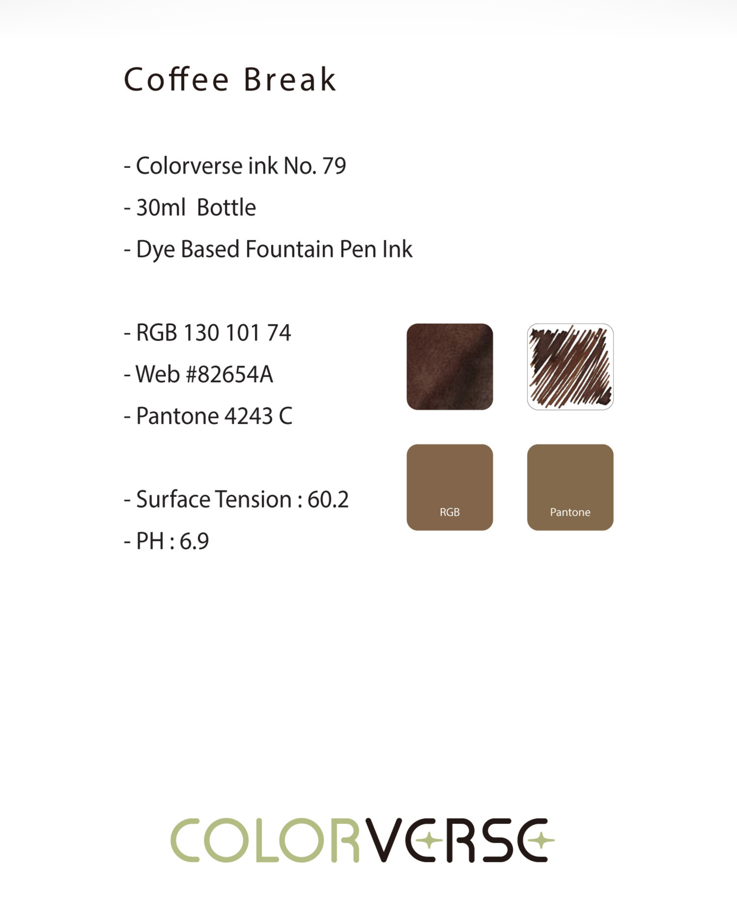
No. 79 Coffee Break is a warm, medium brown with clear yellow undertones — a cocoa-register brown that sits comfortably between the reddish warmth of chestnut and the cooler neutrality of grey-brown, without reading as either. In the bottle, it presents as a rich, translucent amber-brown with a warm, inviting depth. On the page, it dries to a confident, legible warm brown that holds its character well across nib sizes and paper types: expressive and layered at medium to broad sizes, clean and readable at fine sizes, and never muddy or flat regardless of how it is used.
Writers and reviewers describe the base as warm cocoa brown, hotel-lobby coffee, coffee stain, a yellow-leaning medium brown, or a lovely warm brown with cocoa inspiration — a colour that is warm, approachable, and consistently more nuanced than a first glance suggests. The yellow undertones are subtle enough that the ink reads unmistakably as brown rather than tan or khaki, but present enough to keep the colour from ever reading as dull, red-brown, or grey. On cream-toned papers, the yellow warmth integrates particularly well; on bright white papers, the contrast between the warm brown and the white ground produces a clean, characterful page.
Shading
Expressive, layered, and genuinely active for a medium brown. Coffee Break shades across a pleasingly wide tonal range — from a cool, milky, pale biscuit in the finest hairline strokes to a warmer, richer chocolate brown at pooling points and stroke edges, with the warm cocoa base occupying the full mid-range between them. The light end is pale enough to read almost as dry grass or cream; the dark end deepens convincingly toward dark chocolate without losing the yellow warmth of the base colour. The full gradient — pale biscuit to warm cocoa to dark chocolate — is present within each stroke at medium and broader nib sizes, producing a page quality that reviewers consistently single out as Coffee Break's most appealing characteristic.
Reviewers consistently describe the shading as a highlight: a colour that creates genuine variation with each stroke, produces a convincing coffee-stain layering effect at larger nib sizes, and rewards quality paper with a gradient that is more active than the low-shading designation sometimes applied to it would suggest. On Tomoe River and Rhodia with a medium, broad, or stub nib, the full shading range is most apparent and most rewarding. On standard papers, shading narrows but remains clearly visible and characterful.
Sheen
None. Coffee Break does not develop a metallic sheen on any paper surface. No reviewers note any sheening effect under any conditions — the visual depth of the ink comes entirely from the warm brown base and its shading gradient. Writers who prefer clean, sheen-free browns will find Coffee Break a reliable and consistent choice.
Shimmer
None. Coffee Break contains no shimmer particles. The ink is a pure dye formulation — the writing experience is clean, uninterrupted, and completely free of particle residue. No shimmer means no settling in the bottle, no particle buildup in pen feed channels, and no maintenance considerations beyond standard dye-ink care. Safe for all pens including vintage and fine-nibbed instruments.
Ink Properties at a Glance
Flow
Smooth to slightly wet and well-lubricated. Coffee Break flows generously across a range of pen and nib combinations, contributing to the ink's active shading by depositing more ink at pooling points and stroke edges. The flow is smooth and satisfying without being uncontrollably wet — consistent with Colorverse's standard formulation approach. pH 6.9 — effectively neutral, and safe for all pen materials including vintage rubber, modern resins, and metal components.
Dry Time
Moderate and practical for everyday use — approximately 10 to 40 seconds depending on pen wetness, nib size, and paper absorbency. On Rhodia with a medium nib, expect roughly 40 seconds; on more absorbent papers, considerably faster. The slightly wetter flow means dry time will be longer on the smoothest, slowest-absorbing papers such as Tomoe River; writers who prioritise fast dry time should account for this on premium papers.
Water Resistance
Low to moderate. Coffee Break is a water-based dye ink with no meaningful water resistance. Exposure to moisture will cause the colour to run or fade, and it is not suitable for documents requiring archival longevity or water resistance. For everyday journaling, correspondence, and note-taking, this is not a practical concern; for documents intended for long-term preservation or outdoor use, a water-resistant or pigment ink would be more appropriate.
Feathering and Bleed-Through
Minimal on quality papers (Rhodia, Tomoe River, Clairefontaine, Midori MD, Leuchtturm1917). Well-behaved and clean on all fountain-pen-friendly papers. Some feathering may occur on standard absorbent copy paper, particularly at broader nib sizes; the slightly generous flow means this ink performs best on papers designed for fountain pen use.
How to Get the Most Out of No. 79 Coffee Break
Recommended Paper
Coffee Break rewards smooth, slow-absorbing papers that allow the warm brown saturation and shading gradient to develop fully on the surface:
- Tomoe River (52gsm or 68gsm) — the best paper for showcasing Coffee Break's full shading range; slow absorption allows the pale biscuit-to-chocolate gradient to develop fully on the surface; the yellow undertones of the base read at maximum warmth and depth; shading most expressive and most beautiful here; the ink's coffee-stain quality is most convincing on Tomoe River with a broad or stub nib
- Rhodia / Clairefontaine — consistent, reliable, and practical results; warm cocoa saturation clearly expressed; shading clearly visible at medium and broader nib sizes; an excellent everyday option that brings out the full character of the ink without requiring special handling
- Leuchtturm1917 — good overall performance; full brown saturation; shading visible and characterful; the warm yellow undertones read particularly well on cream-toned Leuchtturm pages; a natural pairing for bullet journaling and daily logging
- Midori MD Paper — smooth surface supports good colour development and shading visibility; the matte finish suits the understated warmth of Coffee Break well; a particularly pleasant pairing for journaling and extended writing sessions
- Standard copy paper — functional at fine nib sizes; shading range narrows considerably; some feathering possible at broader sizes; Coffee Break remains legible and warm but loses most of its expressive character on highly absorbent surfaces
Avoid highly absorbent papers for any nib wider than fine. The shading gradient will be suppressed and feathering will become more likely on fast-absorbing surfaces.
Recommended Nibs
Coffee Break rewards wetter, broader nibs that deposit more ink on the page and allow the full shading gradient to express itself fully:
- Stub and cursive italic nibs — the highest-contrast shading and the most convincing coffee-stain layering effect; the pale-to-chocolate gradient is most dramatic here; the variation between thick horizontal strokes and thin vertical strokes showcases the full tonal range within each letterform; the recommended choice for anyone who wants to experience Coffee Break at its most expressive
- Medium and broad nibs — expressive shading clearly visible and active; warm cocoa base reads at full saturation; the recommended everyday choice for getting the most from this ink without requiring a specialist nib; shading is apparent and satisfying at medium widths on all recommended papers
- Fine nibs — clean and readable; warm brown character remains present and distinctive; shading range narrows but the yellow undertones keep the colour from reading as flat or dull; a practical choice for everyday notes, annotations, and any writing context where legibility takes precedence over expressive shading
- Extra-fine nibs — fully functional; the warm brown base remains legible and characterful; shading largely absent; a reliable choice for fine annotation, technical writing, or use in pens with very fine nibs where ink pooling is minimal
- Eyedropper pens — an excellent pairing; high ink volume ensures full colour saturation and consistent shading expression throughout the fill; the generous flow of Coffee Break benefits from eyedropper volume, and the large ink capacity suits an ink this pleasant for extended everyday use
- Dip pens — well-suited to Coffee Break's warm, layered character; the shading gradient and warm brown depth are particularly appealing in dip pen applications; a natural pairing for journaling illustrations, hand-lettering, and any mixed-media work where the coffee-stain warmth is a compositional asset
Pen Maintenance
Colorverse No. 79 Coffee Break is pH 6.9 — effectively neutral — and safe for all pen materials including vintage rubber sacs, modern resins, celluloid, and metal components. As a pure dye ink with no shimmer particles, it carries no particle clogging risk and is low-maintenance across all pen types. Flush every 4–6 weeks under normal use, or when switching inks. Compatible with all standard converter and cartridge systems.
Recommended Uses
- Daily journaling and personal writing — Coffee Break's warm, familiar register and expressive shading make it an ideal everyday journaling ink; it is characterful without being distracting, and the coffee-stain warmth suits the intimate, personal tone of journal writing particularly well
- Correspondence and letter writing — the warm cocoa brown reads with a classic, unhurried quality that suits handwritten correspondence; distinctive enough to be memorable, legible enough to be practical, and warm enough to feel personal
- Note-taking and study — the warm brown is easy to read and easy to live with over long writing sessions; at fine to medium nib sizes, Coffee Break is a characterful alternative to black or blue for students and note-takers who want something with more personality without sacrificing legibility
- Bullet journaling and planners — the Leuchtturm1917 pairing is particularly natural here; the warm brown reads well on cream pages, the shading adds visual interest to headers and titles, and the ink's everyday reliability suits the regular, structured use of a planner or bullet journal
- Calligraphy and hand-lettering — Coffee Break's shading gradient and warm saturation produce a genuinely beautiful page quality at stub and italic nib sizes; particularly effective for warm, organic lettering styles and any lettering context where the coffee-stain warmth is a design asset
- Sketching and illustration — compatible with dip pens and brush application; the warm brown and expressive shading add natural, organic warmth to ink sketching, line work, and mixed-media illustration; a natural choice for figure drawing, architectural sketching, and any illustration context where a warm earth-tone brown is useful
- Fountain pen photography and swatching — Coffee Break photographs warmly and characterfully under natural light; the shading gradient is most dramatic on Tomoe River with a broad or stub nib; the pale-to-chocolate range is most apparent in side-by-side swatch photography with a generous ink load
About the Joy in the Ordinary Series
Joy in the Ordinary is a Colorverse series dedicated to the small, unhurried pleasures of everyday life — the moments that punctuate a writing day rather than define it. Where Colorverse's signature space-themed collections draw their palette from the cosmos, Joy in the Ordinary finds colour in the domestic and familiar: coffee, rest, warmth, the texture of a quiet afternoon. The series inks are pure dye formulations — no shimmer, no sheen — relying entirely on colour quality, shading character, and the specific emotional register of their subject matter to make their case. The result is a series that feels less like a collector's showpiece and more like a companion: inks that earn their place on the desk through daily use rather than occasional display. Coffee Break, as No. 79 in the Colorverse catalogue, sits within a broader numbered series that rewards exploration: each colour carries a story, and the stories accumulate.
About Colorverse
Colorverse is a Seoul-based fountain pen ink studio dedicated to translating the wonder of the cosmos — and the quieter wonders of everyday life — into thoughtfully formulated, plant-based fountain pen inks. Founded in South Korea, Colorverse inks are made with plant-origin colorants and solvents, treated for hydration and antibacterial stability, and designed to maintain a neutral pH of 7–8 for safe, long-term use in all fountain pens. Distributed internationally and available in Canada through select retailers, each Colorverse ink carries a number, a name, and a story. Shop the full Colorverse collection at Shosai — Ottawa and Gatineau's home for Japanese and Korean stationery.
Product Specifications
| Detail | Specification |
|---|---|
| Brand | Colorverse |
| Collection | Joy in the Ordinary |
| Ink Name | No. 79 Coffee Break |
| Inspiration | The quiet pleasure of a coffee break |
| Origin | South Korea |
| Volume | 30ml |
| Bottle | Glass bottle with colour card and illustrated stickers |
| Ink Type | Water-based dye ink |
| Base Colour | Warm medium brown with yellow undertones |
| Shading | Expressive; pale biscuit to dark chocolate gradient |
| Shimmer | None |
| Sheen | None |
| Flow | Smooth to slightly wet |
| Dry Time | ~10–40 seconds |
| Water Resistance | Low |
| pH | 6.9 (neutral) |
| Pen Safety | Safe for all pen materials including vintage rubber and celluloid |
| Nib Compatibility | Medium, broad, and stub recommended; EF and F functional but shading minimal |
Available at Shosai — Ottawa–Gatineau
Shosai (shosai.ca) is a fine stationery boutique serving the Ottawa–Gatineau National Capital Region. We carry a curated selection of premium fountain pen inks, papers, and writing instruments from the world's most respected stationery brands.
- 📍 In-store pickup: Gatineau, QC — J9J 0K6
- 🛵 Local delivery: Available in the Ottawa–Gatineau area
- 🚚 Canada-wide shipping available
- 🇫🇷 Service bilingue — français et anglais
Whether you are new to fountain pens or a seasoned collector, Shosai is your local destination for inks that go beyond the ordinary.
Share