Shosai
Dominant Industry Standard 108 Maple — Terracotta Orange, Warm Shading Fountain Pen Ink (25ml)
Dominant Industry Standard 108 Maple — Terracotta Orange, Warm Shading Fountain Pen Ink (25ml)
Couldn't load pickup availability
Dominant Industry Standard 108 Maple — Terracotta Orange, Warm Shading Fountain Pen Ink (25ml)
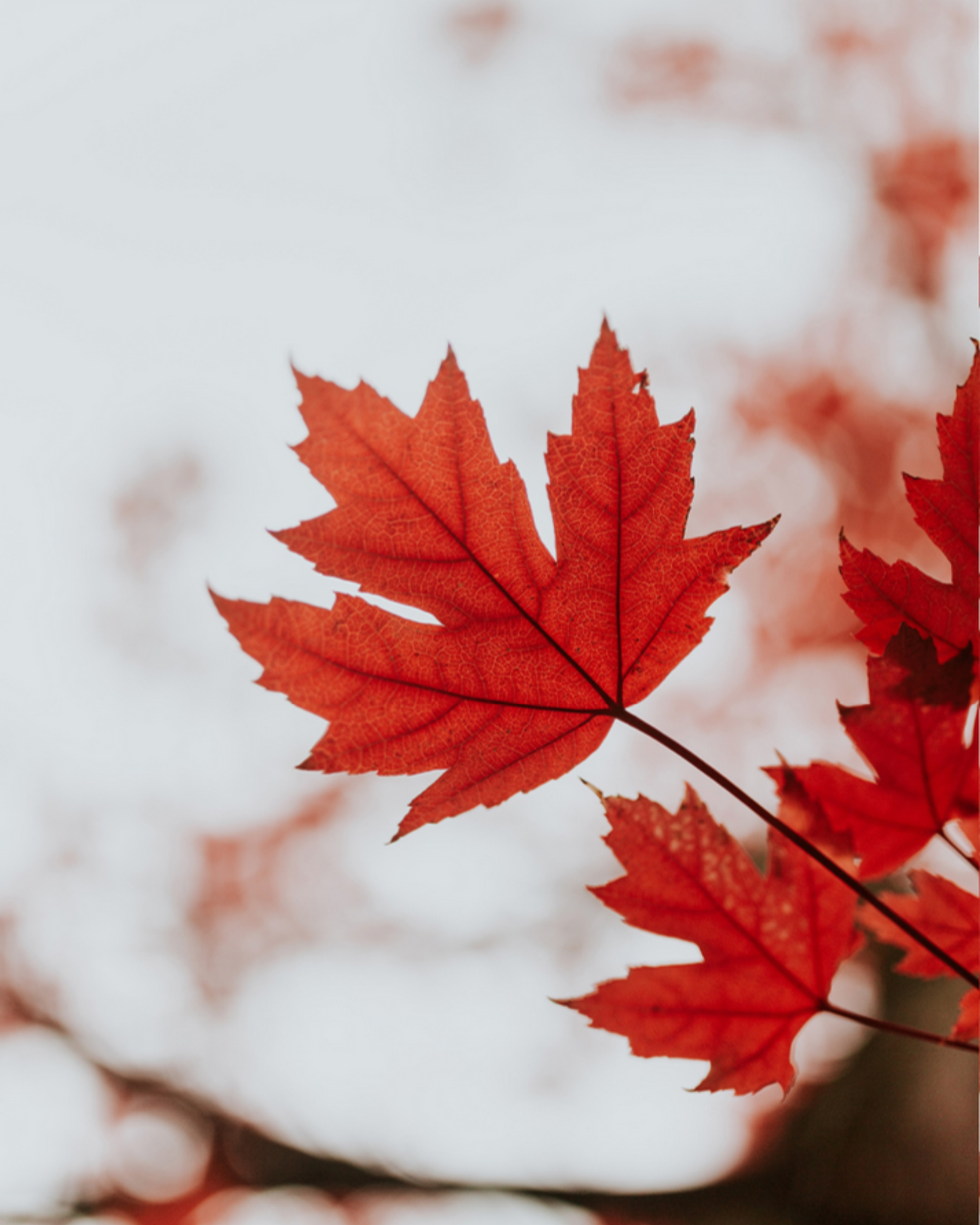
Dominant Industry Standard 108 Maple is a 25ml fountain pen ink from Dominant Industry's Standard Series — a line of richly formulated, non-shimmer inks built for writers who prioritise colour depth, ink quality, and expressive character. Maple delivers a warm, saturated terracotta orange — a rich, earthy red-orange that evokes the specific colour of autumn maple foliage at peak season: not a flat or corporate orange, but a colour that moves between red-orange, warm terracotta, and deep clay-orange depending on the ink density and nib size. It is an autumn ink in the fullest sense — warm, alive, and deeply seasonal — with a low to moderate shading that is one of the ink's most celebrated characteristics, revealing a beautiful gradient from pale warm orange in thin strokes to a deeper, richer red-brown at pooling points.
Part of Dominant Industry's Standard Series — and one of the most popular entries in the line — Maple combines a fully saturated warm terracotta base with expressive shading that rewards premium paper and broader nibs. The shading is the ink's defining quality: a visible, beautiful transition from lighter orange to darker red-brown that gives every written stroke a multi-tonal, seasonal richness. There is no shimmer and no significant sheen — the colour and shading carry the full visual complexity of this ink, and they are more than sufficient. The bottle is 25ml glass.
Available at Shosai (shosai.ca) in Gatineau / Ottawa — with in-store pickup (J9J 0K6) and Canada-wide shipping.
What Makes Standard 108 Maple Different
Maple is one of the most precisely calibrated autumn inks in the fountain pen palette. It sits at the intersection of orange and red-brown — warm enough to read clearly as orange, deep enough to carry genuine earthy warmth — at a colour temperature that is specifically evocative of maple foliage rather than generic autumn or pumpkin orange. The slight pink-red tilt of the base colour distinguishes it from purely orange inks like standard tangerine or amber; it reads as terracotta rather than traffic cone, clay rather than crayon.
The shading is what elevates Maple from a well-formulated orange ink to an exceptional one. Most orange fountain pen inks shade within the orange spectrum — a gradient from pale to saturated orange. Maple shades across a wider range: from a warm pale orange in hairline strokes to a genuine red-brown at pooling points, producing a tonal variation that encompasses much of the warm side of the colour wheel within a single stroke. Reviewers consistently describe the shading as beautiful and surprising — more expressive than expected from the colour description alone. For writers who use autumn inks regularly, Maple is frequently cited alongside Diamine Autumn Oak as a reference point in the category, with a distinctly more red-pink character that makes it visually distinctive.
Colour Profile
Colour
Standard 108 Maple is a warm, saturated terracotta orange — a rich, earthy red-orange with a slight pink-red tilt that gives it a warm, living quality rather than a flat or graphic character. In the bottle, it presents as a vivid warm orange-red with clear depth and saturation. On the page, it dries to a confident, legible terracotta orange that holds its colour energy well: richly coloured and fully expressive at medium to broad nib sizes, and still clearly readable as a warm orange at fine sizes. Writers describe the base as terracotta orange, warm red-brown, autumn orange, or maple red — a colour that is warm, earthy, and unmistakably seasonal.
Shading
Low to moderate, with a wide tonal range. Maple's shading is its most celebrated characteristic — a clearly visible and beautiful tonal gradient that transitions from a lighter, warmer orange in hairline strokes to a deeper, richer red-brown at pooling points and stroke edges. The shading range is wider than most orange inks, encompassing a full warm spectrum from pale golden-orange to deep terracotta red-brown. Reviewers consistently note that the shading exceeds expectations — more expressive and more beautiful than the colour description alone suggests. On premium papers with medium to broad nibs, the full shading range is most apparent; stub and italic nibs bring out the gradient most dramatically.
Sheen
None to negligible. Maple does not develop a significant traditional metallic sheen on smooth papers. The visual complexity of the ink comes entirely from the warm terracotta base and the expressive shading gradient — a combination that produces a richly seasonal result without a sheen component. Some Standard Series inks may develop faint sheen on certain papers, but Maple's reviewers consistently focus on the colour and shading rather than any reflective quality.
Ink Properties at a Glance
Flow
Average to wet, smooth and comfortable. Standard 108 Maple flows at a consistent, generous rate — well-lubricated and smooth across a range of pen and nib combinations. The wetter flow contributes to the ink's expressive shading by depositing more ink on the page at pooling points.
Dry Time
Approximately 20 seconds on quality paper under normal conditions (medium nib on Rhodia) — notably fast for a moderately wet ink, making Maple a practical choice for everyday use.
Water Resistance
Low. Standard 108 Maple is a water-based dye ink with no meaningful water resistance. It will run or fade when exposed to moisture and is not suitable for documents requiring archival longevity.
Feathering and Bleed-Through
Minimal on quality papers (Rhodia, Tomoe River, Clairefontaine, Midori MD, Leuchtturm1917). Well-behaved and clean on fountain-pen-friendly papers. Some feathering may occur on standard absorbent papers.
How to Get the Most Out of Standard 108 Maple
Recommended Paper
Standard 108 Maple rewards smooth, slow-absorbing papers that allow the warm terracotta saturation and shading gradient to develop fully:
- Tomoe River (52gsm or 68gsm) — the best paper for showcasing Maple's full shading range; slow absorption allows the full tonal gradient from pale orange to deep red-brown to develop on the surface; shading most beautiful and most expressive here; the warm terracotta base reads at maximum chromatic depth
- Rhodia / Clairefontaine — consistent, reliable results; warm orange saturation clearly expressed; shading clearly visible at broader nib sizes; the fast 20-second dry time makes this a particularly practical everyday pairing
- Leuchtturm1917 — good overall performance; full terracotta saturation; shading visible; the warm colour reads particularly well on cream-toned pages
- Midori MD Paper — smooth surface supports good colour development and shading expression; a reliable everyday pairing that brings out the ink's autumnal warmth
Avoid highly absorbent papers (standard copy paper). Feathering may occur and the shading gradient will be suppressed on fast-absorbing surfaces.
Recommended Nibs
- Medium to Broad nibs — the primary recommendation for showcasing the full shading gradient; more ink on the page allows the tonal range from pale orange to deep red-brown to develop at its most expressive; the warm terracotta reads with full chromatic depth at broader sizes
- Stub or Italic nibs — the variation between thick and thin strokes showcases the shading gradient most dramatically; the contrast between lighter thin strokes and deeper pooling points is Maple's most visually rewarding characteristic; particularly effective for seasonal calligraphic and artistic work
- Fine nibs — the warm terracotta reads with excellent clarity and legibility at fine sizes; a practical everyday pairing for correspondence, note-taking, and professional writing; shading less visible but ink performs cleanly
- Extra-fine nibs — fully functional; the warm orange base remains legible and precise; shading largely absent; a reliable choice for fine annotation work
- Eyedropper pens — an excellent pairing; high ink volume ensures consistent shading expression and allows the full tonal range to develop throughout long writing sessions
- Dip pens — well-suited to Maple's warm, expressive character; the shading gradient is most spectacular in dip pen applications; particularly effective for autumn-themed calligraphy, botanical illustration, and seasonal artistic work
Pen Maintenance
Standard 108 Maple is pH neutral and safe for resin and celluloid pens. As a non-shimmer ink, it does not carry particle clogging risk and is low-maintenance. Flush every 4–6 weeks under normal use.
Recommended Uses
- Autumn and seasonal writing — the warm terracotta orange is a natural choice for autumn journaling, harvest correspondence, Thanksgiving writing, and any seasonal context where a warm, richly coloured orange-red makes an impression; a natural companion to Standard 101 Romania Red and Pearl 024 October Leaves within the Dominant Industry range
- Journaling and personal writing — the warm, expressive terracotta suits reflective personal writing where a richly coloured, visually complex ink adds depth and seasonal warmth to the page
- Calligraphy and expressive lettering — the shading gradient and warm saturation create a beautiful, multi-tonal page quality; stub and italic nibs bring out the ink's full tonal range; particularly effective for autumn-themed and harvest-inspired decorative work
- Nature writing and botanical illustration — the earthy terracotta orange is a natural choice for nature journals, botanical writing, and any artistic context where the colours of autumn foliage are directly relevant
- Correspondence and personal letters — the warm, distinctive terracotta suits personal letters, cards, and seasonal correspondence where a warm, earthy ink adds character and seasonal resonance
- Fountain pen photography and swatching — the warm terracotta photographs richly under natural light; the shading gradient is most dramatic on Tomoe River with broader nibs; the red-brown pooling is most apparent in swab photography
About the Standard Series
The Standard Series is Dominant Industry's non-shimmer ink line — a range of richly formulated dye-based inks focused on colour depth, expressive character, and ink quality without metallic particle suspension. Standard 108 Maple is one of the most popular entries in the series — a warm terracotta orange with expressive shading that has established itself as a reference point in the autumn fountain pen ink category.
About Dominant Industry
Dominant Industry is a South Korean fountain pen ink brand known for its Pearl Collection shimmer inks and a broad catalogue of richly formulated colours. Founded on a commitment to high-quality ink production, Dominant Industry has built a strong international following among fountain pen enthusiasts, calligraphers, and stationery collectors. Their inks are manufactured in South Korea and distributed through curated stationery retailers worldwide.
Product Specifications
| Detail | Specification |
|---|---|
| Brand | Dominant Industry |
| Series | Standard Series |
| Ink Name | Standard 108 Maple |
| Origin | South Korea |
| Volume | 25ml |
| Bottle | 25ml glass bottle |
| Ink Type | Water-based dye ink |
| Colour | Terracotta Orange / Warm Red-Brown |
| Shading | Low to moderate; wide tonal range, pale orange to deep red-brown |
| Shimmer | None |
| Sheen | None to negligible |
| Flow | Average to wet; smooth and well-lubricated |
| Dry Time | ~20 seconds |
| Water Resistance | Low |
| pH | Neutral |
| Pen Safety | Safe for resin and celluloid pens |
| Nib Compatibility | All nib sizes; broad and stub recommended for shading |
Available at Shosai — Ottawa–Gatineau
Shosai (shosai.ca) is a fine stationery boutique serving the Ottawa–Gatineau National Capital Region. We carry a curated selection of premium fountain pen inks, papers, and writing instruments from the world's most respected stationery brands.
- 📍 In-store pickup: Gatineau, QC — J9J 0K6
- 🛵 Local delivery: Available in the Ottawa–Gatineau area
- 🚚 Canada-wide shipping available
- 🇫🇷 Service bilingue — français et anglais
Whether you are new to fountain pens or a seasoned collector, Shosai is your local destination for inks that go beyond the ordinary.
Share