Shosai
Dominant Industry Standard 114 Downpour — Smoky Grey-Violet, Medium Shading Fountain Pen Ink (25ml)
Dominant Industry Standard 114 Downpour — Smoky Grey-Violet, Medium Shading Fountain Pen Ink (25ml)
Couldn't load pickup availability
Dominant Industry Standard 114 Downpour — Smoky Grey-Violet, Medium Shading Fountain Pen Ink (25ml)
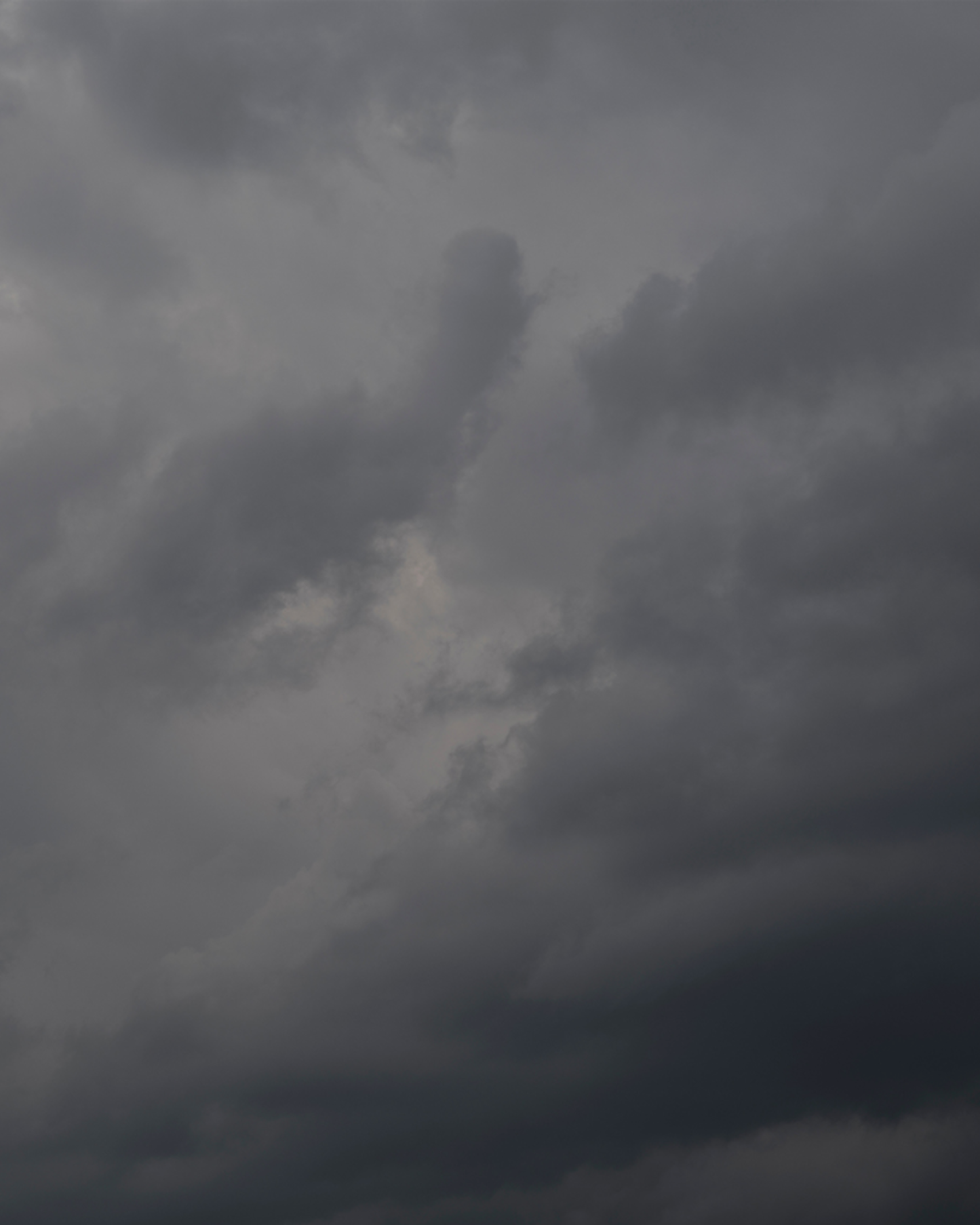
Dominant Industry Standard 114 Downpour is a 25ml fountain pen ink from Dominant Industry's Standard Series — a line of richly formulated, non-shimmer inks built for writers who prioritise colour depth, ink quality, and expressive character. Downpour delivers a smoky, atmospheric grey-violet — a medium grey with a clear violet undertone that gives it a cool, dimensional quality on the page. Named for the Korean 호우 (hōu — heavy rain, downpour), the ink captures the specific visual quality of a rain-heavy sky: the cool, diffuse grey of storm clouds with the subtle violet of light filtered through deep overcast, atmospheric and unmistakably moody.
Part of Dominant Industry's Standard Series, Downpour is one of the most versatile and wearable inks in the line — a grey that reads as grey in most contexts but reveals its violet character on closer inspection or under certain lighting conditions. The medium shading adds a natural tonal depth that makes every stroke multi-dimensional, from lighter grey in thin strokes to a deeper grey-violet at pooling points. There is no shimmer and no significant sheen — the colour and shading carry the full atmospheric character of this ink with the quiet restraint of rainfall itself. The bottle is 25ml glass.
Available at Shosai (shosai.ca) in Gatineau / Ottawa — with in-store pickup (J9J 0K6) and Canada-wide shipping.
What Makes Standard 114 Downpour Different
Grey fountain pen inks occupy a deceptively wide colour space. Pure cool greys read as clean and corporate; warm greys read as aged or sepia; blue-greys read as nautical or clinical. Downpour occupies a rarer position: a violet-grey that is grey enough to be versatile and professional, but violet enough to carry genuine chromatic depth and atmospheric character. It is not a grey with a hint of purple — it is a grey with a deliberate violet personality, most visible in the medium shading that reveals deeper violet-grey tones at heavier ink deposits.
The Korean name 호우 (downpour) provides the most precise description of the ink's visual atmosphere. This is not the light grey of mist or fog, nor the blue-grey of a clear winter sky — it is the specific grey of a heavy, overcast sky before a downpour, charged with moisture and violet light. For writers who want a grey ink that goes beyond simple neutrality, Downpour offers a grey with genuine mood and tonal complexity.
Colour Profile
Colour
Standard 114 Downpour is a medium grey-violet — a smoky, atmospheric grey with a clear violet undertone that gives it a cool, dimensional depth on the page. In the bottle, it presents as a medium grey with a subtle violet quality. On the page, it dries to a confident, legible grey that reads as neutral in most everyday writing contexts but reveals its violet character on closer inspection, under directional light, or at heavier ink deposits. Writers describe the base as dove grey, grey-violet, smoky violet-grey, or a cool grey with purple undertones — a colour that is calm, atmospheric, and quietly distinctive.
Shading
Medium, natural and atmospheric. Downpour exhibits a clearly visible tonal gradient between lighter and denser areas of each stroke — a natural transition from a lighter, cooler grey in hairline strokes to a deeper, more violet-toned grey at pooling points and stroke edges. The shading is one of the ink's most characterful qualities: it is in the deeper shaded areas that the violet undertone is most apparent, giving the ink a dimensionality that a flat grey would lack. The shading reads as natural and wave-like rather than dramatic or extreme, consistent with the ink's atmospheric character. On premium papers with medium to broad nibs, the full shading range and the violet character are most apparent.
Sheen
None to negligible. Downpour does not develop a significant traditional metallic sheen on smooth papers. Some descriptions suggest a very faint red or violet sheen may appear under specific conditions, but it is not a defining characteristic and is not noted by the majority of reviewers. The visual complexity of the ink comes from the grey-violet base and the natural medium shading.
Ink Properties at a Glance
Flow
Good, average flow. Standard 114 Downpour flows at a smooth, reliable, well-balanced rate through standard converters and cartridge-converter systems. pH neutral and safe for all pen materials.
Dry Time
Approximately 20 seconds on quality paper under normal conditions (medium nib on Rhodia) — notably fast, making Downpour one of the most practical Standard Series inks for everyday use.
Water Resistance
Low. Standard 114 Downpour is a water-based dye ink with no meaningful water resistance. It will run or fade when exposed to moisture and is not suitable for documents requiring archival longevity.
Feathering and Bleed-Through
Minimal on quality papers (Rhodia, Tomoe River, Clairefontaine, Midori MD, Leuchtturm1917). Well-behaved and clean on fountain-pen-friendly papers. Some feathering may occur on standard absorbent papers.
How to Get the Most Out of Standard 114 Downpour
Recommended Paper
Standard 114 Downpour rewards smooth, slow-absorbing papers that allow the grey-violet character and shading gradient to develop fully:
- Tomoe River (52gsm or 68gsm) — the best paper for showcasing Downpour's full shading range and violet character; slow absorption allows the full tonal gradient from pale grey to deep grey-violet to develop on the surface; shading most expressive and violet undertone most apparent here
- Rhodia / Clairefontaine — consistent, reliable results; grey-violet character clearly expressed; shading clearly visible at broader nib sizes; the fast 20-second dry time makes this a particularly practical everyday pairing
- Leuchtturm1917 — good overall performance; full grey-violet saturation; shading visible; the cool grey reads particularly well on cream-toned pages
- Midori MD Paper — smooth surface supports good colour development and shading expression; a reliable everyday pairing that preserves the atmospheric, smoky character of the base colour
Avoid highly absorbent papers (standard copy paper). Feathering may occur and the shading gradient will be suppressed, reducing the ink's atmospheric dimensionality on fast-absorbing surfaces.
Recommended Nibs
- Medium to Broad nibs — the primary recommendation; more ink on the page allows the full shading range to develop and the violet undertone to become most apparent; the atmospheric grey-violet reads with full chromatic depth at broader sizes
- Stub or Italic nibs — the variation between thick and thin strokes showcases the shading gradient and the violet depth most effectively; the contrast between lighter thin strokes and deeper violet-grey pooling points is the ink's most atmospheric quality; particularly effective for expressive writing, journaling, and artistic work
- Fine nibs — the grey-violet reads with excellent clarity and legibility at fine sizes; a very practical everyday pairing for note-taking, correspondence, and professional writing; shading less visible but violet undertone still present
- Extra-fine nibs — fully functional; the grey base remains legible and precise; shading and violet character largely absent; a clean, neutral grey line
- Eyedropper pens — an excellent pairing; high ink volume ensures consistent shading expression and allows the full violet character to develop throughout long writing sessions
- Dip pens — well-suited to Downpour's atmospheric, moody character; the shading gradient and violet depth are most apparent in dip pen applications; particularly effective for atmospheric illustration and rain-themed artistic work
Pen Maintenance
Standard 114 Downpour is pH neutral and safe for resin and celluloid pens. As a non-shimmer ink, it does not carry particle clogging risk and is low-maintenance. Flush every 4–6 weeks under normal use.
Recommended Uses
- Everyday writing and professional correspondence — the neutral, versatile grey-violet reads as clean and professional across all paper types; distinctive enough to be characterful, neutral enough to be widely appropriate; an excellent choice for writers who want something more interesting than a pure grey without sacrificing readability
- Journaling and reflective writing — the atmospheric, moody grey-violet is a natural choice for personal journals, reflective writing, and any context where a cool, introspective colour adds depth and mood to the page; particularly effective for rainy-day writing
- Note-taking and annotation — the legible grey-violet is practical for note-taking and annotation across all nib sizes; reads clearly alongside darker inks in multi-colour systems while maintaining its own distinct chromatic identity
- Calligraphy and expressive lettering — the medium shading and grey-violet depth create a dimensional, atmospheric page quality; stub and italic nibs bring out the ink's full tonal range; particularly effective for atmospheric and weather-themed decorative work
- Art and illustration — compatible with dip pens and brush application; the medium shading and violet depth add atmospheric quality to grey-toned illustration, rain-themed artwork, and mixed media work
- Fountain pen photography and swatching — the smoky grey-violet photographs with a cool, atmospheric quality under natural light; the shading gradient and violet depth are most apparent on Tomoe River under directional light; macro photography reveals the violet character most clearly
About the Standard Series
The Standard Series is Dominant Industry's non-shimmer ink line — a range of richly formulated dye-based inks focused on colour depth, expressive character, and ink quality without metallic particle suspension. Standard 114 Downpour is one of the series' most atmospheric entries — a smoky grey-violet with medium shading that captures the specific visual quality of a heavy, overcast sky charged with the violet light of an approaching downpour.
About Dominant Industry
Dominant Industry is a South Korean fountain pen ink brand known for its Pearl Collection shimmer inks and a broad catalogue of richly formulated colours. Founded on a commitment to high-quality ink production, Dominant Industry has built a strong international following among fountain pen enthusiasts, calligraphers, and stationery collectors. Their inks are manufactured in South Korea and distributed through curated stationery retailers worldwide.
Product Specifications
| Detail | Specification |
|---|---|
| Brand | Dominant Industry |
| Series | Standard Series |
| Ink Name | Standard 114 Downpour |
| Origin | South Korea |
| Volume | 25ml |
| Bottle | 25ml glass bottle |
| Ink Type | Water-based dye ink |
| Colour | Smoky Grey-Violet / Dove Grey with violet undertone |
| Shading | Medium; natural gradient, pale grey to deep grey-violet |
| Shimmer | None |
| Sheen | None to negligible |
| Flow | Good; average flow |
| Dry Time | ~20 seconds |
| Water Resistance | Low |
| pH | Neutral |
| Pen Safety | Safe for resin and celluloid pens |
| Nib Compatibility | All nib sizes; broad and stub recommended for shading |
Available at Shosai — Ottawa–Gatineau
Shosai (shosai.ca) is a fine stationery boutique serving the Ottawa–Gatineau National Capital Region. We carry a curated selection of premium fountain pen inks, papers, and writing instruments from the world's most respected stationery brands.
- 📍 In-store pickup: Gatineau, QC — J9J 0K6
- 🛵 Local delivery: Available in the Ottawa–Gatineau area
- 🚚 Canada-wide shipping available
- 🇫🇷 Service bilingue — français et anglais
Whether you are new to fountain pens or a seasoned collector, Shosai is your local destination for inks that go beyond the ordinary.
Share