Shosai
Pilot Iroshizuku Kon-peki (紺碧) — Vivid Cerulean Blue, Red Sheen Fountain Pen Ink (50ml)
Pilot Iroshizuku Kon-peki (紺碧) — Vivid Cerulean Blue, Red Sheen Fountain Pen Ink (50ml)
Couldn't load pickup availability
Pilot Iroshizuku Kon-peki (紺碧) — Vivid Cerulean Blue, Red Sheen Fountain Pen Ink (50ml)
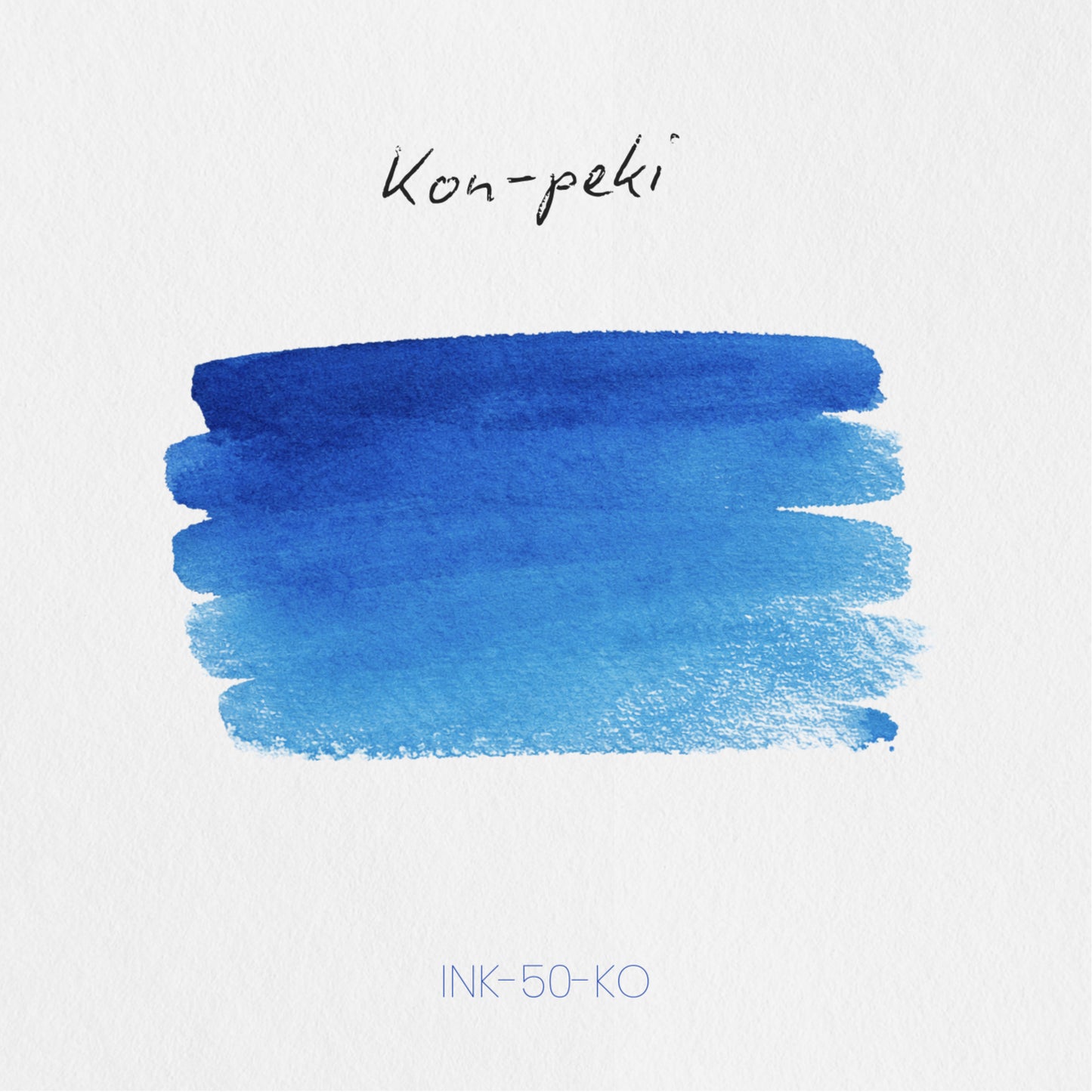
Pilot Iroshizuku Kon-peki (紺碧 — literally deep cerulean or azure, the word used in Japanese poetry and classical literature for the intense, saturated blue of a clear midsummer sky) is a 50ml fountain pen ink from Pilot's Iroshizuku collection — Japan's most iconic premium ink series, formulated in-house by Pilot and bottled in the distinctive flat-sided glass flask that has become one of the most recognisable objects in fountain pen culture. Kon-peki translates its name directly and completely into colour: a vivid, highly saturated cerulean blue with a slight teal or turquoise inflection, brilliant and alive on the page in the way of a clear summer sky at midday — not a corporate blue, not a grey-blue, not a muted navy, but a pure, vibrant, high-energy blue that reads with immediate chromatic force and a lively depth that rewards extended use. Its most celebrated secondary characteristic is a red or pink-red sheen that surfaces on premium papers under the right conditions — a warm, candy-red flash at stroke edges and pooling points that surprises and delights writers encountering it for the first time, and that rewards premium paper use consistently. Kon-peki is a dye-based ink with no shimmer particles; everything it does, it does through colour, shading, and sheen alone.
The Iroshizuku series was conceived as a celebration of Japanese nature and landscape — each ink named for a plant, flower, or natural phenomenon, each colour formulated to translate that reference into something precise and vivid on the page. Kon-peki is among the series' most iconic and best-loved entries: widely praised as one of the most beautiful pure blues in fountain pen inks, and consistently cited alongside Pelikan Edelstein Topaz as a benchmark cerulean blue — with reviewers noting that Kon-peki is more saturated and more deeply alive than comparable inks in the colour space. The bottle is 50ml glass.
Available at Shosai (shosai.ca) in Gatineau / Ottawa — with in-store pickup (J9J 0K6) and Canada-wide shipping.
What Makes Iroshizuku Kon-peki Different
The cerulean blue colour space is one of the most appealing in fountain pen inks — and one of the most demanding to execute well. Blues that read too bright become aggressive; blues that read too muted lose the specific energy that makes cerulean compelling; blues that lean too teal lose their pure blue character. Kon-peki navigates the space with the precision that defines the best Iroshizuku formulations: fully saturated and brilliantly alive without being harsh, clearly and purely blue without being flat, with a slight teal inflection that adds depth and complexity without pulling the colour away from its cerulean identity. The result is a blue that reads as simultaneously vibrant and refined — the blue of a midsummer sky at its most intense, translated precisely into ink.
What makes Kon-peki extraordinary beyond its colour is the red sheen. Most pure blues do not sheen — or sheen weakly. Kon-peki sheens with a warm, candy-red or pink-red flash that appears at stroke edges, pooling points, and across swab surfaces on premium papers with sufficient ink volume. Reviewers consistently describe the sheen as surprising, beautiful, and immediately memorable — a warm red counterpoint to the vivid cool blue base that transforms Kon-peki from a very fine blue into something genuinely spectacular on the right paper. Many writers describe discovering the sheen as a revelation: an effect that nobody told them about, that appears when they first write on quality paper, and that immediately justifies the ink's reputation as one of the Iroshizuku catalogue's most celebrated colours.
Colour Profile
Colour
Pilot Iroshizuku Kon-peki (紺碧) is a vivid, highly saturated cerulean or deep azure blue — a pure, brilliant blue with a slight teal or turquoise inflection that gives it depth and complexity without pulling it toward green or grey. In the bottle, it presents as a rich, vibrant, jewel-toned blue with visible depth and energy. On the page, it dries to a confident, fully saturated cerulean blue: vivid and brilliant at all nib sizes, with the slight teal inflection most apparent at broader coverage where the ink pools. The colour is high-contrast and immediately striking — not a subtle or restrained blue, but a pure, alive cerulean that reads with the specific intensity of midsummer sky. Reviewers describe the base as vivid cerulean blue, deep azure, brilliant blue, and one of the most beautiful pure blues in fountain pen inks — more saturated and more alive than comparable blues including Pelikan Edelstein Topaz, and a colour that is immediately distinctive and immediately rewarding to write with.
Shading
Low to medium, refined, and elegantly expressed. Kon-peki's shading is not its primary visual characteristic — the colour and sheen carry that distinction — but it is present and adds genuine dimension to writing, particularly at broader nib sizes and on papers that allow ink to dwell. In fine nibs, the ink reads as close to uniform — clean, consistent, fully saturated cerulean. In medium to broad nibs and with wet writing on quality papers, a soft, graceful gradient appears: from a slightly lighter, more luminous blue in hairlines to a deeper, more saturated cerulean at pooling points. The shading is deliberately restrained — elegant rather than dramatic, adding depth and liveliness without calling attention to itself or interrupting the ink's primary visual statement. Reviewers describe the shading as subtle and refined for a vivid, saturated blue — just enough to add dimension, not enough to distract.
Sheen
Red / pink-red sheen, clearly present on premium papers, and one of Kon-peki's most celebrated characteristics. The sheen is Kon-peki's signature secondary effect — a warm, candy-red or pink-red metallic flash that appears at stroke edges, pooling points, and across swab surfaces when the ink dries in sufficient quantity on smooth, slow-absorbing paper. On Tomoe River and comparable premium Japanese papers with wet, broad writing, the sheen is clearly and beautifully present — a warm red edge and surface flash that contrasts vividly with the cool cerulean base, and that reviewers describe as one of the most beautiful sheen effects in the Iroshizuku catalogue. In normal everyday writing on standard papers, the sheen is subtle or absent; on premium papers with broader nibs or large swab coverage, it is one of the most rewarding sheen effects in any blue ink. Many writers encounter the sheen for the first time on quality paper and describe the experience as a revelation — a warm, red surprise from an ink that presents as purely and brilliantly blue. No shimmer; the red effect is entirely sheen.
Ink Properties at a Glance
Flow
Very wet, smooth, and well-lubricated — characteristic of the Iroshizuku line as a whole. Kon-peki flows freely and generously across a wide range of nib types and pen bodies, contributing to both comfortable everyday writing and to the ink's sheen expression by ensuring sufficient ink volume at pooling points and stroke edges. The generous flow is consistent with Kon-peki's reputation as an easy, universally well-behaved ink.
Dry Time
Moderate, consistent with other Iroshizuku inks. Kon-peki dries at a practical rate on quality papers — fast enough for most writing contexts, slow enough to develop full colour saturation and sheen expression at pooling points.
Water Resistance
Low. Kon-peki is a water-based dye ink with no meaningful water resistance. It will run or fade when exposed to moisture and is not suitable for documents requiring archival longevity or water-resistant permanence.
Feathering and Bleed-Through
Minimal on quality papers (Rhodia, Tomoe River, Clairefontaine, Leuchtturm1917, Midori MD). Well-behaved and clean on fountain-pen-friendly papers. Some feathering may occur on standard copy paper or highly absorbent surfaces, though Kon-peki performs better than many saturated inks on everyday papers.
How to Get the Most Out of Iroshizuku Kon-peki
Recommended Paper
Kon-peki rewards smooth, slow-absorbing papers that allow the vivid cerulean saturation, elegant shading gradient, and red sheen to develop fully together:
- Tomoe River (52gsm or 68gsm) — the premier recommendation for showcasing Kon-peki's red sheen and full colour expression simultaneously; the slow absorption allows the sheen to develop at maximum intensity at stroke edges and pooling points; the vivid cerulean reads with full chromatic brilliance; the semi-transparent surface showcases the ink's depth and the red sheen contrast most dramatically; premium Japanese papers in general are the preferred surface for Kon-peki's sheen
- Rhodia / Clairefontaine — the most reliable everyday pairing; the vivid cerulean reads cleanly and with full saturation; shading softly visible at medium to broad nib sizes; sheen less prominent but present in good light; the cerulean reads at its most professional and high-contrast on these papers
- Leuchtturm1917 — good overall performance; full vivid cerulean saturation; shading and sheen visible; the brilliant blue reads particularly well against cream-toned pages; a strong notebook pairing
- Black n' Red and slower-absorbing papers — Kon-peki's shading is notably more expressive on slower-absorbing papers that are not the typical premium fountain pen paper; writers who want more visible shading from Kon-peki may find these surfaces rewarding
- Midori MD Paper — smooth, reliable performance; full colour development; shading expression good at medium to broad nib sizes; a practical everyday pairing
Avoid highly absorbent papers. Fast-absorbing surfaces suppress both shading and sheen, reducing Kon-peki to a clean but comparatively flat cerulean.
Recommended Nibs
- Medium to Broad nibs — the primary recommendation for full colour depth, shading expression, and sheen development; more ink on the page activates the elegant shading gradient and gives the red sheen sufficient surface area to develop; the vivid cerulean reads with maximum chromatic brilliance and depth
- Stub or Italic nibs — the variation between thick and thin strokes showcases the shading gradient and red sheen most dramatically; the contrast between brilliant thin cerulean hairlines and warm red-sheening pooling points is Kon-peki's most spectacular writing quality; highly effective for calligraphic and expressive writing
- Fine nibs — the vivid cerulean reads with full brilliance, clarity, and energy at fine sizes; an excellent everyday pairing that showcases the colour at its most pure and saturated; shading minimal but colour performs at full chromatic force
- Extra-fine nibs — fully functional; the cerulean base remains vivid and precise; shading largely absent; sheen not visible at this coverage level; a reliable choice for fine annotation and compact writing
- Eyedropper pens — high ink volume ensures full colour saturation and consistent sheen expression; the generous wet flow of Kon-peki benefits from eyedropper capacity; particularly effective for showcasing the red sheen on premium papers
- Dip pens — excellent for fully showcasing Kon-peki's saturation and red sheen; broad dip nibs allow large coverage areas that reveal the full sheen effect; effective for expressive writing, summer sky-inspired illustration, and ink swatch art
Pen Maintenance
Pilot Iroshizuku Kon-peki (紺碧) is a pH-neutral, dye-based ink safe for all pen materials including resin, celluloid, and ebonite. As a no-shimmer formulation, it carries no particle clogging risk and is low-maintenance across all pen types. Flush every 4–6 weeks under normal use.
Recommended Uses
- Everyday writing and personal correspondence — the vivid cerulean is brilliant, fully legible, and immediately distinctive; a strong personal statement in journals, correspondence, and notebooks; one of the most characterful and most rewarding daily blue inks available
- Note-taking and study — the wet flow, moderate dry time, and high legibility make Kon-peki an excellent note-taking ink; the vivid cerulean reads clearly and energetically under all lighting conditions; a natural choice for writers who want a daily blue with genuine chromatic character
- Calligraphy and expressive lettering — the red sheen and elegant shading are a compelling combination for decorative calligraphy; stub and italic nibs bring out the full tonal and sheen range; the vivid cerulean reads with brilliance and energy in large-format lettering
- Journaling and creative writing — the midsummer sky inspiration and vivid, alive character of Kon-peki make it a natural choice for personal journals and creative writing; a colour with energy, clarity, and seasonal warmth
- Art and illustration — compatible with dip pen and brush application; diluted, Kon-peki produces a beautiful range of water-blue tones suitable for illustration, watercolour work, and mixed media; the vivid base and red sheen add depth and visual interest to blue-themed artwork
- Ink collection and Iroshizuku series building — Kon-peki is one of the Iroshizuku catalogue's most iconic colours and an essential entry for any collection of Japanese inks; pairs naturally with Shin-kai (smoky blue-black), Tsuki-yo (deep teal blue-black), and Rikka (icy cool blue) for a complete Iroshizuku blue palette ranging from vivid cerulean to deep smoky blue-black
- Fountain pen photography and swatching — the vivid cerulean photographs brilliantly under natural light; the red sheen is most apparent in raking light at stroke edges and swab centers on Tomoe River; one of the most photogenic inks in the Iroshizuku catalogue and a perennial favourite in fountain pen community photography
About the Iroshizuku Collection
The Iroshizuku (色彩雫 — literally drops of colour) collection is Pilot's premium fountain pen ink series — a range of sixty inks, each named for a plant, flower, or natural phenomenon drawn from the Japanese landscape, and each formulated by Pilot's in-house ink chemists to translate that natural reference into a precise, vivid, and beautifully behaved fountain pen ink. The series was first launched in 2008 and has remained, in the years since, the benchmark against which Japanese premium inks are measured: consistent, safe for all pens, beautifully bottled in the flat-sided 50ml glass flask with its built-in ink well, and formulated to a quality standard that has established Pilot as one of the world's great fountain pen ink makers.
About Pilot
Pilot Corporation is one of Japan's oldest and most respected writing instrument manufacturers, founded in 1918 and producing fountain pens, inks, and writing instruments for over a century. Pilot's commitment to precision manufacturing and ink formulation is reflected throughout the Iroshizuku line — inks that are among the most consistently well-reviewed, most widely used, and most beloved in the global fountain pen community.
Product Specifications
| Detail | Specification |
|---|---|
| Brand | Pilot |
| Series | Iroshizuku (色彩雫) |
| Ink Name | Kon-peki (紺碧) |
| Inspiration | Deep cerulean, midsummer sky, Japanese classical poetry |
| Origin | Japan |
| Volume | 50ml |
| Bottle | 50ml glass bottle with built-in ink well |
| Ink Type | Water-based dye ink |
| Colour | Vivid cerulean / deep azure blue with slight teal undertone |
| Shading | Low to medium; subtle gradient from lighter to deeper cerulean |
| Shimmer | None |
| Sheen | Red / pink-red sheen; clearly present on premium papers |
| Flow | Very wet, smooth, well-lubricated |
| Dry Time | Moderate |
| Water Resistance | Low |
| pH | Neutral |
| Pen Safety | Safe for all pen materials |
| Nib Compatibility | All nib sizes; medium, broad, stub, and dip pen recommended |
Available at Shosai — Ottawa–Gatineau
Shosai (shosai.ca) is a fine stationery boutique serving the Ottawa–Gatineau National Capital Region. We carry a curated selection of premium fountain pen inks, papers, and writing instruments from the world's most respected stationery brands.
- 📍 In-store pickup: Gatineau, QC — J9J 0K6
- 🛵 Local delivery: Available in the Ottawa–Gatineau area
- 🚚 Canada-wide shipping available
- 🇫🇷 Service bilingue — français et anglais
Whether you are new to fountain pens or a seasoned collector, Shosai is your local destination for inks that go beyond the ordinary.
Share