Shosai
Pilot Iroshizuku Take-sumi (竹炭) — Deep Neutral Black, Red Sheen Fountain Pen Ink (50ml)
Pilot Iroshizuku Take-sumi (竹炭) — Deep Neutral Black, Red Sheen Fountain Pen Ink (50ml)
Couldn't load pickup availability
Pilot Iroshizuku Take-sumi (竹炭) — Deep Neutral Black, Red Sheen Fountain Pen Ink (50ml)
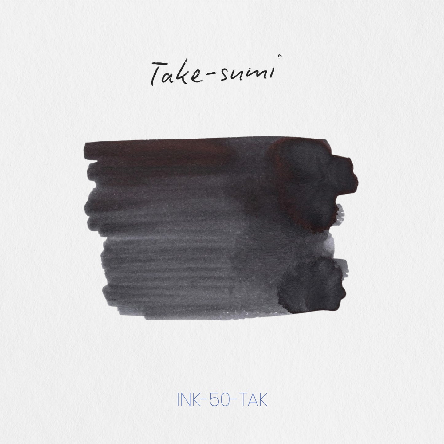
Pilot Iroshizuku Take-sumi (竹炭 — literally bamboo charcoal) is a 50ml fountain pen ink from Pilot's Iroshizuku collection — Japan's most iconic premium ink series, formulated in-house by Pilot and bottled in the distinctive flat-sided glass flask that has become one of the most recognisable objects in fountain pen culture. Take-sumi draws its name and colour from bamboo charcoal — the dense, pure black produced by firing bamboo at high temperatures, long prized in Japanese craft and culture for its purity and depth. The result on the page is a deep, neutral, true black: fully saturated, authoritative, and clean, without the grey cast of diluted blacks or the warm or cool bias of blacks that lean brown or blue. It is accompanied by a red sheen that surfaces under the right conditions — a warm, reddish metallic flash at stroke edges and pooling points on smooth premium papers — that transforms Take-sumi from a very good black into something genuinely spectacular for those who write on quality paper. Take-sumi is a dye-based ink with no shimmer particles and medium water resistance; everything it does, it does through colour, sheen, and the specific purity of its black alone.
The Iroshizuku series was conceived as a celebration of Japanese nature and landscape — each ink named for a plant, flower, or natural phenomenon, each colour formulated to translate that reference into something precise and vivid on the page. Take-sumi is among the series' most quietly celebrated entries: consistently praised as one of the finest black inks available, and widely regarded as a benchmark daily black — pure enough to be immediately convincing, characterful enough to reward attention on premium papers. The bottle is 50ml glass.
Available at Shosai (shosai.ca) in Gatineau / Ottawa — with in-store pickup (J9J 0K6) and Canada-wide shipping.
What Makes Iroshizuku Take-sumi Different
The black ink space is deceptively demanding. Most blacks lean — warm or cool, grey or brown, flat or oversaturated — and the ones that do not lean are often characterless. Take-sumi occupies a rare position: a neutral, true black that is fully saturated without being aggressive, and deeply pure without being flat. In fine nibs on everyday paper, it delivers a clean, consistent, high-contrast black that is among the most professional-reading inks in any colour. In broader nibs on premium papers, it reveals a second character entirely — a warm red sheen that pools and flashes at stroke edges, visible most dramatically on Tomoe River, where reviewers describe the sheen as almost popping off the page, notably more expressive than comparable black inks.
The medium water resistance is a meaningful practical distinction within the Iroshizuku line. Take-sumi is not a waterproof ink, but it holds against light moisture exposure better than most dye-based inks — a useful property for a black ink used in everyday writing contexts. Combined with the generous, well-lubricated flow that defines the Iroshizuku line, Take-sumi is an ink that performs consistently across pen types, nib sizes, and paper qualities, while reserving its most spectacular qualities for those who seek them out.
Colour Profile
Colour
Pilot Iroshizuku Take-sumi (竹炭) is a deep, neutral true black — a fully saturated, high-contrast black with no meaningful warm or cool bias, no grey cast in normal writing conditions, and no brown or blue undertone to distract from its purity. In the bottle, it presents as a rich, deep black with visible depth. On the page, it dries to a confident, authoritative black: deepest and most purely black at broader nib sizes and heavier coverage; occasionally showing a very slight grey quality in extra-fine hairlines, where ink volume is minimal. The colour is clean, consistent, and fully professional at all nib sizes — not the very deepest black available, but a neutral, pure black that carries the specific purity and elegance of its bamboo charcoal namesake. Reviewers describe the base as neutral black, true black, deep pure black, and one of the finest blacks available for everyday writing — a colour that is authoritative without being harsh and pure without being characterless.
Shading
Minimal to none in most writing conditions. Take-sumi is not a shading ink — it is formulated for consistency and purity of black, and in fine to medium nibs on most papers, it delivers a uniform, clean black with little to no visible tonal gradient. In broader nibs on slow-absorbing papers (Tomoe River, Midori MD), a very slight grey-to-black transition may be perceptible at stroke edges and pooling points — a soft, subtle hint of shading rather than a defined gradient. Writers who use Take-sumi for its black purity and professional legibility will find the minimal shading entirely appropriate; those seeking expressive shading should look elsewhere in the Iroshizuku catalogue.
Sheen
Warm red sheen, paper- and nib-dependent, and genuinely spectacular under the right conditions. Take-sumi's sheen is its most surprising and most discussed secondary characteristic — a warm, reddish metallic flash that appears at stroke edges, pooling points, and across swab surfaces when the ink dries in sufficient quantity on smooth, slow-absorbing paper. On Tomoe River paper with medium to broad nibs, reviewers describe the sheen as almost popping off the page — a warm red metallic effect that is notably more expressive than comparable black inks, and more beautiful than the colour description alone suggests. On Rhodia with a medium nib, the sheen is largely absent. On everyday copy paper, it is invisible. The sheen is entirely a function of paper quality and ink volume — those who write on premium papers will find it; those who do not may never see it. No shimmer; the red effect is entirely sheen.
Ink Properties at a Glance
Flow
Very wet, smooth, and well-lubricated — characteristic of the Iroshizuku line as a whole. Take-sumi flows freely and generously across a wide range of nib types and pen bodies, making it a particularly comfortable ink for extended writing sessions. The generous flow ensures consistent colour saturation across nib sizes and contributes to the ink's sheen expression on quality papers.
Dry Time
Moderate to fast — approximately 10 to 42 seconds depending on paper. Take-sumi dries quickly on absorbent papers and at a moderate rate on slow-absorbing premium papers, where the extended wet time contributes to full colour and sheen development.
Water Resistance
Medium — a meaningful distinction within the Iroshizuku dye-based line. Take-sumi holds against light moisture exposure better than most dye-based inks; it will not immediately run or fully dissolve with minor water contact, though it is not waterproof and is not suitable for documents requiring archival permanence. The medium water resistance makes it a practical choice for everyday writing contexts where occasional moisture exposure is possible.
Feathering and Bleed-Through
Minimal on quality papers (Rhodia, Tomoe River, Clairefontaine, Midori MD, Leuchtturm1917). Well-behaved on fountain-pen-friendly papers across a wide range of nib sizes. Performs cleanly even on some standard papers that challenge other inks; some feathering may occur on highly absorbent surfaces.
How to Get the Most Out of Iroshizuku Take-sumi
Recommended Paper
Take-sumi performs reliably across a wide range of papers, but reveals its full character — and its spectacular red sheen — on smooth, slow-absorbing surfaces:
- Tomoe River (52gsm or 68gsm) — the premier recommendation for showcasing Take-sumi's red sheen; the slow absorption and smooth surface allow the sheen to develop at maximum intensity at stroke edges and pooling points; reviewers describe the sheen as almost popping off the page on Tomoe River; the deep neutral black reads with full chromatic depth and the contrast between pure black and warm red sheen is most dramatic here
- Midori MD Paper — smooth, reliable performance with good sheen expression; the deep black reads cleanly and with full saturation; a practical everyday pairing that brings out Take-sumi's full character without requiring specialist paper
- Rhodia / Clairefontaine — consistent, reliable, professional; full black saturation clearly and cleanly expressed; sheen largely absent but the pure neutral black performs at its most authoritative; the best everyday pairing for professional writing contexts where sheen is not a priority
- Cosmo Air Light (Yamamoto Paper) — an excellent surface for sheen expression; the ultra-smooth, slow-absorbing paper allows the red sheen to develop clearly alongside the deep black base
- Leuchtturm1917 — good overall performance; full black saturation; clean and consistent; a practical notebook pairing
Take-sumi performs acceptably on standard papers as well — its medium water resistance and clean flow make it more forgiving on everyday surfaces than many Iroshizuku inks.
Recommended Nibs
- Medium to Broad nibs — the primary recommendation for full colour depth and sheen expression; more ink on the page gives the red sheen sufficient surface area to develop and brings out the ink's full black saturation; the most rewarding pairing for premium paper use
- Stub or Italic nibs — the variation between thick and thin strokes showcases the contrast between pure black hairlines and warm red-sheening pooling points most dramatically; highly effective for calligraphic and expressive writing where Take-sumi's dual character is most apparent
- Fine nibs — the deep neutral black reads with full clarity, legibility, and professional weight at fine sizes; an excellent everyday pairing; sheen absent but colour performs at its most pure and authoritative
- Extra-fine nibs — fully functional; the black base remains precise and high-contrast with a very slight grey quality in hairlines at minimal ink volume; a reliable choice for fine annotation, technical writing, and compact note-taking
- Eyedropper pens — high ink volume ensures full black saturation and consistent sheen expression; the generous wet flow of Take-sumi benefits from eyedropper capacity; particularly effective for showcasing the ink's full visual range on premium papers
- Dip pens — excellent for fully showcasing Take-sumi's saturation and red sheen; broad dip nibs allow large coverage areas that reveal the full sheen effect; effective for expressive writing, sumi-inspired calligraphy, and ink swatch art
Pen Maintenance
Pilot Iroshizuku Take-sumi (竹炭) is a pH-neutral, dye-based ink safe for all pen materials including resin, celluloid, and ebonite. As a no-shimmer formulation, it carries no particle clogging risk and is low-maintenance across all pen types. Flush every 4–6 weeks under normal use.
Recommended Uses
- Everyday writing and professional correspondence — the deep neutral black is high-contrast, fully legible, and authoritative; professional enough for all formal writing contexts, characterful enough to reward attention; one of the finest daily black inks available
- Note-taking and study — the wet flow, practical dry time, and high legibility make Take-sumi an excellent note-taking ink; the deep neutral black reads clearly under all lighting conditions and at all nib sizes; a reliable companion for extended writing sessions
- Calligraphy and sumi-inspired writing — the bamboo charcoal inspiration makes Take-sumi a natural choice for calligraphic work inspired by Japanese sumi ink traditions; stub and italic nibs bring out the ink's full tonal and sheen range; the pure black reads with authority in large-format lettering
- Journaling and creative writing — the pure black and quiet red sheen give Take-sumi a layered character that rewards attention; a colour with quiet depth and elegance for personal writing contexts
- Art and illustration — compatible with dip pen and brush application; medium water resistance makes Take-sumi suitable for light watercolour wash over dried ink lines; the deep black base and warm red sheen add depth and atmosphere to illustration and mixed media
- Ink collection and Iroshizuku series building — Take-sumi is the definitive black in the Iroshizuku catalogue and an essential entry for any collection of Japanese inks; pairs naturally with Tsuki-yo (deep blue-black) and Yama-budo (fuchsia-purple) for a complete Iroshizuku writing palette
- Fountain pen photography and swatching — the deep neutral black photographs cleanly under natural light; the red sheen is most apparent in raking light at stroke edges and swab centers on Tomoe River; a highly photogenic ink with a dramatic dual character
About the Iroshizuku Collection
The Iroshizuku (色彩雫 — literally drops of colour) collection is Pilot's premium fountain pen ink series — a range of sixty inks, each named for a plant, flower, or natural phenomenon drawn from the Japanese landscape, and each formulated by Pilot's in-house ink chemists to translate that natural reference into a precise, vivid, and beautifully behaved fountain pen ink. The series was first launched in 2008 and has remained, in the years since, the benchmark against which Japanese premium inks are measured: consistent, safe for all pens, beautifully bottled in the flat-sided 50ml glass flask with its built-in ink well, and formulated to a quality standard that has established Pilot as one of the world's great fountain pen ink makers.
About Pilot
Pilot Corporation is one of Japan's oldest and most respected writing instrument manufacturers, founded in 1918 and producing fountain pens, inks, and writing instruments for over a century. Pilot's commitment to precision manufacturing and ink formulation is reflected throughout the Iroshizuku line — inks that are among the most consistently well-reviewed, most widely used, and most beloved in the global fountain pen community.
Product Specifications
| Detail | Specification |
|---|---|
| Brand | Pilot |
| Series | Iroshizuku (色彩雫) |
| Ink Name | Take-sumi (竹炭) |
| Inspiration | Bamboo charcoal, Japanese craft tradition |
| Origin | Japan |
| Volume | 50ml |
| Bottle | 50ml glass bottle with built-in ink well |
| Ink Type | Water-based dye ink |
| Colour | Deep neutral true black |
| Shading | Minimal to none |
| Shimmer | None |
| Sheen | Red sheen; present on quality papers with broader nibs |
| Flow | Very wet, smooth, well-lubricated |
| Dry Time | Moderate to fast; approximately 10–42 seconds |
| Water Resistance | Medium |
| pH | Neutral |
| Pen Safety | Safe for all pen materials |
| Nib Compatibility | All nib sizes; medium, broad, stub, and dip pen recommended |
Available at Shosai — Ottawa–Gatineau
Shosai (shosai.ca) is a fine stationery boutique serving the Ottawa–Gatineau National Capital Region. We carry a curated selection of premium fountain pen inks, papers, and writing instruments from the world's most respected stationery brands.
- 📍 In-store pickup: Gatineau, QC — J9J 0K6
- 🛵 Local delivery: Available in the Ottawa–Gatineau area
- 🚚 Canada-wide shipping available
- 🇫🇷 Service bilingue — français et anglais
Whether you are new to fountain pens or a seasoned collector, Shosai is your local destination for inks that go beyond the ordinary.
Share