Shosai
Pilot Iroshizuku Yama-budo (山葡萄) — Vivid Fuchsia Purple, Gold Sheen Fountain Pen Ink (50ml)
Pilot Iroshizuku Yama-budo (山葡萄) — Vivid Fuchsia Purple, Gold Sheen Fountain Pen Ink (50ml)
Couldn't load pickup availability
Pilot Iroshizuku Yama-budo (山葡萄) — Vivid Fuchsia Purple, Gold Sheen Fountain Pen Ink (50ml)
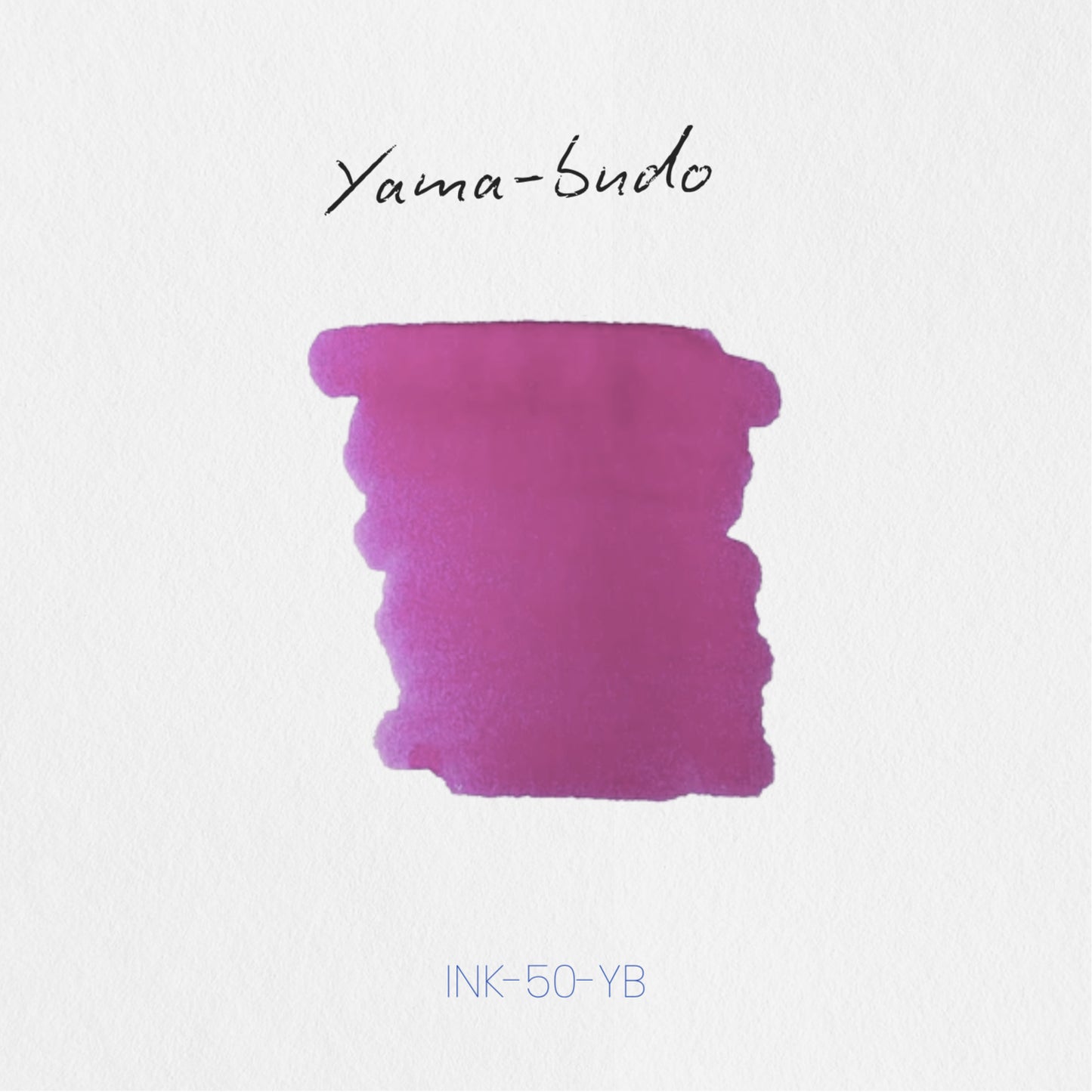
Pilot Iroshizuku Yama-budo (山葡萄 — literally wild mountain grape) is a 50ml fountain pen ink from Pilot's Iroshizuku collection — Japan's most iconic premium ink series, formulated in-house by Pilot and bottled in the distinctive flat-sided glass flask that has become one of the most recognisable objects in fountain pen culture. Yama-budo draws its name and colour from the wild mountain grape native to the forests of Japan: a vivid, saturated fuchsia-purple, rich and mature in the way of ripe wild fruit, bright enough to be immediately striking and deep enough to carry genuine weight on the page. It is accompanied by a quietly spectacular gold sheen — among the most praised characteristics of any Iroshizuku ink — that surfaces at pooling points, stroke edges, and swab centers as a warm golden or green-gold flash, visible in good light and genuinely beautiful in writing. Yama-budo is a dye-based ink with no shimmer particles; everything it does, it does through colour, shading, and sheen alone.
The Iroshizuku series was conceived as a celebration of Japanese nature and landscape — each ink named for a plant, flower, or natural phenomenon, each colour formulated to translate that reference into something precise and vivid on the page. Yama-budo is among the series' most celebrated entries: consistently praised for the purity and intensity of its fuchsia-purple base, the clarity and warmth of its gold sheen, and the quality of its medium shading — a combination that places it in a category of inks that are simultaneously practical and genuinely beautiful. The bottle is 50ml glass.
Available at Shosai (shosai.ca) in Gatineau / Ottawa — with in-store pickup (J9J 0K6) and Canada-wide shipping.
What Makes Iroshizuku Yama-budo Different
The fuchsia-purple colour space is demanding. Inks that read too pink lose purple depth; inks that read too violet lose the warmth and luminosity that make fuchsia-purple compelling; inks that are oversaturated become aggressive rather than rich. Yama-budo navigates the space with the precision that distinguishes the best Iroshizuku formulations: the base is vivid and fully saturated, with a pronounced pink warmth that keeps it lively and distinctly fuchsia rather than cold violet, and a purple depth that carries genuine maturity and weight. Reviewers describe it consistently as a colour that photographs beautifully, performs beautifully, and reads as both professional and personal — bright enough to express character on the page, composed enough to use in serious writing contexts.
What elevates Yama-budo beyond a very good purple is the gold sheen. Iroshizuku inks are not uniformly sheening inks, and Yama-budo's sheen is not the aggressive, edge-flooding sheen of inks formulated specifically as sheeners — it is a warm, subtly spectacular gold-green flash that appears at the edges of thick strokes, at pooling points, and across the surface of swabs, visible most clearly in raking light or natural sunlight. Japanese ink enthusiasts have described it as a golden flash, a green-gold spark, and a sheen effect that is more beautiful in person than in photography — present, warm, and genuinely rewarding. On high-quality papers (Graphilo, Tomoe River, Rhodia), it is among the most beautiful sheen effects in the Iroshizuku line.
Colour Profile
Colour
Pilot Iroshizuku Yama-budo is a vivid fuchsia-purple — a highly saturated red-purple with a pronounced warm pink undertone that gives it luminosity and chromatic vitality. In the bottle, it presents as a deep, saturated jewel-toned purple-red. On the page, it dries to a vivid, confident fuchsia-purple: brighter, more pink-dominant in heavy strokes and swabs; deeper and more distinctly purple in fine hairlines and light coverage. The colour is pure and strong — not hot pink, not cold violet, but a mature, vivid fuchsia that carries the specific richness of ripe wild mountain grape. Reviewers describe the base as bright fuchsia purple, vivid red-purple, pinkish-purple, and a colour that is just purple enough for serious use — a highly saturated ink that holds both warmth and depth simultaneously.
Shading
Medium, clean, and expressive. Yama-budo shades with a clear, beautiful tonal gradient that transitions from a brighter, more pink-dominant fuchsia in hairline strokes and light coverage to a deeper, richer, more purely purple tone at pooling points and in heavy strokes. The shading is not dramatic in the style of inks formulated primarily as shading showcase pieces, but it is clearly and consistently present — a soft, well-defined gradient that adds dimension and vitality to writing at all nib sizes. At broader nib sizes and on slow-absorbing papers (Tomoe River, Rhodia, LIFE Noble), the full tonal range from bright fuchsia to deep purple is most apparent and most rewarding. Japanese evaluators praise the shading specifically, noting that the gradient is particularly beautiful in calligraphic and broad-nib writing. Medium in range, but refined and consistent in expression.
Sheen
Warm gold / green-gold sheen, clearly present and highly praised. Yama-budo's sheen is its signature secondary characteristic — a warm golden or gold-green flash that surfaces at stroke edges, pooling points, and swab centers when the ink dries in sufficient quantity on smooth, slow-absorbing paper. The sheen appears most strongly on Graphilo, Tomoe River, and similarly premium surfaces; it is most visible in raking natural light or direct sunlight; and it is described by Japanese ink enthusiasts and international reviewers alike as a quietly spectacular effect — subdued enough to be elegant rather than loud, present enough to be genuinely beautiful in use. It is not the dominant visual characteristic of the ink (the fuchsia-purple base and shading carry that weight), but it is the characteristic that most consistently surprises and delights writers who encounter Yama-budo for the first time. No shimmer; the gold effect is entirely sheen.
Ink Properties at a Glance
Flow
Smooth, consistent, and well-lubricated — characteristic of the Iroshizuku line as a whole. Yama-budo flows freely across a wide range of nib types and pen bodies, contributing to both comfortable everyday writing and to the ink's expressive shading behaviour. The generous, well-controlled flow is one of the reasons Iroshizuku inks have maintained their reputation across decades of fountain pen culture.
Dry Time
Moderate, consistent with other Iroshizuku inks. Yama-budo dries at a practical rate on quality papers — fast enough for most writing contexts, slow enough to develop full colour saturation and sheen at pooling points.
Water Resistance
Low. Yama-budo is a water-based dye ink with no meaningful water resistance. It will run or fade when exposed to moisture and is not suitable for documents requiring archival longevity or water-resistant permanence.
Feathering and Bleed-Through
Minimal on quality papers (Rhodia, Tomoe River, Clairefontaine, LIFE Noble, Midori MD, Leuchtturm1917). Well-behaved and clean on fountain-pen-friendly papers. Some feathering may occur on standard copy paper or highly absorbent surfaces.
How to Get the Most Out of Iroshizuku Yama-budo
Recommended Paper
Yama-budo rewards smooth, slow-absorbing papers that allow the vivid fuchsia-purple saturation, medium shading gradient, and gold sheen to develop fully together:
- Graphilo (Yamamoto Paper) — the premier recommendation for showcasing Yama-budo's gold-green sheen; the ultra-smooth, slow-absorbing surface allows the sheen to develop at maximum intensity; the vivid fuchsia base reads with full chromatic depth and the shading gradient is cleanly expressed; Japanese enthusiasts single out Graphilo specifically for Yama-budo's sheen performance
- Tomoe River (52gsm or 68gsm) — an excellent paper for full shading and sheen expression; the slow absorption allows the tonal gradient and gold sheen to develop simultaneously; the vivid fuchsia reads with full luminosity; the semi-transparent surface showcases the ink's depth beautifully
- Rhodia / Clairefontaine — consistent, reliable, practical; full fuchsia saturation clearly expressed; shading visible at broader nib sizes; sheen present in good light; a strong everyday option
- LIFE Noble Note / LIFE Writing Paper — the smooth, fountain-pen-optimised surface of LIFE papers pairs well with Yama-budo's flow and colour; the warm tone of LIFE paper interacts pleasingly with the fuchsia-purple base
- Midori MD Paper — smooth, reliable performance; full colour development; shading expression good at medium-broad nib sizes
Avoid highly absorbent papers. Fast-absorbing surfaces will suppress both shading and sheen, reducing Yama-budo to a flat, if still vivid, fuchsia.
Recommended Nibs
- Medium to Broad nibs — the primary recommendation for full colour and shading expression; more ink on the page activates the tonal gradient from bright fuchsia to deep purple and gives the gold sheen sufficient surface area to develop; the vivid base reads at maximum chromatic depth
- Stub or Italic nibs — the variation between thick and thin strokes showcases the shading gradient and sheen most dramatically; the contrast between bright fuchsia hairlines and deeply sheening pooling points is Yama-budo's most spectacular quality; highly effective for calligraphic and expressive writing
- Fine nibs — the vivid fuchsia-purple reads with full clarity and legibility at fine sizes; a practical, characterful everyday pairing; shading and sheen less prominent but colour performs cleanly and vividly
- Extra-fine nibs — fully functional; the fuchsia base remains vivid and precise; shading largely absent; sheen not visible at this coverage level; a reliable fine-line option for annotation and compact writing
- Eyedropper pens — high ink volume ensures full colour saturation and consistent shading and sheen expression; the generous Iroshizuku flow benefits from eyedropper capacity
- Dip pens — excellent for fully showcasing Yama-budo's saturation, shading, and sheen; broad dip nibs and brush pens allow large swabs of colour that reveal the full gold-green sheen effect; particularly effective for decorative writing, botanical illustration, and ink swatch art
Pen Maintenance
Pilot Iroshizuku Yama-budo is a pH-neutral, dye-based ink safe for all pen materials including resin, celluloid, and ebonite. As a no-shimmer formulation, it carries no particle clogging risk and is low-maintenance across all pen types. Flush every 4–6 weeks under normal use.
Recommended Uses
- Everyday writing and correspondence — the vivid fuchsia-purple is immediately striking and immediately readable; distinctive without being difficult; a strong personal statement in journals, correspondence, and notebooks
- Calligraphy and expressive lettering — the gold sheen and medium shading are a natural combination for decorative calligraphy; stub and italic nibs bring out the full tonal and sheen range; the fuchsia-purple reads beautifully in large-format lettering
- Journaling and creative writing — the emotional warmth and vivid character of Yama-budo make it a natural choice for personal journals and creative writing; a colour that feels both expressive and composed
- Art and illustration — compatible with dip pen and brush application; the rich fuchsia base, expressive shading, and gold-green sheen add depth and vitality to botanical illustration, watercolour work, and mixed media
- Ink collection and Iroshizuku series building — Yama-budo is a cornerstone Iroshizuku colour and a natural anchor for any collection of Japanese inks; pairs beautifully with other Iroshizuku inks in the purple, pink, and red families (Ama-iro, Tsutsuji, Murasaki-shikibu) for a complete Japanese colour palette
- Fountain pen photography and swatching — the vivid fuchsia photographs richly and accurately under natural light; the gold-green sheen is most apparent in raking light at stroke edges and swab centers; a highly photogenic ink for fountain pen community sharing
About the Iroshizuku Collection
The Iroshizuku (色彩雫 — literally drops of colour) collection is Pilot's premium fountain pen ink series — a range of sixty inks, each named for a plant, flower, or natural phenomenon drawn from the Japanese landscape, and each formulated by Pilot's in-house ink chemists to translate that natural reference into a precise, vivid, and beautifully behaved fountain pen ink. The series was first launched in 2008 and has remained, in the years since, the benchmark against which Japanese premium inks are measured: consistent, safe for all pens, beautifully bottled in the flat-sided 50ml glass flask with its built-in ink well, and formulated to a quality standard that has established Pilot as one of the world's great fountain pen ink makers.
About Pilot
Pilot Corporation is one of Japan's oldest and most respected writing instrument manufacturers, founded in 1918 and producing fountain pens, inks, and writing instruments for over a century. Pilot's commitment to precision manufacturing and ink formulation is reflected throughout the Iroshizuku line — inks that are among the most consistently well-reviewed, most widely used, and most beloved in the global fountain pen community.
Product Specifications
| Detail | Specification |
|---|---|
| Brand | Pilot |
| Series | Iroshizuku (色彩雫) |
| Ink Name | Yama-budo (山葡萄) |
| Inspiration | Wild mountain grape, Japanese forest flora |
| Origin | Japan |
| Volume | 50ml |
| Bottle | 50ml glass bottle with built-in ink well |
| Ink Type | Water-based dye ink |
| Colour | Vivid fuchsia-purple / magenta-purple with warm pink undertone |
| Shading | Medium; bright fuchsia to deep purple gradient |
| Shimmer | None |
| Sheen | Gold / green-gold sheen; clearly present on quality papers |
| Flow | Smooth, generous, well-lubricated |
| Dry Time | Moderate |
| Water Resistance | Low |
| pH | Neutral |
| Pen Safety | Safe for all pen materials |
| Nib Compatibility | All nib sizes; medium, broad, stub, and dip pen recommended |
Available at Shosai — Ottawa–Gatineau
Shosai (shosai.ca) is a fine stationery boutique serving the Ottawa–Gatineau National Capital Region. We carry a curated selection of premium fountain pen inks, papers, and writing instruments from the world's most respected stationery brands.
- 📍 In-store pickup: Gatineau, QC — J9J 0K6
- 🛵 Local delivery: Available in the Ottawa–Gatineau area
- 🚚 Canada-wide shipping available
- 🇫🇷 Service bilingue — français et anglais
Whether you are new to fountain pens or a seasoned collector, Shosai is your local destination for inks that go beyond the ordinary.
Share