Shosai
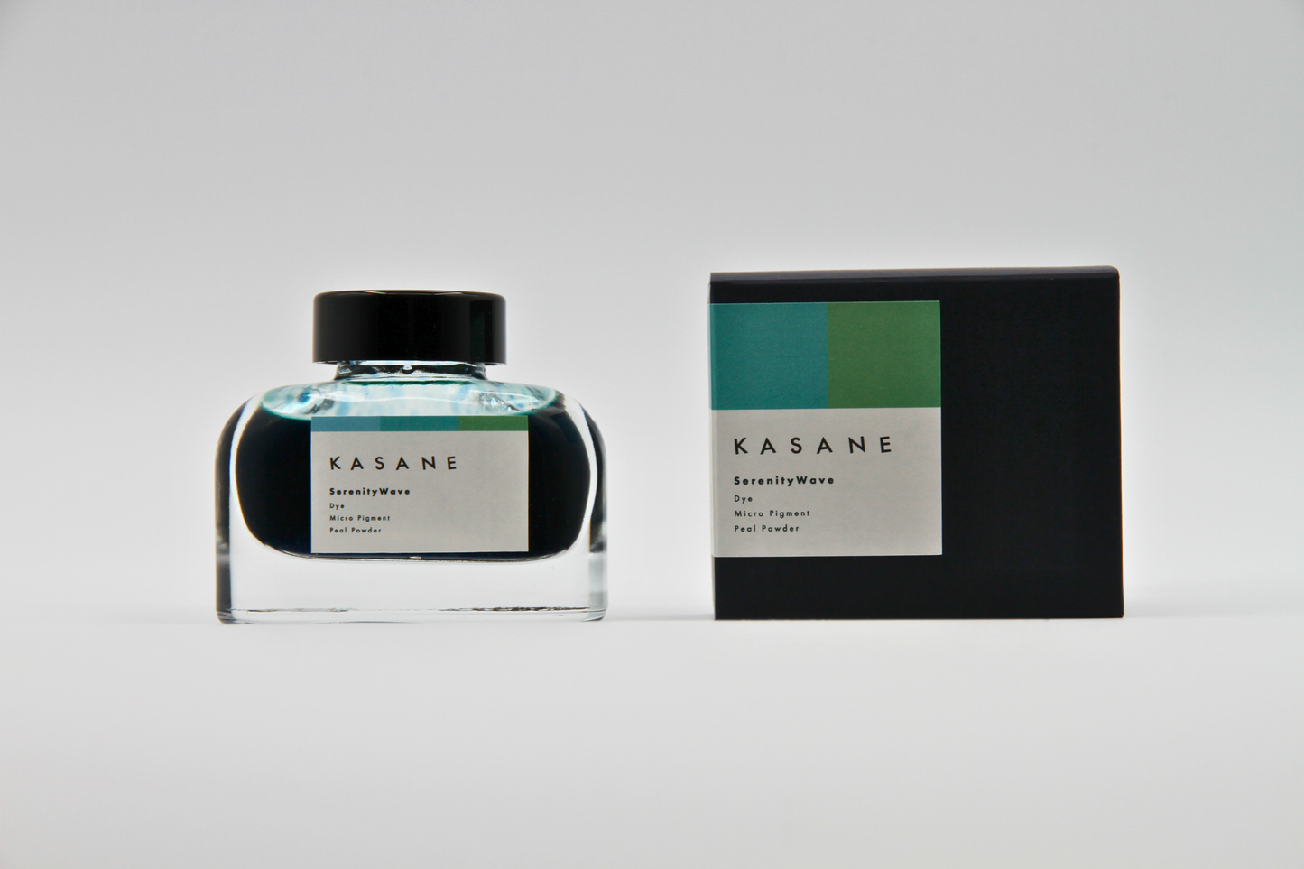
TAG Stationery Kasane Series Serenity Wave — Aqua-Seafoam Blue with Blue Shimmer and Expressive Shading Dip Pen & Brush Ink (25ml)
TAG Stationery Kasane Series Serenity Wave — Aqua-Seafoam Blue with Blue Shimmer and Expressive Shading Dip Pen & Brush Ink (25ml)
Couldn't load pickup availability
TAG Stationery Kasane Series Serenity Wave — Aqua-Seafoam Blue with Blue Shimmer and Expressive Shading Dip Pen & Brush Ink (25ml)
TAG Stationery Kasane Series Serenity Wave is a dip pen and brush ink released in late October 2024 as part of TAG Stationery's Kasane (重ね) collection — a series built around the layered colour traditions of Japanese kimono, where the art of kasane-no-irome (重ねの色目) defines beauty through the relationship between colours placed one upon another. Serenity Wave takes that tradition as its creative point of departure: an ink that embodies the quiet energy of water in motion, the calm of breaking seafoam, the depth beneath a still surface. The Kasane series is designed for writers and artists who want an ink that does more than mark a page — an ink that moves on the paper, separates, layers, and reveals something different depending on how it is applied, how much water is introduced, and where the light falls.
TAG Stationery (京都TAG文具店) is a Kyoto-based stationery brand with deep roots in the Japanese stationery tradition. Their inks are produced with an artist's attention to colour complexity and a craftsperson's care for formulation — and the Kasane series, in particular, represents their most technically sophisticated work: inks designed to separate and interact on the page, producing results that vary meaningfully with nib type, paper surface, water application, and the artist's own hand.
Serenity Wave is available at Shosai (shosai.ca) in Gatineau — your Ottawa–Gatineau source for Japanese and Korean stationery, with in-store pickup and Canada-wide shipping.
⚠️ For dip pen and brush use only. Not compatible with fountain pens, rollerball pens, or any inhalation-type writing instrument.
What Makes Serenity Wave Different
Most inks are formulated for consistency: a single dye, a predictable colour, repeatable results across tools and papers. Serenity Wave is formulated for expression. Its mixed dye-and-pigment base — blue dye, yellow-green pigment, and fine blue shimmer particles — is designed to behave differently depending on how it is used. Applied with a dry dip pen nib, it writes clean and controlled, the aqua-seafoam base expressing itself directly. With a brush loaded with water, or with a generous dip pen load on slow-absorbing paper, the dye and pigment components begin to separate on the page, producing distinct halos, colour shifts, and layered patches where the yellow-green pigment pulls toward one edge and the blue dye pools in another, creating a spontaneous chromatic landscape that cannot be fully predicted or controlled — only guided.
That separation behaviour is the defining characteristic of the Kasane series and the quality that most clearly links it to the kimono colour-layering tradition that inspired it. Just as a craftsperson who works with kasane-no-irome cannot fully control how the layered silks will interact with each other in specific light conditions, the artist who works with Serenity Wave cannot fully predict where the dye and pigment will separate — only prepare the conditions and allow the result to emerge. The blue shimmer adds a third dimension: a fine pearlescent luminosity that persists once the ink has dried, catching light at changing angles and adding the visual depth of still water beneath a winter sky.
Ink Profile
Colour
Serenity Wave's base is a light aqua blue that carries both water-blue and seafoam green in its register — a colour that sits between sky and ocean, between open water and breaking foam. In the bottle, it presents as a translucent, luminous blue-green with visible depth from the shimmer particles. On the page, it dries to a lighter, quieter version of the wet colour — the drying-down is part of the ink's expressive character, as the shift from wet to dry produces the first layer of colour change. Applied with a dry nib on absorbent paper, the base reads as a clean, cool aqua; applied generously with a brush or broad dip pen nib on slow-absorbing paper, the green undertone from the yellow-green pigment becomes more visible, and the colour acquires a more complex, layered quality.
The overall impression is consistently described as calming and therapeutic — a blue-green that does not demand attention but rewards it, a colour associated with clear water, coastal light, and the edge of movement where wave meets shore.
Shading (Nuançage)
Pronounced and among the Kasane series' most distinctive qualities. Serenity Wave shades through multiple colour registers as the ink moves from wet to dry and as the dye and pigment components interact and separate during drying. The shading is not a single gradient from light to dark within a single hue — it is a genuine separation of colour, with the blue dye and yellow-green pigment pulling in different directions, producing distinct zones of cooler blue and warmer green-blue within a single stroke or brush application. At pooling points, the colour deepens; at the edges of strokes, the pigment component can halo outward in a lighter, warmer fringe; in between, the dye component holds the aqua base.
The shading is most active and most dramatic with generous ink loads on slow-absorbing papers, and in brush applications where water is introduced deliberately. Tomoe River and similar thin, slow-absorbing papers give Serenity Wave its most expressive shading performance.
Shimmer (Paillettes)
Blue shimmer — fine, pearlescent, and clearly visible. Serenity Wave's shimmer particles are a combination of fine blue glitter and pearl powder, producing an effect that is simultaneously sparkling and luminous rather than purely glittery. In direct or raking light, the shimmer catches and scatters, creating a three-dimensional quality that mirrors the way light moves on the surface of moving water. In diffuse light, the shimmer contributes to the ink's depth without overwhelming the base colour — present and beautiful without being loud.
The shimmer performs best with generous ink loads and on slow-absorbing papers where the particles remain visible on the page surface. Shake the bottle gently before each use to redistribute settled particles, and rinse dip pen nibs thoroughly after each session to prevent particles from drying on the nib.
Sheen (Reflet métallique)
No significant sheen effect has been reported for Serenity Wave. The visual complexity of this ink comes from its base colour, its shading and dye-pigment separation behaviour, and its shimmer — not from a sheen overlay. This is consistent with the Kasane series' focus on the interaction between ink components rather than on thin-film surface effects.
Ink Type
Mixed dye and pigment base — blue dye, yellow-green pigment, and fine blue shimmer particles. This formulation combines the flow and colour richness of dye with the persistence and separation behaviour of pigment, producing a water-interaction dynamic that makes Serenity Wave particularly well-suited to artistic and expressive applications. For dip pen and brush use only. The pigment component will settle and may dry in the narrow channels of fountain pen feeds, causing damage. Not compatible with any inhalation-type writing instrument.
Ink Properties at a Glance
| Property | Detail |
|---|---|
| Base Colour | Light aqua blue with seafoam green undertone |
| Ink Type | Mixed: blue dye + yellow-green pigment + blue shimmer |
| Shading | Pronounced; dye-pigment separation produces distinct colour zones |
| Shimmer | Blue — fine pearlescent shimmer, clearly visible |
| Sheen | None |
| Water Resistance | Low to moderate (pigment component adds some durability) |
| Compatible Tools | Dip pens, brushes only — not compatible with fountain pens |
| Best Papers | Tomoe River, Rhodia, Clairefontaine; smooth slow-absorbing papers |
How to Get the Most Out of Serenity Wave
Recommended Paper
Serenity Wave's shading and dye-pigment separation are surface-dependent. Slow-absorbing, smooth papers give the dye and pigment time and space to separate before they are absorbed into the fibre, producing the layered colour effects that define the Kasane series. Fast-absorbing papers lock the ink in place before separation can develop fully, producing a flatter, simpler result.
- Tomoe River (52gsm or 68gsm) — the definitive paper for Serenity Wave; the slow absorption rate gives the dye-pigment separation maximum time to develop; shimmer distributes evenly and is clearly visible; the full aqua-to-seafoam-green colour separation is most dramatic here; the recommended choice for artistic applications and for experiencing the ink at its most expressive
- Rhodia / Clairefontaine — excellent performance; shading and separation clearly visible; shimmer well-distributed; a reliable everyday choice for experiencing Serenity Wave's core character
- Yamamoto Ro-biki Notebook — the wax surface slows absorption further, creating conditions for intense shimmer and strong colour separation; highly recommended for artistic writing and display pieces
- Cosmo Air Light — smooth surface gives good colour development; shading visible and clean; shimmer present; a natural pairing for loose sheet work
- Standard copy paper — functional for basic legibility; shading and separation minimal; shimmer less visible; not recommended for the full visual experience
Recommended Tools
- Brush — the highest-intensity separation and the most expressive results; introducing water to a brushstroke loaded with Serenity Wave produces the most dramatic dye-pigment separation and the most vivid aqua-to-seafoam colour range; the definitive recommendation for artistic use; both Eastern and Western brush styles suit this ink naturally
- Dip pen — broad and italic nibs — shading and shimmer most visible at broader nib widths with generous ink loads; the recommended choice for expressive calligraphy and display lettering
- Dip pen — pointed flex nibs — clean aqua base with visible shading at hairline-to-swell transitions; shimmer catches light on the broader swells; well-suited to copperplate and pointed pen styles
- Glass dip pen — excellent compatibility; shimmer distributes evenly; easy to clean between colours; a natural pairing for ink swatching and exploratory work
⚠️ Not compatible with fountain pens, rollerball pens, or any inhalation-type writing instrument.
Tool Maintenance
Serenity Wave is formulated for dip pen and brush use only and is not compatible with fountain pens or any inhalation-type writing instrument. Rinse dip pen nibs thoroughly after each use to prevent pigment and shimmer particles from drying on the nib. Clean brushes promptly with water after use. Shake the bottle gently before each use to redistribute settled shimmer particles. Store the bottle upright in a cool, dry location away from direct sunlight.
Recommended Uses
- Brush lettering and East Asian calligraphy — the dye-pigment separation and shimmer make Serenity Wave a natural match for both Western and East Asian brush traditions; the water-interaction behaviour echoes the spontaneity of sumi-e and ink wash painting
- Western calligraphy and pointed pen work — the aqua-seafoam base and blue shimmer produce lettering of genuine visual complexity; particularly striking in copperplate and modern calligraphy styles where the shimmer catches light on the broad strokes
- Artistic journaling and mixed-media work — the separation dynamic and shimmer produce pages of genuine visual complexity without requiring deliberate technique; the ink does the visual work naturally as part of the creative process
- Ink swatching and art photography — the shimmer and dye-pigment separation photograph exceptionally well, particularly under natural light on Tomoe River
- Meditative and therapeutic writing — the calm, healing quality of the aqua-seafoam palette and the gentle shimmer make Serenity Wave a natural choice for reflective and contemplative creative practice
- Gift for stationery and calligraphy enthusiasts — the layered complexity of the Kasane concept, the distinctive shimmer, and the connection to Japanese kimono tradition make Serenity Wave a compelling and story-rich gift
About the Kasane Series
The Kasane (重ね) series takes its name and concept from kasane-no-irome (重ねの色目) — the Japanese art of layered kimono colour combinations, in which the relationship between the front and lining fabrics of a kimono produced a distinct colour effect visible at the cuffs, collar, and hem. This tradition, which flourished in the Heian period (794–1185 CE), understood colour not as a fixed property of a single material but as an emergent quality produced by the interaction of two or more layers. The Kasane ink series applies this concept directly: each ink is formulated with a dye-and-pigment base designed to separate and interact on the page, producing layered colour effects that emerge from the relationship between components rather than from any single ingredient. Serenity Wave — with its blue dye, yellow-green pigment, and blue shimmer — is one of the most fully realised expressions of the Kasane concept: an ink that presents differently in different conditions, rewards different tools and papers differently, and produces results that cannot be fully anticipated, only experienced.
About TAG Stationery
TAG Stationery (京都TAG文具店) is a Kyoto-based Japanese stationery brand with a philosophy rooted in the intersection of traditional craft and contemporary writing culture. Their inks are produced with attention to both formulation quality and conceptual depth — each ink in the TAG catalogue carries a story, a reference, and a considered visual identity. The Kasane series represents their most technically ambitious ink work, bringing the vocabulary of traditional Japanese colour aesthetics into direct conversation with the expressive possibilities of dip pen and brush writing. Shop the full TAG Stationery collection at Shosai — Gatineau–Ottawa's home for Japanese and Korean stationery.
Product Specifications
| Detail | Serenity Wave |
|---|---|
| Brand | TAG Stationery (京都TAG文具店) |
| Series | Kasane (重ね) |
| Model | KA-0102 |
| Release | October 2024 |
| Inspiration | Japanese kimono layered colour tradition (kasane-no-irome) |
| Origin | Japan (Kyoto) |
| Volume | 25ml |
| Ink Type | Mixed: water-based blue dye + yellow-green pigment + blue shimmer |
| Base Colour | Light aqua blue / seafoam green |
| Shading | Pronounced; dye-pigment separation |
| Shimmer | Blue — fine pearlescent shimmer |
| Sheen | None |
| Water Resistance | Low to moderate |
| Compatible Tools | Dip pens, brushes only — not compatible with fountain pens |
Available at Shosai — Ottawa–Gatineau
Shosai (shosai.ca) is a fine stationery boutique serving the Ottawa–Gatineau National Capital Region. We carry a curated selection of premium inks, papers, and writing instruments from the world's most respected Japanese and Korean stationery brands.
- 📍 In-store pickup: Gatineau, QC — J9J 0K6
- 🛵 Local delivery: Available in the Ottawa–Gatineau area
- 🚚 Canada-wide shipping available
- 🇫🇷 Service bilingue — français et anglais
Whether you are new to calligraphy and brush arts or a seasoned collector, Shosai is your local destination for inks that go beyond the ordinary.
Share