Shosai
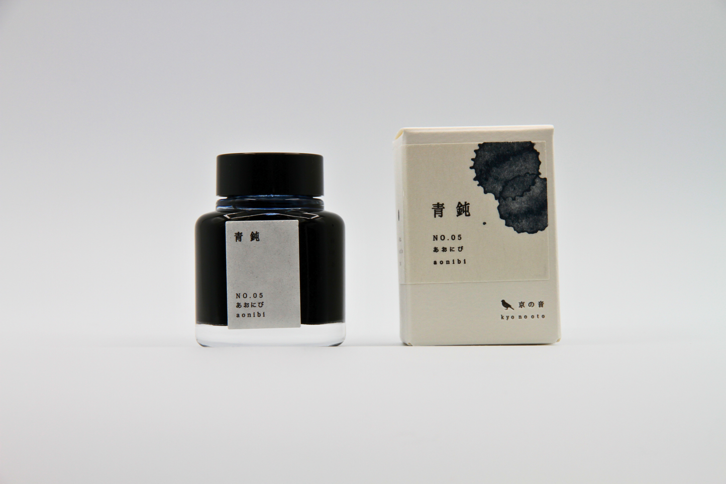
TAG Stationery Kyo No Oto Aonibi (あをにび) — Muted Grey-Blue with Elegant Shading Fountain Pen Ink (40ml)
TAG Stationery Kyo No Oto Aonibi (あをにび) — Muted Grey-Blue with Elegant Shading Fountain Pen Ink (40ml)
Couldn't load pickup availability
TAG Stationery Kyo No Oto Aonibi (あをにび) — Muted Grey-Blue with Elegant Shading Fountain Pen Ink (40ml)
TAG Stationery Kyo No Oto Aonibi is a fountain pen ink produced by TAG Stationery (京都TAG文具店) in collaboration with a traditional Kyoto ink workshop — the fifth ink in the Kyo No Oto (京のおと) series, and one of the most quietly beloved inks in the contemporary Japanese fountain pen ink market. Aonibi (あをにび) takes its name and concept from a traditional Japanese colour term rooted in the aesthetic culture of the Heian period — a colour described as indigo added to pale ink, evoking the particular blue-grey of moonlit sky over Kyoto, the city standing still beneath it in the measured silence of classical Japan. The ink translates that concept with characteristic Kyo No Oto fidelity: a muted, deeply elegant grey-blue that carries the restraint and gravity of its source material without ever becoming cold or severe. In everyday writing, it presents as a sophisticated, low-saturation blue-grey — calm, composed, and immediately beautiful — that has made Aonibi one of the most recommended inks for writers who want a colour that is genuinely distinctive without demanding attention.
TAG Stationery (京都TAG文具店), also known as Takeda Jimuki, is a Kyoto-based stationery brand with deep roots in the Japanese stationery tradition. The Kyo No Oto series represents their most collaborative work — each ink produced in partnership with traditional Kyoto craft workshops, connecting contemporary fountain pen culture to the city's centuries-old dyeing and craft heritage.
Aonibi is available at Shosai (shosai.ca) in Gatineau — your Ottawa–Gatineau source for Japanese and Korean stationery, with in-store pickup and Canada-wide shipping.
What Makes Aonibi Different
The grey-blue register is one of the most crowded in the fountain pen ink world, and one of the most difficult to get right. The challenge is specificity: grey-blues tend toward either too much grey, producing a flat and lifeless tone, or too much blue, losing the quiet restraint that makes the colour interesting. Aonibi occupies exactly the right position in that register — a muted, desaturated blue with sufficient grey presence to read as complex and considered, sufficient blue depth to remain unmistakably and beautifully blue. It has been compared to faded denim, to stone-washed blue, to the particular colour of a clear night sky just before full darkness — colours that are familiar and immediately legible but carry a depth that rewards sustained attention.
What distinguishes Aonibi from other grey-blues is the quality of its shading and the character of its dye formulation. The dry flow and traditional dyeing technique produce a shading gradient that moves elegantly from a lighter, more blue-toned register at the thinnest strokes to a deeper, more grey-blue register at pooling points and broader nib widths — a gradient that adds tonal dimension to the base colour without ever becoming dramatic or distracting. The result is an ink that is calm and consistent in casual use and quietly rewarding in deliberate writing — one of the most satisfying blue-grey inks available, and a colour that improves with every page.
Ink Profile
Colour
Aonibi's base is a muted, desaturated grey-blue — low in saturation, sophisticated in character, and carrying the specific quality of the traditional Japanese colour concept that inspired it. In the bottle, it presents as a deep, settled grey-blue with visible cool undertones. On the page in its wet state, it reads as a rich, moderately saturated blue-grey; as it dries, it settles into a softer, more muted tone that is distinctly elegant — a colour that has been consistently described as faded denim, stone-washed blue, dusty blue-grey, and the colour of moonlight on stone.
The official description — indigo added to pale ink, moonlight over Kyoto — captures the colour's essential quality precisely: it is a blue that has been quieted, a blue that has been given gravity and restraint by the addition of grey, producing a tone that reads as neither warm nor cold, neither vivid nor flat, but as something more considered than either. At fine nib sizes, it reads as a clean, cool blue-grey suitable for everyday correspondence and journaling; at broader nib sizes on quality papers, the shading reveals a deeper, more complex blue-grey dimension that adds considerable tonal interest to the base colour.
Shading
Medium and among the most elegant qualities of Aonibi. The dry flow characteristic produces meaningful variation in ink deposit across a stroke, creating the conditions for expressive but restrained shading: lighter, more purely blue-toned grey at the thinnest stroke areas and beginnings, deeper, more complex blue-grey at pooling points and stroke endings. The shading gradient — from light dusty blue to deeper grey-blue — is clearly visible on quality papers with medium to broad or stub nibs, and most rewarding on Tomoe River and similar slow-absorbing surfaces.
The shading is tonal and chromatic — moving within the grey-blue register rather than between distinct hues — which gives Aonibi a cohesive, restrained quality even at its most expressive. Many writers specifically highlight Aonibi's shading at broad and italic nib sizes as one of its most compelling qualities: the contrast between the lighter blue thin strokes and the deeper grey-blue pooling points creates a visual rhythm that makes extended writing sessions particularly satisfying.
Sheen
Minimal — a faint grey sheen visible only in swab applications and on very slow-absorbing papers such as Tomoe River. In everyday writing at all nib sizes, the sheen is not visible under normal conditions. Writers who specifically seek sheen inks should note that Aonibi's visual interest comes primarily from its colour and shading rather than from a surface sheen effect. The minimal grey sheen, when visible, adds a subtle depth to the ink's appearance without changing its fundamental character.
Shimmer
None. Aonibi is a pure dye ink with no shimmer or metallic particles of any kind. Its visual complexity comes entirely from its colour and shading behaviour. No particle clogging risk; no maintenance beyond standard dye ink care; compatible with all pen types including vintage instruments.
Ink Type
Pure dye-based ink, produced in collaboration with a traditional Kyoto ink workshop using traditional plant-based dyeing techniques. Not pigment-based; contains no iron gall and no shimmer particles. Low water resistance, as is standard for dye-based inks. The water-solubility of the dye formulation makes Aonibi well-suited to water brush blending and wash techniques. The dry flow characteristic supports the ink's shading behaviour and rewards wetter pens and broader nibs; writers using extra-fine nibs on very dry pens may find occasional feedback that is best addressed by pairing with a wetter-flowing instrument.
Ink Properties at a Glance
| Property | Detail |
|---|---|
| Base Colour | Muted grey-blue; desaturated, cool-toned, low saturation |
| Ink Type | Pure dye-based; traditional Kyoto plant-based dyeing techniques |
| Shading | Medium; light dusty blue to deeper grey-blue |
| Shimmer | None |
| Sheen | Minimal; faint grey sheen in swab / Tomoe River only |
| Flow | Dry; best with wetter pens or broader nibs |
| Dry Time | Approximately 15 seconds (medium nib, quality paper) |
| Water Resistance | Low |
| Feathering / Bleed | Low on fountain pen-friendly papers |
| Compatible Tools | Fountain pens; dip pen and water brush use also possible |
| Best Papers | Tomoe River, Rhodia, Clairefontaine; smooth slow-absorbing papers |
| Volume | 40ml glass bottle |
How to Get the Most Out of Aonibi
Recommended Paper
Aonibi's shading is surface-dependent. Slow-absorbing, smooth papers give the dry-flowing dye time to pool and develop its full tonal range. Fast-absorbing papers compress the shading and reduce the depth that makes this ink particularly rewarding.
- Tomoe River (52gsm or 68gsm) — the definitive paper for Aonibi; the slow absorption allows the full shading range to develop; the minimal grey sheen is most visible here; the light dusty blue to deeper grey-blue gradient is most apparent and most rewarding; the recommended choice for journaling and any use where the ink's full character is the priority
- Rhodia / Clairefontaine — excellent everyday performance; shading clearly visible and well-developed; a reliable and practical daily choice that fully showcases the ink's core character
- Cosmo Air Light — smooth surface gives clean colour development and visible shading; a natural pairing for loose sheet writing and correspondence
- Yamamoto Ro-biki Notebook — the wax-finished surface slows absorption and supports strong shading development; a rewarding pairing for journaling and extended writing sessions
- Leuchtturm1917 — good overall performance; shading visible and present; a practical choice for bullet journaling and daily use
- Standard copy paper — functional for basic legibility at fine nib sizes; shading reduced; some feathering possible at broader sizes; not recommended for the full visual experience
Recommended Nibs
Aonibi's dry flow rewards wetter, broader nibs that deposit sufficient ink for the shading to develop fully. Many writers specifically highlight the ink's performance with broad and italic nibs as its most rewarding use case.
- Stub and cursive italic nibs — the widest shading gradient and the most expressive results; the contrast between the lighter blue thin strokes and the deeper grey-blue pooling points is most apparent at stub and italic widths; particularly recommended for extended writing sessions where the rhythmic shading adds sustained visual interest
- Medium and broad nibs — shading clearly visible and well-developed; the dusty blue to grey-blue gradient is most rewarding at these widths; the recommended everyday choice for the full tonal range
- Wetter fine nibs — the muted grey-blue base reads cleanly; shading reduced but present; a practical choice for correspondence and note-taking where line precision is a priority; pair with a known wet writer for best results
- Extra-fine nibs — fully functional for legibility; shading largely absent; the colour reads as a clean, cool grey-blue; recommended where fine line precision takes precedence; very dry extra-fine nibs may experience occasional feedback — best addressed with a wetter pen
- Dip pen and water brush — well-suited for calligraphic and illustrative use; the water-soluble dye formulation makes Aonibi particularly responsive to water brush blending, producing wash effects that extend the grey-blue register toward lighter, more atmospheric tones
Pen Maintenance
Aonibi is a pure dye ink with no shimmer particles or pigment solids — low-maintenance and safe for all pen types including vintage instruments. Flush every 4–6 weeks under normal use, or when changing inks. Compatible with all pen materials including vintage rubber sacs, celluloid, and ebonite. No special maintenance considerations beyond standard dye ink care.
Recommended Uses
- Daily journaling and long-form writing — the muted grey-blue base and elegant shading make Aonibi an exceptionally satisfying everyday journaling ink; legible and characterful at fine sizes, tonally rich and quietly beautiful at broader sizes; a colour that improves with every page and ages gracefully in a filled journal
- Correspondence and professional writing — the restrained, sophisticated tone makes Aonibi well-suited to both personal and professional correspondence; a colour that communicates calm authority and considered taste without the formality of black or the softness of conventional blue
- Note-taking and study — the muted grey-blue is sufficiently distinctive from standard blue and black to serve effectively as a primary writing colour without visual fatigue; easy on the eyes during extended reading and review
- Japanese aesthetic writing — the direct connection to the Heian period colour tradition and the ink's moonlit Kyoto concept make it a natural choice for writers engaged with Japanese aesthetics, classical literature, and writing culture; a colour that embodies the concept of miyabi — the Heian ideal of elegance and refinement
- Water brush and mixed media — the water-soluble dye formulation makes Aonibi responsive to water blending; diluted washes extend the grey-blue register toward soft atmospheric tones ideal for watercolour-style journaling and illustration work
- Fountain pen photography and swatching — the shading gradient from dusty blue to grey-blue photographs beautifully on Tomoe River under natural light; a compelling and distinctive addition to any ink swatch collection
- Gift for fountain pen enthusiasts — the Kyoto craft workshop collaboration, the Heian period colour concept, the elegant shading, and the ink's reputation as one of the most satisfying grey-blues on the market make Aonibi a story-rich and genuinely distinctive gift
About the Kyo No Oto Series
Kyo No Oto (京のおと) — "sounds of Kyoto" — is TAG Stationery's most collaborative series: each ink produced in partnership with a traditional Kyoto craft workshop, connecting the contemporary fountain pen ink format to the city's centuries-old craft heritage. Where the Kyo Iro series captures the visual colours of specific Kyoto places and phenomena, the Kyo No Oto series draws from the deeper traditions of Kyoto craft — the dyeing techniques, colour concepts, and material culture that have defined the city's aesthetic identity for centuries. Aonibi (KO-0105) draws directly from the classical colour vocabulary of Heian Japan, translating a colour concept that has existed for over a millennium into a fountain pen ink formulated for contemporary writing — a colour that carries its history quietly and rewards the writer who knows where to look for it.
About TAG Stationery
TAG Stationery (京都TAG文具店), also known as Takeda Jimuki, is a Kyoto-based Japanese stationery brand with a philosophy rooted in the intersection of traditional craft and contemporary writing culture. Their inks are produced with attention to both formulation quality and conceptual depth — each ink in the TAG catalogue carries a story, a reference, and a considered visual identity. The Kyo No Oto series represents their most craft-rooted work, produced in direct collaboration with traditional Kyoto workshops to create inks that are as connected to the city's heritage as they are to contemporary fountain pen culture. Shop the full TAG Stationery collection at Shosai — Gatineau–Ottawa's home for Japanese and Korean stationery.
Product Specifications
| Detail | Aonibi |
|---|---|
| Brand | TAG Stationery (京都TAG文具店) / Takeda Jimuki |
| Series | Kyo No Oto (京のおと) |
| Model | KO-0105 |
| Full Name | Aonibi / あをにび |
| Inspiration | Heian period colour concept: moonlit sky over Kyoto; indigo added to pale ink |
| Origin | Japan (Kyoto) — produced with traditional Kyoto ink workshop |
| Volume | 40ml |
| Ink Type | Pure dye-based; traditional Kyoto plant-based dyeing techniques |
| Base Colour | Muted grey-blue; desaturated, cool-toned |
| Shading | Medium; light dusty blue to deeper grey-blue |
| Shimmer | None |
| Sheen | Minimal; faint grey sheen in swab / Tomoe River only |
| Flow | Dry |
| Dry Time | ~15 seconds (medium nib) |
| Water Resistance | Low |
| Pen Safety | Safe for all pen materials including vintage instruments |
Available at Shosai — Ottawa–Gatineau
Shosai (shosai.ca) is a fine stationery boutique serving the Ottawa–Gatineau National Capital Region. We carry a curated selection of premium fountain pen inks, papers, and writing instruments from the world's most respected Japanese and Korean stationery brands.
- 📍 In-store pickup: Gatineau, QC — J9J 0K6
- 🛵 Local delivery: Available in the Ottawa–Gatineau area
- 🚚 Canada-wide shipping available
- 🇫🇷 Service bilingue — français et anglais
Whether you are new to fountain pens or a seasoned collector, Shosai is your local destination for inks that go beyond the ordinary.
Share