Shosai
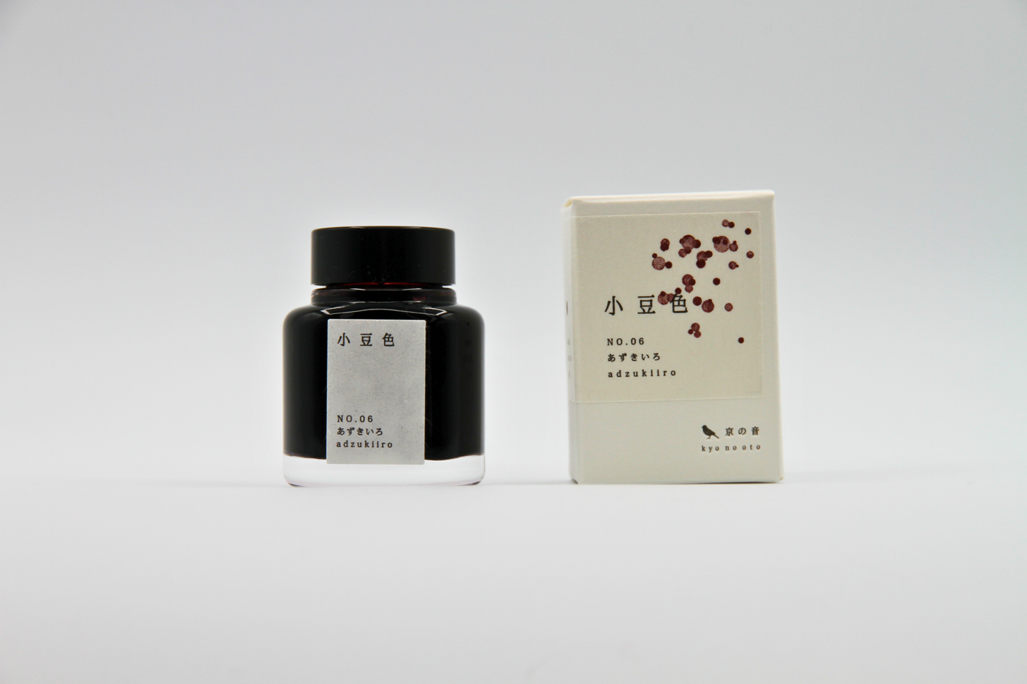
TAG Stationery Kyo No Oto Adzukiiro (小豆色) — Deep Burgundy-Red with Expressive Shading Fountain Pen Ink (40ml)
TAG Stationery Kyo No Oto Adzukiiro (小豆色) — Deep Burgundy-Red with Expressive Shading Fountain Pen Ink (40ml)
Couldn't load pickup availability
TAG Stationery Kyo No Oto Adzukiiro (小豆色) — Deep Burgundy-Red with Expressive Shading Fountain Pen Ink (40ml)
TAG Stationery Kyo No Oto Adzukiiro is a fountain pen ink produced by TAG Stationery (京都TAG文具店) in collaboration with a traditional Kyoto ink workshop — part of the celebrated Kyo No Oto (京のおと) series, and one of the most quietly compelling inks in the contemporary Japanese fountain pen ink market. Adzukiiro (小豆色) takes its name and concept from the traditional Japanese colour term for the deep, muted red of the adzuki bean — a colour that has occupied an important place in Japanese colour culture for centuries, associated with warmth, restraint, and the particular richness of autumn. The ink translates that concept with characteristic Kyo No Oto fidelity: a deep burgundy-red with purple undertones that reads as mature, elegant, and quietly complex — a red that has been given depth and gravity without losing the warmth that makes it immediately beautiful.
TAG Stationery (京都TAG文具店), also known as Takeda Jimuki, is a Kyoto-based stationery brand with deep roots in the Japanese stationery tradition. The Kyo No Oto series represents their most collaborative work — each ink produced in partnership with traditional Kyoto craft workshops, connecting contemporary fountain pen culture to the city's centuries-old dyeing and craft heritage.
Adzukiiro is available at Shosai (shosai.ca) in Gatineau — your Ottawa–Gatineau source for Japanese and Korean stationery, with in-store pickup and Canada-wide shipping.
What Makes Adzukiiro Different
The burgundy-red register is well-represented in the fountain pen ink world, but genuinely distinguished inks in this colour family are rarer than the number of options suggests. Most burgundy inks tend either toward a generic wine red that lacks chromatic interest, or toward an overly saturated crimson that loses the depth and restraint that makes the colour register rewarding over time. Adzukiiro occupies a more considered position: a muted yet rich burgundy that carries real purple depth, a colour that reads as sophisticated and complex in everyday use and that improves on the page with every stroke.
What sets Adzukiiro apart is the combination of its base colour, its shading behaviour, and its subtle sheen. The deep burgundy-red base shades expressively from a lighter, warmer wine-red at fine stroke areas to a deeper, darker, almost plum-black at pooling points and broader nib widths — a gradient that mirrors the natural tonal range of adzuki bean colour, from the warm reddish surface to the deep, almost-black shadow at the heart of the bean. At pooling points, a subtle black sheen emerges — occasionally with a hint of green — that adds a further dimension of visual complexity without transforming the ink into a sheen-forward novelty. The result is a burgundy ink that is complete, considered, and genuinely rewarding in the way that only the best classic inks are.
Ink Profile
Colour
Adzukiiro's base is a deep burgundy-red — rich, muted, and carrying a clear purple undertone that gives it complexity and depth beyond a conventional wine red. In the bottle, it presents as a deep, concentrated burgundy with visible warmth and depth. On the page in its wet state, it reads as a rich, saturated wine-red with purple presence; as it dries, it settles into a slightly more muted tone that retains its depth and warmth while acquiring the quiet elegance that makes it so satisfying for extended writing. At heaviest ink deposit areas, the colour deepens toward a plum-purple that adds further tonal complexity.
The colour is consistently described as deep burgundy, wine red, adzuki red, plum-tinged red, and mature autumn red — a colour with a distinctly Japanese aesthetic character that belongs to the wabi-sabi tradition of beauty found in depth and restraint. At fine nib sizes, it reads as a clean, saturated burgundy-red suitable for everyday writing; at broader nib sizes on quality papers, the shading reveals the full plum-to-burgundy tonal range that makes this ink one of the most rewarding reds in the Kyo No Oto catalogue.
Shading
Medium and among the most characterful qualities of Adzukiiro. The moderate-to-dry flow and dye formulation produce a shading range that moves expressively from a lighter, warmer wine-red at the thinnest stroke areas to a deeper, darker burgundy approaching plum-black at pooling points and stroke endings. The shading gradient — from warm wine-red to deep plum-burgundy — is clearly visible on quality papers with medium to broad or stub nibs, and most dramatic on Tomoe River and similar slow-absorbing surfaces.
The shading is both tonal and chromatic — it moves not only from light to dark but from a warmer, more purely red register toward a deeper, more purple-inflected one, giving the ink a two-dimensional tonal depth that is more expressive than a simple gradient. Writers who use broad and stub nibs specifically highlight the contrast between the lighter warm wine-red thin strokes and the deep plum pooling points as one of Adzukiiro's most compelling qualities. The ink's shading is effective across nib sizes — even fine and extra-fine nibs show a meaningful tonal range, which is less common in burgundy inks of this depth.
Sheen
Low to moderate — present and attractive without being the ink's defining characteristic. The sheen presents primarily as a black iridescence at pooling points and areas of heaviest ink deposit, occasionally accompanied by a hint of green sheen under certain light conditions. In everyday writing at fine to medium nib sizes, the sheen is not prominently visible; at broader nib sizes and in swab applications on slow-absorbing papers, it becomes clearly present and adds a subtle, sophisticated surface complexity to the deep burgundy base. Writers who specifically seek strong sheen inks should note that Adzukiiro's primary visual interest is in its colour and shading; the sheen is a complementary quality rather than a defining one.
Shimmer
None. Adzukiiro is a pure dye ink with no shimmer or metallic particles of any kind. Its visual complexity comes from its colour, shading, and subtle sheen behaviour. No particle clogging risk; no maintenance beyond standard dye ink care; compatible with all pen types including vintage instruments.
Ink Type
Pure dye-based ink, produced in collaboration with a traditional Kyoto ink workshop using traditional Japanese dyeing techniques. Not pigment-based; contains no iron gall and no shimmer particles. Low water resistance, as is standard for dye-based inks. The moderate-to-dry flow characteristic supports the ink's shading behaviour and rewards wetter pens and broader nibs, while remaining comfortable and functional across all nib sizes including fine and extra-fine.
Ink Properties at a Glance
| Property | Detail |
|---|---|
| Base Colour | Deep burgundy-red; muted, rich, purple undertones |
| Ink Type | Pure dye-based; traditional Kyoto dyeing techniques |
| Shading | Medium; warm wine-red to deep plum-burgundy |
| Shimmer | None |
| Sheen | Low to moderate; black sheen at pooling points; occasional green hint |
| Flow | Moderate to dry; best with wetter pens or broader nibs |
| Dry Time | Approximately 5–40 seconds (paper dependent) |
| Water Resistance | Low |
| Feathering / Bleed | Low on fountain pen-friendly papers |
| Compatible Tools | Fountain pens; dip pen use also possible |
| Best Papers | Tomoe River, Rhodia, Clairefontaine; smooth slow-absorbing papers |
| Volume | 40ml glass bottle |
How to Get the Most Out of Adzukiiro
Recommended Paper
Adzukiiro's shading and subtle sheen are surface-dependent. Slow-absorbing, smooth papers give the dye time to pool and develop its full tonal range, and allow the black sheen to emerge at heavier ink deposit areas. Fast-absorbing papers reduce both the shading and sheen effects.
- Tomoe River (52gsm or 68gsm) — the definitive paper for Adzukiiro; the slow absorption allows the full shading range to develop from warm wine-red to deep plum-burgundy; the black sheen is most visible here; the recommended choice for journaling and any use where the ink's full character is the priority
- Rhodia / Clairefontaine — excellent everyday performance; shading clearly visible and well-developed; sheen present at pooling points; a reliable and practical daily choice
- Cosmo Air Light — smooth surface gives clean colour development and visible shading; a natural pairing for loose sheet writing and correspondence
- Yamamoto Ro-biki Notebook — the wax-finished surface slows absorption and supports strong shading and sheen development; a rewarding pairing for journaling and extended writing sessions
- Leuchtturm1917 — good overall performance; shading visible and present; a practical choice for bullet journaling and daily use
- Standard copy paper — functional for basic legibility; shading reduced; sheen largely absent; not recommended for the full visual experience
Recommended Nibs
Adzukiiro performs well across the full nib size range — one of its notable qualities is that even fine and extra-fine nibs show meaningful shading, which is relatively uncommon for a deeply saturated burgundy ink.
- Stub and cursive italic nibs — the widest shading gradient and the most expressive results; the contrast between the lighter wine-red thin strokes and the deep plum pooling points is most apparent at stub and italic widths; the black sheen is most visible here; the recommended choice for maximum visual expression
- Medium and broad nibs — shading clearly visible and well-developed; the wine-red to plum-burgundy gradient is most rewarding at these widths; sheen present at stroke endings; the recommended everyday choice
- Fine nibs — shading clearly present and effective — notably strong for a deeply saturated ink at fine nib sizes; the deep burgundy-red reads as a clean, saturated, characterful writing colour
- Extra-fine nibs — fully functional for legibility; shading reduced but present; the colour reads as a rich, saturated burgundy-red; recommended for fine line precision work
- Dip pen — well-suited for calligraphic use; the shading behaviour produces expressive results with broad calligraphy nibs; the black sheen is most visible in dip pen applications with generous ink loads
Pen Maintenance
Adzukiiro is a pure dye ink with no shimmer particles or pigment solids — low-maintenance and safe for all pen types including vintage instruments. Flush every 4–6 weeks under normal use, or when changing inks. Compatible with all pen materials including vintage rubber sacs, celluloid, and ebonite. No special maintenance considerations beyond standard dye ink care.
Recommended Uses
- Autumn and winter journaling — the deep burgundy-red palette makes Adzukiiro a natural seasonal choice; a colour that belongs to the cooler months, to candlelight and early darkness, to the particular beauty of Japanese autumn; one of the most satisfying autumn journaling inks available
- Daily writing and correspondence — the rich, saturated base and effective shading across all nib sizes make Adzukiiro an exceptionally versatile everyday ink; sophisticated and characterful at all sizes, most expressive at broader widths
- Formal and personal correspondence — the deep, mature burgundy communicates warmth, gravity, and considered taste; a colour well-suited to letters and personal writing where a distinctive but restrained ink choice signals both personality and care
- Japanese aesthetic and wabi-sabi themed writing — the direct connection to the traditional Japanese adzuki colour concept and the ink's muted, deep palette make it a natural choice for writers engaged with Japanese aesthetics; a colour that embodies the autumn dimension of wabi-sabi — the beauty of depth, maturity, and the passage of time
- Fountain pen calligraphy and display writing — the shading gradient from warm wine-red to deep plum-burgundy creates visually expressive lettering at broad and italic nib sizes; the subtle black sheen adds a further dimension of sophistication in display applications
- Fountain pen photography and swatching — the shading gradient and black sheen photograph beautifully on Tomoe River under natural light; a compelling and distinctive addition to any ink swatch collection
- Gift for fountain pen enthusiasts — the Kyoto craft workshop collaboration, the adzuki colour tradition, the expressive shading, and the ink's reputation as one of the most satisfying burgundy-reds on the market make Adzukiiro a story-rich and genuinely distinctive gift
About the Kyo No Oto Series
Kyo No Oto (京のおと) — "sounds of Kyoto" — is TAG Stationery's most collaborative series: each ink produced in partnership with a traditional Kyoto craft workshop, connecting the contemporary fountain pen ink format to the city's centuries-old craft heritage. Where the Kyo Iro series captures the visual colours of specific Kyoto places and phenomena, the Kyo No Oto series draws from the deeper traditions of Kyoto craft — the dyeing techniques, colour concepts, and material culture that have defined the city's aesthetic identity for centuries. Adzukiiro (KO-0106) draws from the traditional Japanese colour vocabulary of natural materials, translating the specific, muted richness of adzuki bean colour into a fountain pen ink that carries the warmth, depth, and restraint of its source.
About TAG Stationery
TAG Stationery (京都TAG文具店), also known as Takeda Jimuki, is a Kyoto-based Japanese stationery brand with a philosophy rooted in the intersection of traditional craft and contemporary writing culture. Their inks are produced with attention to both formulation quality and conceptual depth — each ink in the TAG catalogue carries a story, a reference, and a considered visual identity. The Kyo No Oto series represents their most craft-rooted work, produced in direct collaboration with traditional Kyoto workshops to create inks that are as connected to the city's heritage as they are to contemporary fountain pen culture. Shop the full TAG Stationery collection at Shosai — Gatineau–Ottawa's home for Japanese and Korean stationery.
Product Specifications
| Detail | Adzukiiro |
|---|---|
| Brand | TAG Stationery (京都TAG文具店) / Takeda Jimuki |
| Series | Kyo No Oto (京のおと) |
| Model | KO-0106 |
| Full Name | Adzukiiro / 小豆色 |
| Inspiration | Traditional Japanese colour of the adzuki bean; autumn richness and restraint |
| Origin | Japan (Kyoto) — produced with traditional Kyoto ink workshop |
| Volume | 40ml |
| Ink Type | Pure dye-based; traditional Kyoto dyeing techniques |
| Base Colour | Deep burgundy-red; muted, rich, purple undertones |
| Shading | Medium; warm wine-red to deep plum-burgundy |
| Shimmer | None |
| Sheen | Low to moderate; black sheen at pooling points |
| Flow | Moderate to dry |
| Dry Time | ~5–40 seconds (paper dependent) |
| Water Resistance | Low |
| Pen Safety | Safe for all pen materials including vintage instruments |
Available at Shosai — Ottawa–Gatineau
Shosai (shosai.ca) is a fine stationery boutique serving the Ottawa–Gatineau National Capital Region. We carry a curated selection of premium fountain pen inks, papers, and writing instruments from the world's most respected Japanese and Korean stationery brands.
- 📍 In-store pickup: Gatineau, QC — J9J 0K6
- 🛵 Local delivery: Available in the Ottawa–Gatineau area
- 🚚 Canada-wide shipping available
- 🇫🇷 Service bilingue — français et anglais
Whether you are new to fountain pens or a seasoned collector, Shosai is your local destination for inks that go beyond the ordinary.
Share