Shosai
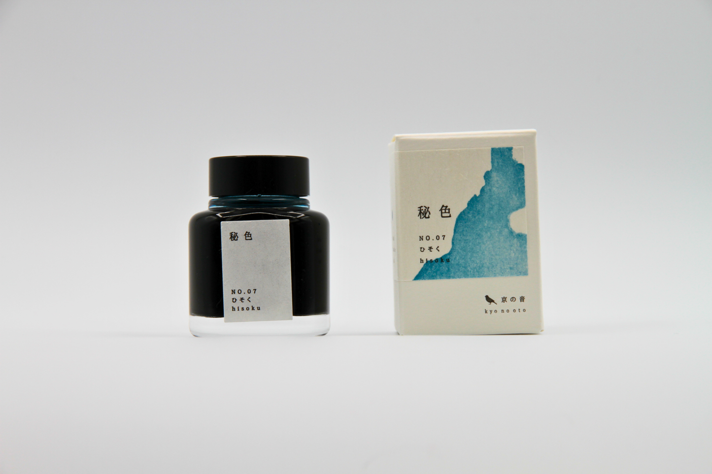
TAG Stationery Kyo No Oto Hisoku (秘色) — Misty Celadon Blue-Green with Expressive Shading Fountain Pen Ink (40ml)
TAG Stationery Kyo No Oto Hisoku (秘色) — Misty Celadon Blue-Green with Expressive Shading Fountain Pen Ink (40ml)
Couldn't load pickup availability
TAG Stationery Kyo No Oto Hisoku (秘色) — Misty Celadon Blue-Green with Expressive Shading Fountain Pen Ink (40ml)
TAG Stationery Kyo No Oto Hisoku is a fountain pen ink produced by TAG Stationery (京都TAG文具店) in collaboration with a traditional Kyoto ink workshop — part of the celebrated Kyo No Oto (京のおと) series, and one of the most distinctive and quietly mysterious inks in the contemporary Japanese fountain pen ink market. Hisoku (秘色) takes its name and concept from one of the most storied colour terms in Japanese and Chinese aesthetic history — a colour whose name translates literally as "secret colour," originally used to describe the specific, elusive blue-green glaze of the most prized celadon ceramics produced for the imperial court of the Tang dynasty. The colour was so rare, so closely guarded, and so difficult to reproduce that it became legendary — a colour described more by what it evoked than what it was, associated with mystery, refinement, and the particular quality of light on ancient glazed porcelain. The ink translates that concept with characteristic Kyo No Oto fidelity: a light, muted grey-blue-green that carries the celadon quality of its source — soft, luminous, and slightly otherworldly — without tipping into either blue or green, occupying instead that rare intermediate zone where the colour's full complexity resides.
TAG Stationery (京都TAG文具店), also known as Takeda Jimuki, is a Kyoto-based stationery brand with deep roots in the Japanese stationery tradition. The Kyo No Oto series represents their most collaborative work — each ink produced in partnership with traditional Kyoto craft workshops, connecting contemporary fountain pen culture to the city's centuries-old dyeing and craft heritage.
Hisoku is available at Shosai (shosai.ca) in Gatineau — your Ottawa–Gatineau source for Japanese and Korean stationery, with in-store pickup and Canada-wide shipping.
What Makes Hisoku Different
The blue-green register is genuinely difficult to occupy well. Most inks that attempt it drift clearly toward one of the two parent colours — readable as a blue with green undertones, or a green with blue undertones — and lose the genuine ambiguity that makes the colour register interesting. Hisoku is exceptional precisely because it does not drift. The grey component holds the blue and green in suspension, producing a tone that reads as both simultaneously without committing to either, a colour that changes subtly with the paper surface, the lighting, and the nib — more blue in some conditions, more green in others, more grey in others still, always the same and never quite the same.
What deepens Hisoku beyond its base colour is its shading. The slightly dry flow and dye formulation produce a shading range that moves expressively from a lighter, more purely blue-green register at the thinnest stroke areas to a deeper, more complex grey-green-blue at pooling points and broader nib widths — a gradient that mirrors the way celadon glaze deepens in the recesses of a ceramic surface and lightens at the raised edges. The result is an ink that is subtle and mysterious in casual use, and that rewards deliberate, attentive writing with a visual complexity that few inks in this colour register can match.
Ink Profile
Colour
Hisoku's base is a light, muted grey-blue-green — the specific colour that has been described for centuries as the celadon colour: neither clearly blue nor clearly green nor clearly grey, but carrying all three in a suspension that is, by any standard, extraordinarily difficult to achieve and extraordinarily beautiful when achieved. In the bottle, it presents as a light, translucent grey-blue-green with visible cool undertones. On the page in its wet state, it reads as a soft, moderately saturated blue-green with grey presence; as it dries, it settles into a lighter, more muted tone that retains the celadon quality — misty, luminous, and quietly complex.
The colour is consistently described as celadon, misty blue-green, grey-blue-green, secret colour, hazy turquoise, and soft steel blue — a colour with a distinctly poetic and historical character that belongs to the long tradition of Japanese and Chinese appreciation of celadon ceramics. At fine nib sizes, it reads as a clean, cool blue-green-grey suitable for everyday writing and journaling; at broader nib sizes on quality papers, the shading reveals the full range of the colour's complexity, from lighter blue-green to deeper, more saturated grey-green-blue.
Shading
Medium to strong, and among the most characterful qualities of Hisoku. The slightly dry flow and dye formulation produce a shading range that is genuinely expressive — moving from a lighter, more purely blue-green register at the thinnest stroke areas to a deeper, richer grey-green-blue at pooling points and broader nib widths. The shading gradient adds tonal and chromatic depth to the base colour, making the celadon quality most apparent at the transition zones where the lighter blue-green and the deeper grey-green meet. On quality papers with medium to broad or stub nibs, the full shading range is clearly visible and particularly rewarding; on Tomoe River, the shading is most dramatic and most beautiful.
The shading is both tonal and chromatic — the ink moves not only from light to dark but from a cooler, more blue-toned register toward a warmer, more green-grey-inflected one, giving Hisoku the same two-dimensional tonal depth that makes Aonibi and Adzukiiro so satisfying. Many users specifically identify the shading as one of Hisoku's most compelling qualities, and it is among the strongest shading performances in the Kyo No Oto series.
Sheen
Minimal to low — a faint black sheen visible primarily at pooling points and in swab applications on slow-absorbing papers; occasionally a faint red sheen has been reported under specific light conditions. In everyday writing at fine to medium nib sizes, the sheen is not visible under normal conditions. Writers who specifically seek sheen inks should note that Hisoku's visual interest comes primarily from its colour and shading; the minimal sheen is a complementary quality that adds a subtle depth to the heaviest ink deposit areas without defining the ink's overall character.
Shimmer
None. Hisoku is a pure dye ink with no shimmer or metallic particles of any kind. Its visual complexity comes entirely from its colour and shading behaviour. No particle clogging risk; no maintenance beyond standard dye ink care; compatible with all pen types including vintage instruments.
Ink Type
Pure dye-based ink, produced in collaboration with a traditional Kyoto ink workshop in small batches. Not pigment-based; contains no iron gall and no shimmer particles. Low water resistance, as is standard for dye-based inks. The slightly dry flow characteristic supports the ink's shading behaviour and rewards wetter pens and broader nibs. Minor colour variations between production batches are an inherent characteristic of the small-batch handcrafted process and should be understood as a feature of the ink's artisanal origin rather than an inconsistency.
Ink Properties at a Glance
| Property | Detail |
|---|---|
| Base Colour | Light muted grey-blue-green; celadon quality; cool-toned |
| Ink Type | Pure dye-based; traditional Kyoto craft workshop; small batch |
| Shading | Medium to strong; light blue-green to deeper grey-green-blue |
| Shimmer | None |
| Sheen | Minimal; faint black sheen at pooling points; occasional faint red |
| Flow | Slightly dry; best with wetter pens or broader nibs |
| Dry Time | Approximately 30 seconds (medium nib) |
| Water Resistance | Low |
| Feathering / Bleed | Low on fountain pen-friendly papers |
| Compatible Tools | Fountain pens; dip pen and brush use also possible |
| Best Papers | Tomoe River, Rhodia, Clairefontaine; smooth slow-absorbing papers |
| Volume | 40ml glass bottle |
How to Get the Most Out of Hisoku
Recommended Paper
Hisoku's shading is surface-dependent. Slow-absorbing, smooth papers give the dye time to pool and develop its full tonal range. Fast-absorbing papers compress the shading and reduce the depth that makes this ink particularly rewarding.
- Tomoe River (52gsm or 68gsm) — the definitive paper for Hisoku; the slow absorption allows the full shading range to develop; the light blue-green to deeper grey-green-blue gradient is most dramatic and most beautiful here; the celadon quality of the colour is most fully expressed on Tomoe River; the recommended choice for journaling and any use where the ink's full character is the priority
- Rhodia / Clairefontaine — excellent everyday performance; shading clearly visible and well-developed; a reliable and practical daily choice that fully showcases the ink's core character
- Cosmo Air Light — smooth surface gives clean colour development and visible shading; a natural pairing for loose sheet writing and correspondence
- Yamamoto Ro-biki Notebook — the wax-finished surface slows absorption and supports strong shading development; a rewarding pairing for journaling and extended writing sessions
- Leuchtturm1917 — good overall performance; shading visible and present; a practical choice for bullet journaling and daily use
- Standard copy paper — functional for basic legibility; shading reduced; not recommended for the full visual experience
Recommended Nibs
Hisoku's slightly dry flow rewards wetter, broader nibs that deposit sufficient ink for the full shading range to develop.
- Stub and cursive italic nibs — the widest shading gradient and the most expressive results; the contrast between the lighter blue-green thin strokes and the deeper grey-green-blue pooling points is most apparent at stub and italic widths; the recommended choice for the ink's full visual character
- Medium and broad nibs — shading clearly visible and well-developed; the celadon colour register is most fully expressed at these widths; the recommended everyday choice
- Wetter fine nibs — the misty blue-green base reads cleanly; shading reduced but present; a practical choice for correspondence and journaling where line precision is a priority; pair with a known wet writer for best results
- Extra-fine nibs — fully functional for legibility; shading largely absent; the colour reads as a clean, light grey-blue-green; recommended where fine line precision takes precedence
- Dip pen and brush — well-suited for calligraphic and illustrative use; the shading behaviour and the celadon colour register produce particularly beautiful results in brush applications with deliberate water use
Pen Maintenance
Hisoku is a pure dye ink with no shimmer particles or pigment solids — low-maintenance and safe for all pen types including vintage instruments. Flush every 4–6 weeks under normal use, or when changing inks. Compatible with all pen materials including vintage rubber sacs, celluloid, and ebonite. Minor colour variations between production batches should be understood as a characteristic of the small-batch handcrafted process.
Recommended Uses
- Daily journaling and long-form writing — the misty celadon blue-green base and expressive shading make Hisoku an exceptionally characterful everyday journaling ink; a colour that changes subtly with nib size and paper, producing pages that are quietly extraordinary in their visual complexity
- Correspondence and personal writing — the restrained, luminous tone makes Hisoku well-suited to personal correspondence; a colour that communicates refinement and considered taste without effort
- Ceramic and Japanese aesthetic writing — the direct connection to the historic celadon colour tradition and the ink's luminous, mysterious quality make it a natural choice for writers engaged with Japanese and Chinese aesthetics, ceramic culture, and writing with a strong historical and artistic sensibility
- Creative writing and poetry — the colour's poetic name — secret colour — and its genuinely mysterious, light-shifting quality make Hisoku a natural companion for creative writing, poetry, and any writing practice where the colour of the ink is part of the creative atmosphere
- Fountain pen photography and swatching — the shading gradient and the celadon colour register photograph beautifully on Tomoe River under natural light; a compelling and visually distinctive addition to any ink swatch collection
- Gift for fountain pen enthusiasts — the Kyoto craft workshop collaboration, the extraordinary history of the hisoku colour concept, the expressive shading, and the ink's genuine visual mystery make it one of the most story-rich and distinctive gifts in the TAG Stationery catalogue
About the Kyo No Oto Series
Kyo No Oto (京のおと) — "sounds of Kyoto" — is TAG Stationery's most collaborative series: each ink produced in partnership with a traditional Kyoto craft workshop, connecting the contemporary fountain pen ink format to the city's centuries-old craft heritage. Where the Kyo Iro series captures the visual colours of specific Kyoto places and phenomena, the Kyo No Oto series draws from the deeper traditions of Kyoto craft — the dyeing techniques, colour concepts, and material culture that have defined the city's aesthetic identity for centuries. Hisoku (KO-0107) draws from one of the most historically resonant colour concepts in East Asian aesthetic culture, translating the legendary celadon colour of Tang dynasty imperial ceramics into a fountain pen ink that carries the mystery, refinement, and elusive beauty of its source.
About TAG Stationery
TAG Stationery (京都TAG文具店), also known as Takeda Jimuki, is a Kyoto-based Japanese stationery brand with a philosophy rooted in the intersection of traditional craft and contemporary writing culture. Their inks are produced with attention to both formulation quality and conceptual depth — each ink in the TAG catalogue carries a story, a reference, and a considered visual identity. The Kyo No Oto series represents their most craft-rooted work, produced in direct collaboration with traditional Kyoto workshops to create inks that are as connected to the city's heritage as they are to contemporary fountain pen culture. Shop the full TAG Stationery collection at Shosai — Gatineau–Ottawa's home for Japanese and Korean stationery.
Product Specifications
| Detail | Hisoku |
|---|---|
| Brand | TAG Stationery (京都TAG文具店) / Takeda Jimuki |
| Series | Kyo No Oto (京のおと) |
| Model | KO-0107 |
| Full Name | Hisoku / 秘色 |
| Inspiration | Historic celadon colour concept; secret colour of Tang dynasty imperial ceramics |
| Origin | Japan (Kyoto) — produced with traditional Kyoto ink workshop; small batch |
| Volume | 40ml |
| Ink Type | Pure dye-based; traditional Kyoto craft workshop collaboration |
| Base Colour | Light muted grey-blue-green; celadon quality |
| Shading | Medium to strong; light blue-green to deeper grey-green-blue |
| Shimmer | None |
| Sheen | Minimal; faint black sheen at pooling points |
| Flow | Slightly dry |
| Dry Time | ~30 seconds (medium nib) |
| Water Resistance | Low |
| Pen Safety | Safe for all pen materials including vintage instruments |
Available at Shosai — Ottawa–Gatineau
Shosai (shosai.ca) is a fine stationery boutique serving the Ottawa–Gatineau National Capital Region. We carry a curated selection of premium fountain pen inks, papers, and writing instruments from the world's most respected Japanese and Korean stationery brands.
- 📍 In-store pickup: Gatineau, QC — J9J 0K6
- 🛵 Local delivery: Available in the Ottawa–Gatineau area
- 🚚 Canada-wide shipping available
- 🇫🇷 Service bilingue — français et anglais
Whether you are new to fountain pens or a seasoned collector, Shosai is your local destination for inks that go beyond the ordinary.
Share