Shosai
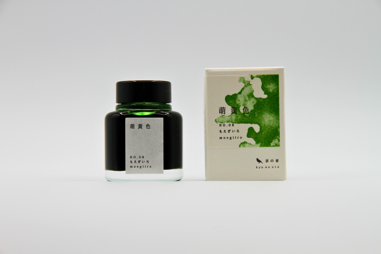
TAG Stationery Kyo No Oto Moegiiro (萌黄色) — Bright Spring Green with Elegant Shading Fountain Pen Ink (40ml)
TAG Stationery Kyo No Oto Moegiiro (萌黄色) — Bright Spring Green with Elegant Shading Fountain Pen Ink (40ml)
Couldn't load pickup availability
TAG Stationery Kyo No Oto Moegiiro (萌黄色) — Bright Spring Green with Elegant Shading Fountain Pen Ink (40ml)
TAG Stationery Kyo No Oto Moegiiro is a fountain pen ink produced by TAG Stationery (京都TAG文具店) in collaboration with a traditional Kyoto ink workshop — part of the celebrated Kyo No Oto (京のおと) series, and one of the most vivid and joyful inks in the contemporary Japanese fountain pen ink market. Moegiiro (萌黄色) takes its name and concept from one of the most beloved colour terms in the traditional Japanese colour vocabulary — the specific yellow-green of newly sprouted shoots in early spring, the colour of the first growth that emerges after winter. In the Japanese colour tradition, moegiiro is the colour of vitality, renewal, and the particular quality of green that belongs only to the first days of spring — a green that is both bright and tender, saturated without weight, vivid without aggression. The ink translates that concept with characteristic Kyo No Oto fidelity: a clean, bright lime-green that carries the freshness and clarity of its source material, the colour of new leaves seen against early spring light.
TAG Stationery (京都TAG文具店), also known as Takeda Jimuki, is a Kyoto-based stationery brand with deep roots in the Japanese stationery tradition. The Kyo No Oto series represents their most collaborative work — each ink produced in partnership with traditional Kyoto craft workshops, connecting contemporary fountain pen culture to the city's centuries-old dyeing and craft heritage.
Moegiiro is available at Shosai (shosai.ca) in Gatineau — your Ottawa–Gatineau source for Japanese and Korean stationery, with in-store pickup and Canada-wide shipping.
What Makes Moegiiro Different
Among the inks in the Kyo No Oto series — a collection characterised by restraint, historical depth, and muted, considered colour — Moegiiro stands apart. Where Nurebairo offers deep blue-black mystery, Aonibi quiet grey-blue elegance, and Hisoku the elusive pale ambiguity of celadon, Moegiiro brings something entirely different: brightness, clarity, and the unambiguous joy of new growth. It is the colour of spring in a bottle — not the soft, atmospheric spring of cherry blossoms and morning mist, but the sharp, vivid spring of the first green shoots breaking through the earth, the particular lime-yellow-green that announces the season has turned.
What prevents Moegiiro from being merely bright is its shading and the quality of its dye formulation. The medium shading gradient — from a lighter, more yellow-toned green at fine stroke edges to a deeper, richer green at pooling points — adds tonal dimension to the vivid base without dimming its essential brightness. The slight black sheen that appears at heaviest ink deposit areas adds an unexpected depth that anchors the colour's energy without contradicting it. The result is a green ink that is vivid and characterful in casual use, and that rewards deliberate writing with a layered visual quality that makes it among the most satisfying bright greens available.
Ink Profile
Colour
Moegiiro's base is a bright, clean lime-green — a yellow-green that sits in the vivid register without tipping into neon or artificial-feeling territory, and without the blue overtones that would make it a conventional grass green. It is a colour that is immediately recognisable as spring: fresh, tender, and saturated in a way that feels natural rather than engineered. In the bottle, it presents as a bright, clear yellow-green with visible depth. On the page in its wet state, it reads as a vivid, saturated lime-green; as it dries, it settles into a slightly softer but still clearly bright green that retains the freshness of the moegiiro concept — a colour that is immediately legible as green without being either flat or aggressive.
The colour is consistently described as lime green, yellow-green, fresh spring green, bright yellow-green, and new leaf green — a colour with a distinctly seasonal and natural character that belongs to the Japanese tradition of representing the arrival of spring through the specific quality of the first new growth. At fine nib sizes, it reads as a clean, vivid lime-green suitable for everyday writing; at broader nib sizes on quality papers, the shading reveals a deeper, richer green dimension that adds tonal complexity to the bright base.
Shading
Medium and among the most characterful qualities of Moegiiro. The dye formulation — a mixture of yellow and pale blue dyes — produces a shading range that moves naturally from a lighter, more yellow-toned green at the thinnest stroke areas and stroke beginnings to a deeper, richer, more purely green tone at pooling points and stroke endings. The shading gradient — from bright yellow-green to deeper green — is clearly visible on quality papers with medium to broad or stub nibs, and most rewarding on Tomoe River and similar slow-absorbing surfaces. Even at fine nib sizes, the shading is clearly present, which is a notable quality for a bright, vivid ink of this character.
The shading is chromatic as well as tonal — it moves not only from light to dark but from a more yellow-inflected register toward a more purely green one, reflecting the dye composition of the ink and giving Moegiiro a two-dimensional depth that makes the colour feel genuinely alive on the page.
Sheen
Minimal — a faint black sheen visible primarily at pooling points, in swab applications, and at heaviest ink deposit areas with broad nibs on slow-absorbing papers. In everyday writing at fine to medium nib sizes, the sheen is not prominently visible under normal conditions. When present, the black sheen provides an unexpected contrast with the bright lime-green base — a dark depth against the vivid colour — that adds sophistication without contradicting the ink's essential brightness. Writers who specifically seek sheen inks should note that Moegiiro's primary visual interest is in its colour and shading; the minimal sheen is a complementary quality rather than a defining one.
Shimmer
None. Moegiiro is a pure dye ink with no shimmer or metallic particles of any kind. Its visual complexity comes from its colour, shading, and minimal black sheen. No particle clogging risk; no maintenance beyond standard dye ink care; compatible with all pen types including vintage instruments.
Ink Type
Pure dye-based ink, produced in collaboration with a traditional Kyoto ink workshop using traditional Japanese dyeing techniques. The colour is produced from a mixture of yellow and pale blue dyes — a formulation that accounts for the shading behaviour and the natural yellow-to-green chromatic shift across the tonal range. Not pigment-based; contains no iron gall and no shimmer particles. Dry time is notably fast at approximately 10 seconds with a medium nib on quality paper. Flow is slightly dry in some pen and paper combinations; pairing with a wetter-flowing instrument or quality paper is recommended for best results.
Ink Properties at a Glance
| Property | Detail |
|---|---|
| Base Colour | Bright lime-green; yellow-green; vivid, fresh, spring-toned |
| Ink Type | Pure dye-based; yellow + pale blue dye mixture; traditional Kyoto techniques |
| Shading | Medium; light yellow-green to deeper green |
| Shimmer | None |
| Sheen | Minimal; faint black sheen at pooling points and heavy deposit areas |
| Flow | Slightly dry; best with wetter pens or quality papers |
| Dry Time | Approximately 10 seconds (medium nib) |
| Water Resistance | Low to moderate |
| Feathering / Bleed | Low on fountain pen-friendly papers |
| Compatible Tools | Fountain pens; dip pen use also possible |
| Best Papers | Tomoe River, Rhodia, Clairefontaine; smooth slow-absorbing papers |
| Volume | 40ml glass bottle |
How to Get the Most Out of Moegiiro
Recommended Paper
Moegiiro's shading is surface-dependent. Slow-absorbing, smooth papers give the dye time to pool and develop its full tonal range, and allow the yellow-to-green chromatic shift to express itself fully. Fast-absorbing papers compress the shading and flatten the colour into a more uniform bright green.
- Tomoe River (52gsm or 68gsm) — the definitive paper for Moegiiro; the slow absorption allows the full shading range to develop; the yellow-green to deeper green gradient is most apparent and most beautiful here; the black sheen is most visible at pooling points; the recommended choice for journaling and any use where the ink's full character is the priority
- Rhodia / Clairefontaine — excellent everyday performance; colour vivid and bright; shading clearly visible and well-developed; a reliable and practical daily choice
- Cosmo Air Light — smooth surface gives clean, vivid colour development and visible shading; a natural pairing for loose sheet writing and correspondence
- Yamamoto Ro-biki Notebook — the wax-finished surface slows absorption and supports strong shading development; a rewarding pairing for journaling and extended writing sessions
- Leuchtturm1917 — good overall performance; colour bright and clearly present; shading visible; a practical choice for bullet journaling and daily use
- Standard copy paper — functional for basic legibility; shading reduced; some feathering possible at broader sizes; not recommended for the full visual experience
Recommended Nibs
Moegiiro performs well across the full nib size range. The shading is notably present even at fine nib sizes, making it a rewarding colour at any width; the full chromatic and tonal range is most apparent at broader sizes.
- Stub and cursive italic nibs — the widest shading gradient and the most expressive results; the contrast between the lighter yellow-green thin strokes and the deeper green pooling points is most apparent at stub and italic widths; the black sheen is most visible here; the recommended choice for the ink's full visual expression
- Medium and broad nibs — shading clearly visible and well-developed; the yellow-green to deeper green gradient is most rewarding at these widths; the recommended everyday choice
- Fine nibs — shading clearly present and effective — notably good for a vivid, bright ink; the lime-green base reads as clean, vivid, and characterful at fine sizes
- Extra-fine nibs — fully functional for legibility; shading reduced but present; the colour reads as a clean, bright lime-green; recommended where fine line precision takes precedence
- Dip pen — well-suited for calligraphic and illustrative use; the vivid colour and shading behaviour produce particularly striking results in display lettering and botanical illustration
Pen Maintenance
Moegiiro is a pure dye ink with no shimmer particles or pigment solids — low-maintenance and safe for all pen types including vintage instruments. Flush every 4–6 weeks under normal use, or when changing inks. Compatible with all pen materials including vintage rubber sacs, celluloid, and ebonite. No special maintenance considerations beyond standard dye ink care.
Recommended Uses
- Spring and seasonal journaling — the bright lime-green palette makes Moegiiro the natural spring journaling ink; a colour that captures the energy and freshness of early spring better than any other in the Kyo No Oto series; a colour that makes every page feel like a new beginning
- Daily writing and personal correspondence — the vivid, clean base and effective shading across all nib sizes make Moegiiro a characterful and versatile everyday ink; distinctive enough to be immediately recognisable as a personal colour, bright enough to bring energy to every page
- Botanical illustration and nature journaling — the lime-green base and yellow-to-green shading make Moegiiro a natural choice for botanical illustration, nature journaling, and any writing or drawing practice that engages with the natural world and the qualities of living green
- Japanese aesthetic and seasonal writing — the direct connection to the moegiiro colour tradition and its association with the arrival of spring in Japanese culture make this ink a natural choice for writers engaged with the Japanese seasonal aesthetic, haiku, and any writing practice that marks the passage of the year
- Fountain pen photography and swatching — the vivid lime-green base and the yellow-to-green shading gradient photograph beautifully on Tomoe River under natural light; the unexpected black sheen at pooling points adds visual drama; a compelling addition to any ink swatch collection
- Gift for fountain pen enthusiasts — the Kyoto craft workshop collaboration, the moegiiro spring colour tradition, the expressive shading, and the ink's joyful brightness make it a distinctive and story-rich gift for any fountain pen collector
About the Kyo No Oto Series
Kyo No Oto (京のおと) — "sounds of Kyoto" — is TAG Stationery's most collaborative series: each ink produced in partnership with a traditional Kyoto craft workshop, connecting the contemporary fountain pen ink format to the city's centuries-old craft heritage. Where the Kyo Iro series captures the visual colours of specific Kyoto places and phenomena, the Kyo No Oto series draws from the deeper traditions of Kyoto craft — the dyeing techniques, colour concepts, and material culture that have defined the city's aesthetic identity for centuries. Moegiiro (KO-0108) draws from the traditional Japanese colour vocabulary of the natural world, translating the specific, vivid yellow-green of early spring shoots into a fountain pen ink that carries the energy, freshness, and seasonal joy of its source.
About TAG Stationery
TAG Stationery (京都TAG文具店), also known as Takeda Jimuki, is a Kyoto-based Japanese stationery brand with a philosophy rooted in the intersection of traditional craft and contemporary writing culture. Their inks are produced with attention to both formulation quality and conceptual depth — each ink in the TAG catalogue carries a story, a reference, and a considered visual identity. The Kyo No Oto series represents their most craft-rooted work, produced in direct collaboration with traditional Kyoto workshops to create inks that are as connected to the city's heritage as they are to contemporary fountain pen culture. Shop the full TAG Stationery collection at Shosai — Gatineau–Ottawa's home for Japanese and Korean stationery.
Product Specifications
| Detail | Moegiiro |
|---|---|
| Brand | TAG Stationery (京都TAG文具店) / Takeda Jimuki |
| Series | Kyo No Oto (京のおと) |
| Model | KO-0108 |
| Full Name | Moegiiro / 萌黄色 |
| Inspiration | Traditional Japanese spring colour; new shoots of early spring |
| Origin | Japan (Kyoto) — produced with traditional Kyoto ink workshop |
| Volume | 40ml |
| Ink Type | Pure dye-based; yellow + pale blue dye mixture; traditional Kyoto techniques |
| Base Colour | Bright lime-green; yellow-green; vivid, fresh |
| Shading | Medium; light yellow-green to deeper green |
| Shimmer | None |
| Sheen | Minimal; faint black sheen at pooling points |
| Flow | Slightly dry |
| Dry Time | ~10 seconds (medium nib) |
| Water Resistance | Low to moderate |
| Pen Safety | Safe for all pen materials including vintage instruments |
Available at Shosai — Ottawa–Gatineau
Shosai (shosai.ca) is a fine stationery boutique serving the Ottawa–Gatineau National Capital Region. We carry a curated selection of premium fountain pen inks, papers, and writing instruments from the world's most respected Japanese and Korean stationery brands.
- 📍 In-store pickup: Gatineau, QC — J9J 0K6
- 🛵 Local delivery: Available in the Ottawa–Gatineau area
- 🚚 Canada-wide shipping available
- 🇫🇷 Service bilingue — français et anglais
Whether you are new to fountain pens or a seasoned collector, Shosai is your local destination for inks that go beyond the ordinary.
Share