Shosai
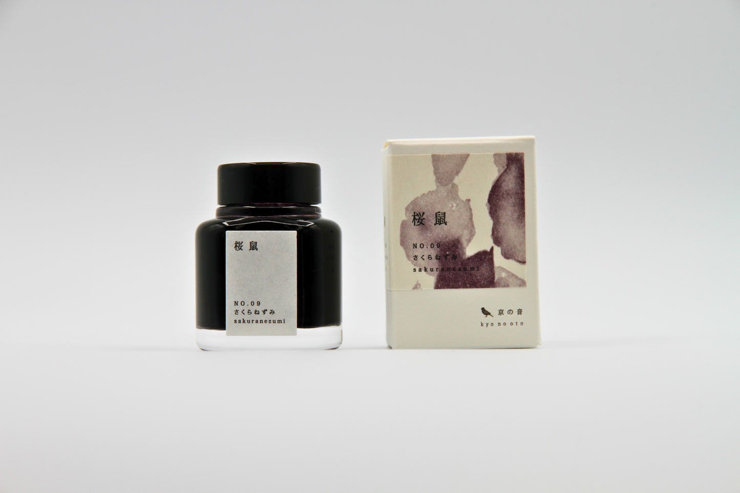
TAG Stationery Kyo No Oto Sakuranezumi (桜鼠) — Dusky Grey-Purple with Expressive Shading Fountain Pen Ink (40ml)
TAG Stationery Kyo No Oto Sakuranezumi (桜鼠) — Dusky Grey-Purple with Expressive Shading Fountain Pen Ink (40ml)
Couldn't load pickup availability
TAG Stationery Kyo No Oto Sakuranezumi (桜鼠) — Dusky Grey-Purple with Expressive Shading Fountain Pen Ink (40ml)
TAG Stationery Kyo No Oto Sakuranezumi is a fountain pen ink produced by TAG Stationery (京都TAG文具店) in collaboration with a traditional Kyoto ink workshop — part of the celebrated Kyo No Oto (京のおと) series, and one of the most quietly distinguished inks in the contemporary Japanese fountain pen ink market. Sakuranezumi (桜鼠) takes its name and concept from one of the most evocative colour terms in the traditional Japanese colour vocabulary — literally "cherry blossom mouse," the specific grey-purple that belongs to cherry blossoms seen not in bright spring sunlight but under an overcast sky, where the pink is muted by grey and the colour takes on a quality of depth and melancholy that the vivid version does not carry. In the Japanese colour tradition, the nezumi (mouse) colours are the grey-toned relatives of more vivid hues — understated, sophisticated, and associated with the refined aesthetic sensibility of the Edo period merchant class, who developed a taste for subtle colours that communicated taste and restraint in equal measure. Sakuranezumi is the grey version of sakura pink: a colour that knows what cherry blossoms look like after the petals begin to fall, when the colour has given something of itself back to the sky.
TAG Stationery (京都TAG文具店), also known as Takeda Jimuki, is a Kyoto-based stationery brand with deep roots in the Japanese stationery tradition. The Kyo No Oto series represents their most collaborative work — each ink produced in partnership with traditional Kyoto craft workshops, connecting contemporary fountain pen culture to the city's centuries-old dyeing and craft heritage.
Sakuranezumi is available at Shosai (shosai.ca) in Gatineau — your Ottawa–Gatineau source for Japanese and Korean stationery, with in-store pickup and Canada-wide shipping.
What Makes Sakuranezumi Different
The grey-purple register is one of the most considered and difficult colour zones in the fountain pen ink world. Most inks that occupy this space tip either too far toward purple — losing the grey restraint that makes the colour interesting — or too far toward grey, producing a tone that reads as colourless rather than considered. Sakuranezumi occupies the register with genuine authority. The grey component is strong enough to mute the pink-purple base into something that reads as neither sweet nor decorative, but as genuinely sophisticated — a colour that belongs to the aesthetic vocabulary of restraint and depth rather than to the vocabulary of prettiness.
What makes Sakuranezumi more than a study in restraint is its shading. The slightly dry flow and dye formulation produce a shading range that is among the most praised in the Kyo No Oto series — a gradient that moves from a lighter, more dusty rose-pink register at fine stroke areas to a deeper, richer plum-purple approaching grey-black at pooling points and broader nib widths. The range is wide, the transition natural, and the result is an ink that carries genuine chromatic depth within a palette that appears at first glance to be almost monochrome. Writers and reviewers consistently identify the shading as one of Sakuranezumi's most compelling qualities — an ink that reveals more the more carefully you look at it.
Ink Profile
Colour
Sakuranezumi's base is a dusky grey-purple — a colour that carries the pink of cherry blossoms filtered through grey, producing a tone that reads as neither clearly pink nor clearly grey nor clearly purple, but as something more complex and considered than any of its component parts. In the bottle, it presents as a muted, medium-depth grey-purple with visible cool undertones. On the page in its wet state, it reads as a rich, moderately saturated grey-purple; as it dries, it settles into a softer, slightly more muted tone that is distinctly elegant — a colour that has been consistently described as dusty rose, dusty mauve, grey-purple, vintage purple, plum-grey, and the grey of cherry blossoms under an overcast sky.
The lighter areas of shading read as dusty rose or dusty pink-mauve — a soft, feminine tone that carries its grey content cleanly without being cold; the deeper areas read as plum, dark mauve, or grey-purple approaching dark, producing a two-register colour that is far more complex than its base description suggests. At fine nib sizes, it reads as a clean, cool grey-purple suitable for everyday correspondence and journaling; at broader nib sizes on quality papers, the full dusty-rose to plum-grey shading range is revealed, making this one of the most visually rewarding pink-purple inks available.
Shading
Medium to strong, and consistently identified by reviewers as one of Sakuranezumi's most outstanding qualities — among the best shading performances in the Kyo No Oto series. The slightly dry flow produces meaningful variation in ink deposit across a stroke, creating the conditions for a shading gradient that is wide, natural, and genuinely beautiful: lighter, more pink-toned dusty rose at the thinnest stroke areas, deeper, more purple-inflected plum-grey at pooling points and stroke endings. The transition between registers is smooth and natural rather than abrupt, giving the ink a fluid, organic quality that is particularly well-suited to brush use and ink wash techniques.
The shading is chromatic as well as tonal — moving not only from light to dark but from a warmer, more pink-toned register toward a cooler, more purple-grey one, giving Sakuranezumi a two-dimensional depth that rewards attention at any nib size. Even at fine and extra-fine nib sizes, the shading is clearly present and contributes meaningfully to the character of the writing — an unusual quality for a deeply muted ink of this character.
Sheen
None to minimal — the most that has been observed is an extremely faint suggestion of gold-green at the very edges of pooling areas under specific lighting conditions, and this is not consistently reported across reviews. For all practical purposes, Sakuranezumi should be understood as a non-sheen ink. Its visual complexity comes entirely from its base colour and its expressive shading behaviour. Writers who specifically seek sheen inks should note that Sakuranezumi's rewards are of a different kind — tonal and chromatic rather than surface-optical.
Shimmer
None. Sakuranezumi is a pure dye ink with no shimmer or metallic particles of any kind. Its visual complexity comes entirely from its colour and shading behaviour. No particle clogging risk; no maintenance beyond standard dye ink care; compatible with all pen types including vintage instruments.
Ink Type
Pure dye-based ink, produced in collaboration with a traditional Kyoto ink workshop using traditional Japanese dyeing techniques in small batches. Not pigment-based; contains no iron gall and no shimmer particles. Low to medium water resistance — the water-solubility of the dye formulation makes Sakuranezumi well-suited to ink wash and water brush techniques, where the colour dilutes gracefully toward lighter dusty pink-mauve tones. The slightly dry flow characteristic supports the ink's shading behaviour and rewards wetter pens and broader nibs. Minor colour variations between production batches are an inherent characteristic of the small-batch handcrafted process.
Ink Properties at a Glance
| Property | Detail |
|---|---|
| Base Colour | Dusky grey-purple; muted, cool-toned; dusty rose to plum-grey |
| Ink Type | Pure dye-based; traditional Kyoto dyeing techniques; small batch |
| Shading | Medium to strong; dusty rose-pink to deep plum-grey |
| Shimmer | None |
| Sheen | None to minimal; extremely faint gold-green at pooling edges only |
| Flow | Slightly dry; best with wetter pens or broader nibs |
| Dry Time | Approximately 20 seconds (paper dependent) |
| Water Resistance | Low to moderate |
| Feathering / Bleed | Low on fountain pen-friendly papers |
| Compatible Tools | Fountain pens; dip pen and water brush use also possible |
| Best Papers | Tomoe River, Rhodia, Clairefontaine; smooth slow-absorbing papers |
| Volume | 40ml glass bottle |
How to Get the Most Out of Sakuranezumi
Recommended Paper
Sakuranezumi's shading is surface-dependent. Slow-absorbing, smooth papers give the dye time to pool and develop the full dusty-rose to plum-grey tonal range. Fast-absorbing papers compress the shading and reduce the tonal depth that makes this ink particularly rewarding.
- Tomoe River (52gsm or 68gsm) — the definitive paper for Sakuranezumi; the slow absorption allows the full shading range to develop from dusty rose-pink to deep plum-grey; the shading is most dramatic and most beautiful here; the recommended choice for journaling and any use where the ink's full character is the priority
- Rhodia / Clairefontaine — excellent everyday performance; shading clearly visible and well-developed; a reliable and practical daily choice that showcases the ink's core character
- Cosmo Air Light — smooth surface gives clean colour development and visible shading; a natural pairing for loose sheet writing and correspondence; the water-solubility of the ink makes it well-suited to ink wash work on Cosmo Air Light
- Yamamoto Ro-biki Notebook — the wax-finished surface slows absorption and supports strong shading development; a rewarding pairing for journaling and extended writing sessions
- Leuchtturm1917 — good overall performance; shading visible and present; a practical choice for bullet journaling and daily use
- Standard copy paper — functional for basic legibility; shading reduced; not recommended for the full visual experience
Recommended Nibs
Sakuranezumi's slightly dry flow rewards wetter, broader nibs. The shading is present and effective even at fine nib sizes, but the full dusty-rose to plum-grey chromatic range is most apparent and most rewarding at broader widths. Very dry extra-fine nibs may experience occasional skipping and are best avoided with this ink.
- Stub and cursive italic nibs — the widest shading gradient and the most expressive results; the contrast between the lighter dusty-rose thin strokes and the deep plum-grey pooling points is most apparent at stub and italic widths; the recommended choice for the ink's full visual character
- Medium and broad nibs — shading clearly visible and well-developed; the dusty rose to plum-grey gradient is most rewarding at these widths; the recommended everyday choice
- Wetter fine nibs — shading clearly present and effective; the grey-purple base reads as a clean, cool, and characterful writing colour; pair with a known wet writer for best results
- Extra-fine nibs — functional for legibility but occasional skipping possible with very dry pens; shading reduced; the colour reads as a clean, muted grey-purple; recommended only with wet extra-fine nibs
- Dip pen and water brush — exceptionally well-suited; the shading behaviour and the water-solubility of the ink produce outstanding results in calligraphy and ink wash techniques; the diluted colour transitions gracefully from plum-grey toward dusty pink-mauve as water is added
Pen Maintenance
Sakuranezumi is a pure dye ink with no shimmer particles or pigment solids — low-maintenance and safe for all pen types including vintage instruments. Flush every 4–6 weeks under normal use, or when changing inks. Compatible with all pen materials including vintage rubber sacs, celluloid, and ebonite. Minor colour variations between production batches should be understood as a characteristic of the small-batch handcrafted process.
Recommended Uses
- Everyday journaling and long-form writing — the dusky grey-purple base and expressive shading make Sakuranezumi an exceptionally characterful everyday journaling ink; a colour that carries a quiet melancholy and depth that makes extended writing sessions particularly satisfying; one of the most rewarding purple-grey inks for daily use
- Vintage and literary aesthetic writing — the colour's direct connection to the Edo period nezumi colour aesthetic makes it a natural choice for writers engaged with vintage aesthetics, classical Japanese literature, and writing practices with a historical or literary sensibility; a colour that belongs to the tradition of elegant restraint
- Correspondence and formal writing — the restrained, sophisticated grey-purple communicates quiet authority and considered taste; a colour well-suited to personal correspondence where a distinctive but understated ink choice signals both personality and refinement
- Japanese aesthetic and wabi-sabi writing — the muted, grey-toned palette and the direct connection to the cherry blossom colour tradition make Sakuranezumi a natural choice for writers engaged with Japanese aesthetics and the concept of mono no aware — the bittersweet beauty of impermanence that cherry blossoms have always represented
- Ink wash and mixed-media work — the water-solubility and graceful dilution behaviour make Sakuranezumi particularly well-suited to ink wash techniques; diluted washes produce a beautiful range from soft dusty pink-mauve to near-transparent grey that is ideal for watercolour-style journaling and illustration
- Fountain pen photography and swatching — the shading gradient from dusty rose-pink to deep plum-grey photographs beautifully on Tomoe River under natural light; a compelling and distinctive addition to any ink swatch collection
- Gift for fountain pen enthusiasts — the Kyoto craft workshop collaboration, the nezumi colour tradition, the outstanding shading, and the ink's vintage aesthetic character make Sakuranezumi a story-rich and genuinely distinctive gift
About the Kyo No Oto Series
Kyo No Oto (京のおと) — "sounds of Kyoto" — is TAG Stationery's most collaborative series: each ink produced in partnership with a traditional Kyoto craft workshop, connecting the contemporary fountain pen ink format to the city's centuries-old craft heritage. Where the Kyo Iro series captures the visual colours of specific Kyoto places and phenomena, the Kyo No Oto series draws from the deeper traditions of Kyoto craft — the dyeing techniques, colour concepts, and material culture that have defined the city's aesthetic identity for centuries. Sakuranezumi (KO-0109) draws from the traditional nezumi colour vocabulary of the Edo period, translating the specific grey-toned quality of cherry blossom pink under an overcast sky into a fountain pen ink that carries the restraint, depth, and quiet melancholy of its source.
About TAG Stationery
TAG Stationery (京都TAG文具店), also known as Takeda Jimuki, is a Kyoto-based Japanese stationery brand with a philosophy rooted in the intersection of traditional craft and contemporary writing culture. Their inks are produced with attention to both formulation quality and conceptual depth — each ink in the TAG catalogue carries a story, a reference, and a considered visual identity. The Kyo No Oto series represents their most craft-rooted work, produced in direct collaboration with traditional Kyoto workshops to create inks that are as connected to the city's heritage as they are to contemporary fountain pen culture. Shop the full TAG Stationery collection at Shosai — Gatineau–Ottawa's home for Japanese and Korean stationery.
Product Specifications
| Detail | Sakuranezumi |
|---|---|
| Brand | TAG Stationery (京都TAG文具店) / Takeda Jimuki |
| Series | Kyo No Oto (京のおと) |
| Model | KO-0109 |
| Full Name | Sakuranezumi / 桜鼠 |
| Inspiration | Traditional Edo period nezumi colour; cherry blossoms under an overcast sky |
| Origin | Japan (Kyoto) — produced with traditional Kyoto ink workshop; small batch |
| Volume | 40ml |
| Ink Type | Pure dye-based; traditional Kyoto dyeing techniques |
| Base Colour | Dusky grey-purple; muted, cool-toned; dusty rose to plum-grey |
| Shading | Medium to strong; dusty rose-pink to deep plum-grey |
| Shimmer | None |
| Sheen | None to minimal |
| Flow | Slightly dry |
| Dry Time | ~20 seconds (paper dependent) |
| Water Resistance | Low to moderate |
| Pen Safety | Safe for all pen materials including vintage instruments |
Available at Shosai — Ottawa–Gatineau
Shosai (shosai.ca) is a fine stationery boutique serving the Ottawa–Gatineau National Capital Region. We carry a curated selection of premium fountain pen inks, papers, and writing instruments from the world's most respected Japanese and Korean stationery brands.
- 📍 In-store pickup: Gatineau, QC — J9J 0K6
- 🛵 Local delivery: Available in the Ottawa–Gatineau area
- 🚚 Canada-wide shipping available
- 🇫🇷 Service bilingue — français et anglais
Whether you are new to fountain pens or a seasoned collector, Shosai is your local destination for inks that go beyond the ordinary.
Share