Shosai
TAG Stationery Kyo No Oto Ochiguriiro (落栗色) — Warm Chestnut-Brown with Expressive Shading Fountain Pen Ink (40ml)
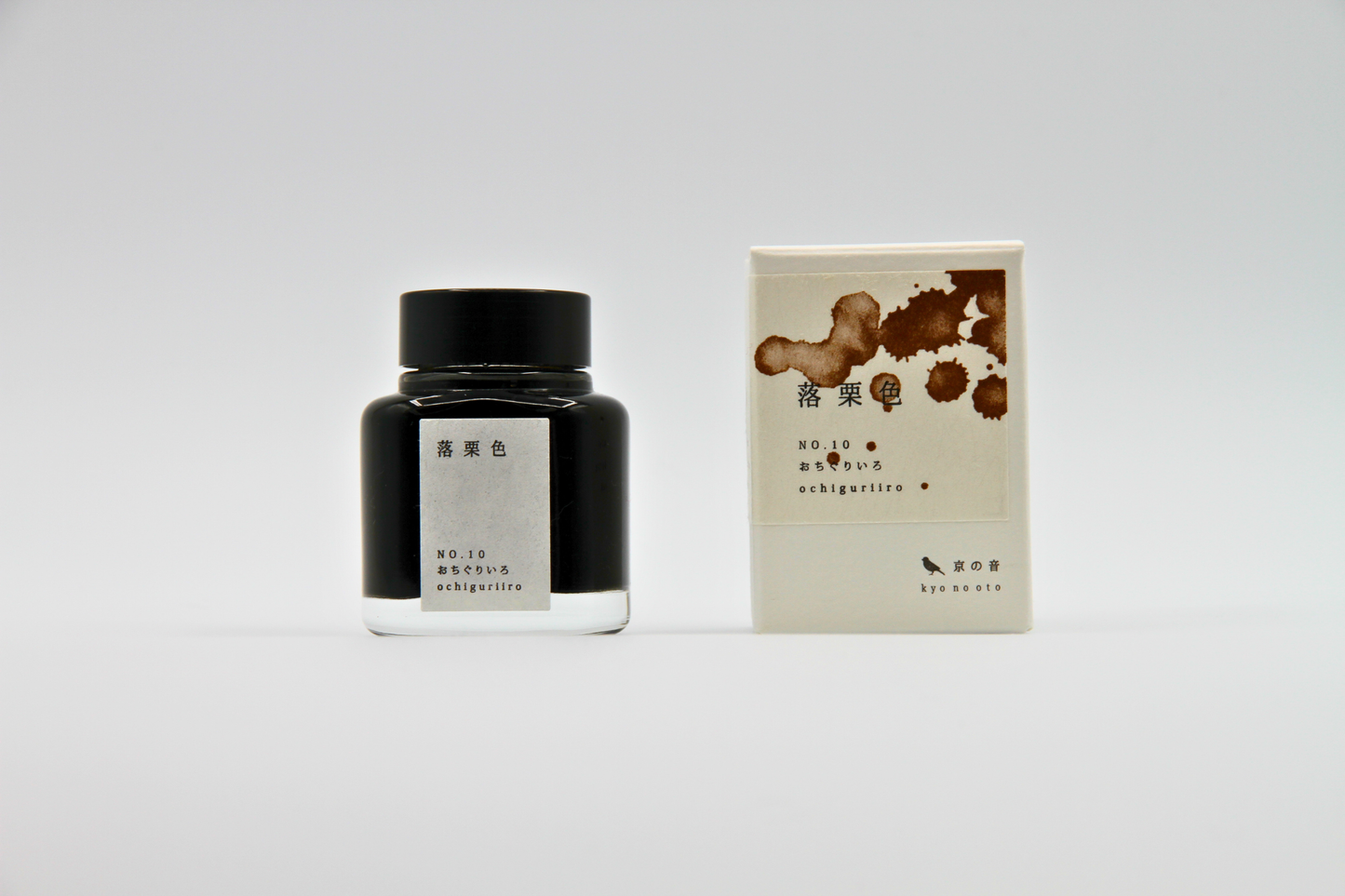
TAG Stationery Kyo No Oto Ochiguriiro (落栗色) — Warm Chestnut-Brown with Expressive Shading Fountain Pen Ink (40ml)
Couldn't load pickup availability
TAG Stationery Kyo No Oto Ochiguriiro (落栗色) — Warm Chestnut-Brown with Expressive Shading Fountain Pen Ink (40ml)
TAG Stationery Kyo No Oto Ochiguriiro is a fountain pen ink produced by TAG Stationery (京都TAG文具店) in collaboration with a traditional Kyoto ink workshop — part of the celebrated Kyo No Oto (京のおと) series, and one of the warmest and most grounded inks in the contemporary Japanese fountain pen ink market. Ochiguriiro (落栗色) takes its name and concept from a traditional Japanese colour term rooted in the aesthetic culture of the Heian period — the specific warm brown of fallen chestnuts, the colour that belongs to the ground beneath the trees in autumn when the husks have split open and the nuts lie among the leaves. In the Japanese colour tradition, ochiguriiro is an earth colour in the most literal sense — a brown drawn from the material world of the forest floor, from the particular warmth of chestnut that sits between grey-brown and yellow-brown without being clearly either. The ink translates that concept with characteristic Kyo No Oto fidelity: a warm, slightly unsaturated walnut-brown that carries the earthy richness of its source material, a colour that feels immediately natural and right on the page.
TAG Stationery (京都TAG文具店), also known as Takeda Jimuki, is a Kyoto-based stationery brand with deep roots in the Japanese stationery tradition. The Kyo No Oto series represents their most collaborative work — each ink produced in partnership with traditional Kyoto craft workshops, connecting contemporary fountain pen culture to the city's centuries-old dyeing and craft heritage.
Ochiguriiro is available at Shosai (shosai.ca) in Gatineau — your Ottawa–Gatineau source for Japanese and Korean stationery, with in-store pickup and Canada-wide shipping.
What Makes Ochiguriiro Different
Brown inks occupy a paradoxical position in the fountain pen ink world. They are among the most practical and satisfying colours for everyday writing — warm, legible, characterful, easy on the eye across extended writing sessions — and yet they are also among the most difficult to formulate well. Most brown inks tend toward either too much yellow, producing a honey-amber tone that loses the earthiness that makes brown interesting, or too much grey, producing a cold, flat tone that loses the warmth. Ochiguriiro is exceptional precisely because it avoids both tendencies. The chestnut reference point gives the formulation a specific target — the particular, slightly muted warmth of a chestnut that has just fallen, neither sun-bright nor shadow-dark — and the ink hits that target with a precision that makes it immediately satisfying.
What deepens Ochiguriiro beyond its base colour is its shading and its notably wet flow for the Kyo No Oto series. The shading range — from a softer, lighter warm-brown at fine stroke areas to a richer, deeper chestnut-brown at pooling points — adds tonal complexity to an already-beautiful base colour. The wetter-than-usual flow for the series makes Ochiguriiro particularly comfortable in everyday pen use, depositing sufficient ink to allow the shading to develop naturally without requiring deliberate technique. The result is a brown ink that is both exceptionally practical and genuinely beautiful — one of the most satisfying earth-toned inks in the Kyo No Oto catalogue.
Ink Profile
Colour
Ochiguriiro's base is a warm chestnut-brown — slightly unsaturated, earthy, and carrying the specific quality of the traditional Japanese colour concept that inspired it. It sits in the register between grey-brown and yellow-brown without committing fully to either, producing a tone that reads as warmly natural rather than either warm-vivid or grey-neutral. In the bottle, it presents as a settled, medium-depth warm brown with visible earthy undertones. On the page in its wet state, it reads as a rich, moderately saturated chestnut-brown; as it dries, it settles into a slightly softer, more muted tone that retains the warmth without becoming flat — a colour that is consistently described as walnut brown, chestnut brown, earthy brown, warm brown, and autumn brown.
The colour reads particularly beautifully on cream and ivory papers, where the warmth of the ink is complemented by the warmth of the paper surface, producing a combination that belongs naturally to the tradition of manuscript and letter writing — a colour that makes handwriting look like it was always meant to be this shade. At fine nib sizes, it reads as a clean, warm brown suitable for everyday correspondence and journaling; at broader nib sizes on quality papers, the shading reveals a deeper, richer dimension that adds considerable tonal interest.
Shading
Medium to strong, and among the most characterful qualities of Ochiguriiro. The dye formulation produces a shading range that moves expressively from a softer, lighter warm-brown at the thinnest stroke areas to a deeper, richer chestnut-brown at pooling points and stroke endings — a gradient that mirrors the natural tonal range of a fallen chestnut, from the lighter outer surface to the deeper, richer colour at the heart of the nut. The shading gradient is clearly visible on quality papers with medium to broad or stub nibs, and most dramatic on Tomoe River and similar slow-absorbing surfaces.
The shading is both tonal and chromatic — moving not only from light to dark but from a slightly cooler, greyer brown toward a warmer, more purely chestnut-brown register, giving the ink a two-dimensional tonal depth that makes the colour feel genuinely alive on the page. The shading is effective across nib sizes; at broader widths the full range is most apparent, but even fine nibs show meaningful variation.
Sheen
Low — a faint black sheen visible at pooling points and in swab applications under certain lighting conditions. In everyday writing at fine to medium nib sizes, the sheen is not prominently visible. When present, the black sheen adds a subtle depth to the heaviest ink deposit areas — a dark surface complexity against the warm brown base that adds sophistication without altering the ink's fundamental earthy character. Writers who specifically seek sheen inks should note that Ochiguriiro's primary visual interest is in its colour and shading; the low black sheen is a complementary quality.
Shimmer
None. Ochiguriiro is a pure dye ink with no shimmer or metallic particles of any kind. Its visual complexity comes from its colour, shading, and minimal black sheen. No particle clogging risk; no maintenance beyond standard dye ink care; compatible with all pen types including vintage instruments.
Ink Type
Pure dye-based ink, produced in collaboration with a traditional Kyoto ink workshop using traditional Japanese dyeing techniques. Not pigment-based; contains no iron gall and no shimmer particles. Low water resistance — water wash removes almost all colour, leaving only a faint ghosting. The flow is notably wetter than many other inks in the Kyo No Oto series, making Ochiguriiro particularly comfortable and practical for everyday fountain pen use. Dry time ranges from approximately 5 seconds on fast-absorbing papers to approximately 40 seconds on slow-absorbing papers such as Rhodia with a medium nib.
Ink Properties at a Glance
| Property | Detail |
|---|---|
| Base Colour | Warm chestnut-brown; slightly unsaturated; earthy, walnut-toned |
| Ink Type | Pure dye-based; traditional Kyoto dyeing techniques |
| Shading | Medium to strong; light warm-brown to deep chestnut-brown |
| Shimmer | None |
| Sheen | Low; faint black sheen at pooling points |
| Flow | Wet to moderate; wetter than most Kyo No Oto inks |
| Dry Time | Approximately 5–40 seconds (paper dependent) |
| Water Resistance | Low |
| Feathering / Bleed | Low on fountain pen-friendly papers |
| Compatible Tools | Fountain pens; dip pen and water brush use also possible |
| Best Papers | Tomoe River, Rhodia, Clairefontaine; cream and ivory papers |
| Volume | 40ml glass bottle |
How to Get the Most Out of Ochiguriiro
Recommended Paper
Ochiguriiro's shading is surface-dependent. Slow-absorbing, smooth papers give the dye time to pool and develop its full tonal range. The ink reads particularly warmly on cream and ivory papers where the paper warmth complements the ink's earthy character.
- Tomoe River (52gsm or 68gsm) — the definitive paper for Ochiguriiro's shading; the slow absorption allows the full shading range to develop from light warm-brown to deep chestnut; the black sheen is most visible here; the recommended choice for journaling and any use where the ink's full character is the priority
- Rhodia / Clairefontaine — excellent everyday performance; shading clearly visible and well-developed; note the longer dry time of approximately 40 seconds on Rhodia with a medium nib; a reliable and practical daily choice
- Cosmo Air Light — smooth surface gives clean colour development and visible shading; a natural pairing for loose sheet writing and correspondence
- Yamamoto Ro-biki Notebook — the wax-finished surface slows absorption and supports strong shading development; a rewarding pairing for journaling and extended writing sessions
- Cream and ivory papers — Ochiguriiro reads with particular warmth and beauty on cream and ivory paper surfaces; the combination of warm ink and warm paper belongs naturally to the tradition of handwritten correspondence and journal-keeping; highly recommended for letters and personal writing
- Leuchtturm1917 — good overall performance; shading visible and present; a practical choice for bullet journaling and daily use
- Standard copy paper — functional for basic legibility; shading reduced; not recommended for the full visual experience
Recommended Nibs
Ochiguriiro's wetter-than-usual flow for the Kyo No Oto series means it performs comfortably across the full nib size range. The shading develops naturally with the ink's own generous flow without requiring the deliberate technique that drier inks sometimes demand.
- Stub and cursive italic nibs — the widest shading gradient and the most expressive results; the contrast between the lighter warm-brown thin strokes and the deeper chestnut pooling points is most apparent at stub and italic widths; the black sheen is most visible here; the recommended choice for maximum visual expression
- Medium and broad nibs — shading clearly visible and well-developed; the warm-brown to chestnut gradient is most rewarding at these widths; the recommended everyday choice
- Fine nibs — shading clearly present; the warm chestnut-brown reads as a clean, characterful writing colour at fine sizes; the wetter flow makes Ochiguriiro comfortable at fine nib sizes where drier brown inks can sometimes feel scratchy
- Extra-fine nibs — fully functional for legibility; shading reduced but present; the colour reads as a clean, warm brown; the ink's wetter flow makes it more comfortable at extra-fine sizes than many Kyo No Oto inks
- Dip pen and water brush — well-suited for calligraphic and illustrative use; the water-solubility and earthy warmth of the colour make it a natural choice for botanical illustration, landscape sketching, and watercolour-style journaling
Pen Maintenance
Ochiguriiro is a pure dye ink with no shimmer particles or pigment solids — low-maintenance and safe for all pen types including vintage instruments. Flush every 4–6 weeks under normal use, or when changing inks. Compatible with all pen materials including vintage rubber sacs, celluloid, and ebonite. No special maintenance considerations beyond standard dye ink care.
Recommended Uses
- Everyday journaling and long-form writing — the warm chestnut-brown base, expressive shading, and comfortable wet flow make Ochiguriiro one of the most practical and satisfying everyday journaling inks in the Kyo No Oto series; a colour that is warm and legible across all nib sizes, and that improves with every page
- Autumn and winter seasonal writing — the chestnut colour and earthy warmth make Ochiguriiro a natural seasonal choice for autumn and winter writing; a colour that belongs to the season of fallen leaves, firelight, and the particular beauty of the Japanese autumn forest floor
- Correspondence and personal letters — the warm, earthy brown is well-suited to personal correspondence, particularly on cream or ivory paper; a colour that communicates warmth, groundedness, and the kind of considered taste that chooses brown over black for a handwritten letter
- Japanese aesthetic and wabi-sabi writing — the direct connection to the Heian period ochiguriiro colour concept and the ink's earthy, natural palette make it a natural choice for writers engaged with Japanese aesthetics; a colour that embodies the wabi-sabi ideal of finding beauty in natural, impermanent things
- Watercolour-style journaling and illustration — the water-solubility and warm earthy tone make Ochiguriiro well-suited to watercolour-style wash techniques; diluted washes produce a beautiful warm-brown range ideal for landscape sketching, botanical illustration, and mixed-media journaling
- Fountain pen photography and swatching — the shading gradient from light warm-brown to deep chestnut photographs beautifully on Tomoe River under natural light; the warm colour reads with particular beauty on cream paper; a compelling addition to any ink swatch collection
- Gift for fountain pen enthusiasts — the Kyoto craft workshop collaboration, the ochiguriiro colour tradition, the expressive shading, and the ink's warm, grounded character make it a story-rich and genuinely distinctive gift
About the Kyo No Oto Series
Kyo No Oto (京のおと) — "sounds of Kyoto" — is TAG Stationery's most collaborative series: each ink produced in partnership with a traditional Kyoto craft workshop, connecting the contemporary fountain pen ink format to the city's centuries-old craft heritage. Where the Kyo Iro series captures the visual colours of specific Kyoto places and phenomena, the Kyo No Oto series draws from the deeper traditions of Kyoto craft — the dyeing techniques, colour concepts, and material culture that have defined the city's aesthetic identity for centuries. Ochiguriiro (KO-0110) draws from the traditional Japanese colour vocabulary of the natural world, translating the specific warm brown of fallen chestnuts into a fountain pen ink that carries the earthiness, warmth, and quiet beauty of the autumn forest floor.
About TAG Stationery
TAG Stationery (京都TAG文具店), also known as Takeda Jimuki, is a Kyoto-based Japanese stationery brand with a philosophy rooted in the intersection of traditional craft and contemporary writing culture. Their inks are produced with attention to both formulation quality and conceptual depth — each ink in the TAG catalogue carries a story, a reference, and a considered visual identity. The Kyo No Oto series represents their most craft-rooted work, produced in direct collaboration with traditional Kyoto workshops to create inks that are as connected to the city's heritage as they are to contemporary fountain pen culture. Shop the full TAG Stationery collection at Shosai — Gatineau–Ottawa's home for Japanese and Korean stationery.
Product Specifications
| Detail | Ochiguriiro |
|---|---|
| Brand | TAG Stationery (京都TAG文具店) / Takeda Jimuki |
| Series | Kyo No Oto (京のおと) |
| Model | KO-0110 |
| Full Name | Ochiguriiro / 落栗色 |
| Inspiration | Traditional Japanese colour of fallen chestnuts; Heian period earth colour tradition |
| Origin | Japan (Kyoto) — produced with traditional Kyoto ink workshop |
| Volume | 40ml |
| Ink Type | Pure dye-based; traditional Kyoto dyeing techniques |
| Base Colour | Warm chestnut-brown; slightly unsaturated; earthy, walnut-toned |
| Shading | Medium to strong; light warm-brown to deep chestnut |
| Shimmer | None |
| Sheen | Low; faint black sheen at pooling points |
| Flow | Wet to moderate; wetter than most Kyo No Oto inks |
| Dry Time | ~5–40 seconds (paper dependent) |
| Water Resistance | Low |
| Pen Safety | Safe for all pen materials including vintage instruments |
Available at Shosai — Ottawa–Gatineau
Shosai (shosai.ca) is a fine stationery boutique serving the Ottawa–Gatineau National Capital Region. We carry a curated selection of premium fountain pen inks, papers, and writing instruments from the world's most respected Japanese and Korean stationery brands.
- 📍 In-store pickup: Gatineau, QC — J9J 0K6
- 🛵 Local delivery: Available in the Ottawa–Gatineau area
- 🚚 Canada-wide shipping available
- 🇫🇷 Service bilingue — français et anglais
Whether you are new to fountain pens or a seasoned collector, Shosai is your local destination for inks that go beyond the ordinary.
Share